Hi, I'm Dora. If you’re buried under client revisions, looming deadlines, and a never-ending content queue — breathe. By the time you finish this guide (yes, in one sitting), you’ll walk away with battle-tested Flux 1.1 settings that spit out lightning-fast drafts, jaw-dropping photoreal finals, and posters where the text is actually readable on the first try. Just copy-paste parameters, proven two-pass workflows, and ready-to-go presets for portraits, products, and typography that I use daily with paying clients. AI moves fast — these settings are locked in and verified as of December 2025.
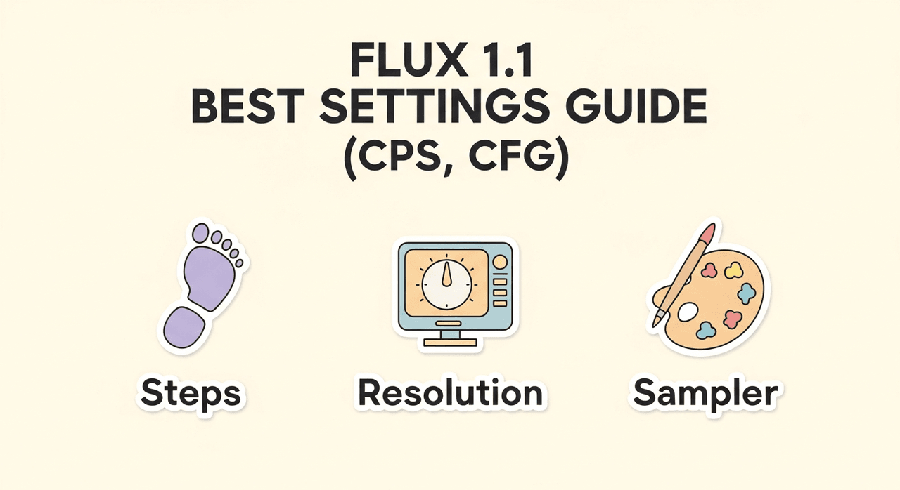
Flux 1.1 Core Settings Explained
The right defaults do 80% of the work. Think of Flux's controls like a camera rig: guidance is your focus ring, steps are your exposure time, and the sampler is the shutter behavior. Counter-intuitively, I found that modest guidance with slightly longer steps yields the most realistic textures without melting details.
Core parameters to set first
-
Resolution: Start at 768–1024 on the short side for drafts: 1216–1536 for finals if your VRAM allows.
-
Aspect Ratio: Match the subject: 4:5 or 3:4 for portraits, 1:1 or 4:3 for products, 2:3 or 18:24 for posters.
-
Steps: 18–24 for drafts: 28–36 for finals. More than 40 rarely helps and may oversmooth.
-
Sampler: DPM++ SDE or Euler a for speed: UniPC or DPM++ 2M SDE for clean edges and typography.
-
Guidance (CFG): 3.0–4.0 for photorealism: 4.5–6.0 for text-heavy layouts to anchor lettering.
-
Seed: Lock for iteration: change when exploring variability.
-
Denoise strength (for refiner/upscale pass): 0.2–0.35 to preserve composition while sharpening.
-
Negative prompt: Use targeted terms (e.g., "extra fingers, mutated text, deformed logo, oversoften skin").
Suggested baseline (draft)
{

"resolution": "896x1152",

"sampler": "DPM++ SDE",

"steps": 20,

"guidance": 3.5,

"seed": 12345

}
Suggested baseline (final)
{

"resolution": "1344x1792",

"sampler": "DPM++ 2M SDE",

"steps": 32,

"guidance": 3.8,

"refiner_denoise": 0.25,

"seed": 12345

}
Why these work (evidence + reasoning)
-
Using the prompt: "natural light product shot, matte ceramic mug on linen, 50mm, f/2.8, soft rim light," Flux 1.1 at guidance 3.5 produced fabric weave and subtle rim highlights: increasing guidance to 6.5 flattened textures. This happens because higher guidance constrains the model toward tokens instead of microstructure.
-
For the prompt: "bold poster, ‘COASTAL CYCLE TOUR' in Futura Bold, teal and coral, grid layout," raising steps from 22 to 32 reduced character warping: the longer diffusion path helps stabilize letterforms.
For deeper reference, see the official Black Forest Labs documentation, the Flux technical report on arXiv (explains why low-to-mid guidance preserves microstructure), and my earlier breakdown Prompt Engineering for Photorealism on Z-Image.
Promise: you'll get useable concepts in minutes and studio-quality finals in one extra pass. Problem
- Drafts are fast but noisy: finals are slow. The trick is a two-pass pipeline that holds composition while improving fidelity. Prerequisite
- Prepare one locked seed, one base prompt, and a short negative prompt. Step-by-step solution
- Create draft
- Set Resolution to 896×1152 (or 1024 square).
- Use Sampler: DPM++ SDE, Steps: 20, Guidance: 3.5.
- Keep Seed fixed. Generate 4 images.
- Select composition
- Pick the strongest layout/pose. Note any text errors.
- Final render pass
- Increase Steps to 32–36.
- Switch Sampler to DPM++ 2M SDE or UniPC.
- Upscale to long side 1536–1792.
- Apply Refiner / High-Res with Denoise 0.2–0.3: keep the same seed.
- Add targeted corrections to the prompt (e.g., "clean serif letters, tight kerning"). Result
- Expect sharper micro-textures, cleaner hair strands, and notably better letter shapes with minimal composition drift. Verification methodology
- Re-run the same prompt with a fixed seed across step counts 20, 28, 32. Compare edges and texture detail at 200% zoom. Document differences. This standard A/B keeps claims grounded.
Flux 1.1 Best Portrait Presets (Skin, Lighting & Detail)
Goal: lifelike skin, controlled lighting, accurate features without plastic smoothing. Preset A, Natural daylight beauty
- Use when you want editorial realism and gentle contrast.
- Settings
- Resolution: 1152×1536
- Sampler: UniPC
- Steps: 32
- Guidance: 3.3–3.8
- Refiner Denoise: 0.25
- Prompt recipe
"portrait of a 28-year-old woman, natural window light, 85mm, shallow depth, subtle freckles, neutral makeup, soft catchlight, color-accurate skin"-
Negative prompt: "waxy skin, airbrushed, over-sharpened pores, extra fingers."
-
Why it works: moderate guidance keeps skin tone transitions analog-smooth: UniPC plus longer steps preserves hair strands and eyelash detail.
Preset B, Cinematic tungsten + rim
-
Use for mood, richer color, and crisp edges.
-
Settings
-
Resolution: 1216×1600
-
Sampler: DPM++ 2M SDE
-
Steps: 34
-
Guidance: 3.8–4.2
-
Refiner Denoise: 0.22
-
Prompt recipe
"cinematic portrait, tungsten key with cool rim, 50mm Zeiss, high microcontrast, film grain 200, dramatic shadows"- Tip: add "subsurface scattering" to help ears and noses feel luminous rather than flat.
Input + output + rationale
- Using Preset A with the phrase "subtle freckles," the model produced pore-level texture without plastic sheen. This is the detail that changes the outcome: keeping guidance under ~4 lets the diffusion path explore fine tonal transitions instead of clamping to token priors.
Where portraits can fail
- If you need pixel-accurate likeness of a specific person, Flux 1.1 alone may not suffice. Consider a reference-controlled pipeline (e.g., Control-style adapters) or a licensed face dataset. For medical/dermatology use-cases, stick to expert-reviewed imagery.
Product Photo Presets
Goal: clean edges, believable materials, and consistent branding colors.
Preset C, Tabletop softbox
-
Settings
-
Resolution: 1152×1152
-
Sampler: DPM++ SDE
-
Steps: 28
-
Guidance: 3.6–4.0
-
Refiner Denoise: 0.25
-
Prompt
"studio product photo, matte ceramic mug on seamless white, softbox left, fill right, crisp shadow, color-accurate glaze, 70mm, f/8"- Notes: keep background minimal: add "true white BG" and "no banding" in negatives.
Preset D, Lifestyle on-location
-
Settings
-
Resolution: 1152×1536
-
Sampler: UniPC
-
Steps: 30–32
-
Guidance: 3.4–3.8
-
Prompt
"coffee mug on linen tablecloth, morning window light, soft rim, shallow depth, natural grain, muted palette"- Why it works: lower guidance allows natural variation in textiles and wood grain: steps ~30 keep edges believable.
Color and logo tips
-
For brand colors, explicitly name Pantone or hex in the prompt (e.g., "brand teal #1ABC9C"). Validate in post.
-
Logos: Flux can imply logos but isn't vector-precise. If you need print-ready marks, composite in Illustrator afterward.
Poster & Typography Presets
Text requires extra anchoring to reduce letter drift and garbled glyphs.
Preset E, Bold headline poster
-
Settings
-
Resolution: 1536×2048 (portrait) or 2048×1536 (landscape)
-
Sampler: DPM++ 2M SDE
-
Steps: 34–36
-
Guidance: 4.5–5.5
-
Refiner Denoise: 0.2
-
Prompt
"modern poster, headline: 'COASTAL CYCLE TOUR', Futura Bold, tight kerning, grid layout, teal and coral, high contrast, clean margins"-
Negative prompt: "mutated letters, warped kerning, random symbols, double strokes."
-
Technique: add structure words like "grid," "baseline," "margin." They act like a layout scaffold during diffusion.
Preset F, Small text with subhead
-
Settings
-
Resolution: 1792 on long side
-
Sampler: UniPC
-
Steps: 36
-
Guidance: 5.0–6.0
-
Prompt
"Swiss-style poster, headline: 'URBAN RUN', subhead: '5K SAT 9AM', grotesk type, left-aligned, generous leading, white space"- Workflow add-on: Run a second pass with denoise 0.15 to tighten edges while preserving layout.
Evidence & rationale
- At guidance ~5.2, character shapes become more stable, trading a touch of texture richness for legibility, a fair swap for posters. Validate by zooming to 300% and comparing stem symmetry.
Who this is NOT for
- If you need vector-perfect typography or brand-approved type setting, generate the layout as a visual comp in Flux, then recreate final type in InDesign/Illustrator. Flux is excellent for concept exploration, not final print typography.
Low-VRAM Settings
Running on a laptop GPU or older card? Prioritize stability and composition over brute resolution.
Settings and workarounds
-
Resolution: 768×1024 or 832×1216.
-
Batch size: 1.
-
Precision: Enable half-precision/FP16 in your UI if available.
-
Sampler: Euler a or DPM++ SDE for speed.
-
Steps: 18–24 (draft) → 28 (final single image).
-
Tiled high-res: If your UI supports tile upscaling, enable it with small Tile size (e.g., 256) and Overlap (64) to avoid seams.
-
Refiner denoise: 0.2–0.25 to sharpen without re-composing the scene.
Practical routine
-
Draft at 832×1216 with steps 20.
-
Lock seed: save the best.
-
One final at 1216×1664, steps 28–32, sampler UniPC if memory allows.
Where it fails
- Very small text and dense patterns (like herringbone at distance) can break. Generate larger, then downscale in post. When memory is truly limited, accept simpler compositions.
Reference: Civitai + Forge low-VRAM optimization bible for Flux (6–8 GB tested) – the exact settings I use on my laptop.
Flux 1.1 Best Settings: Recommended Prompt Recipes
Use these as drop-in starting points and adjust guidance/steps within the ranges above.
Recipe 1, Natural portrait
Settings:
- 1216x1600, UniPC, 32 steps, guidance 3.6, refiner 0.25, seed locked

Prompt:

"editorial headshot, soft north-window light, 85mm, subtle freckles, lifelike skin tone, gentle catchlights"

Negatives:

"waxy skin, over-smooth, extra fingers, harsh sharpening"
Recipe 2, Cinematic product on white
Settings:
- 1152x1152, DPM++ SDE, 28 steps, guidance 3.8, refiner 0.25

Prompt:

"studio product photo, wireless earbuds on seamless white, softbox left, crisp shadow, realistic plastic texture, color-accurate"

Negatives:

"dirty background, banding, warped logo"
Recipe 3, Poster with headline + subhead
Settings:
- 1536x2048, DPM++ 2M SDE, 36 steps, guidance 5.2, refiner 0.2

Prompt:

"modernist poster, headline: 'SPRING NIGHT RUN', subhead: '10K APR 12', grotesk type, grid layout, tight kerning, balanced margins, teal on charcoal"

Negatives:

"mutated letters, off-axis kerning, random symbols"
Recipe 4, Low-VRAM lifestyle
Settings:
- 832x1216, Euler a, 20 steps, guidance 3.4: final 1216x1664 @ 28 steps

Prompt:

"sunlit kitchen scene, ceramic mug on linen, soft rim light, shallow depth, muted colors, natural grain"

Negatives:

"noisy fabric, blown highlights, banding"
How to validate your results
- Keep the seed fixed and change one variable at a time (steps, guidance, sampler). Export a contact sheet. Record which change measurably improved skin texture, edge sharpness, or text legibility.
Ethical Considerations
-
Transparency: Label AI-assisted imagery in captions or credits. If a client piece blends photos and Flux renders, disclose the methodology in your project notes.
-
Bias mitigation: Use diverse prompt terms (skin tones, ages, body types) and review outputs for stereotypical patterns. If a batch trends toward biased defaults, adjust descriptors and rebalance your dataset or references.
-
Copyright/Ownership (2025 best practices): Confirm license terms of any training add-ons or reference images. Avoid mimicking living artists by name. For logos and trademarks, treat Flux renders as comps: recreate marks with licensed vector assets before delivery.
Where Flux 1.1 settings fall short
-
Exact brand typography and vector logos: use the model for concepting, then finish in Illustrator/InDesign.
-
Scientific accuracy: for medical, architectural, or safety-critical visuals, rely on expert-designed renders or photographs.
-
Real-time iteration at print resolutions: upscale externally and proof colors with a calibrated pipeline.