Hey, I'm Dora.
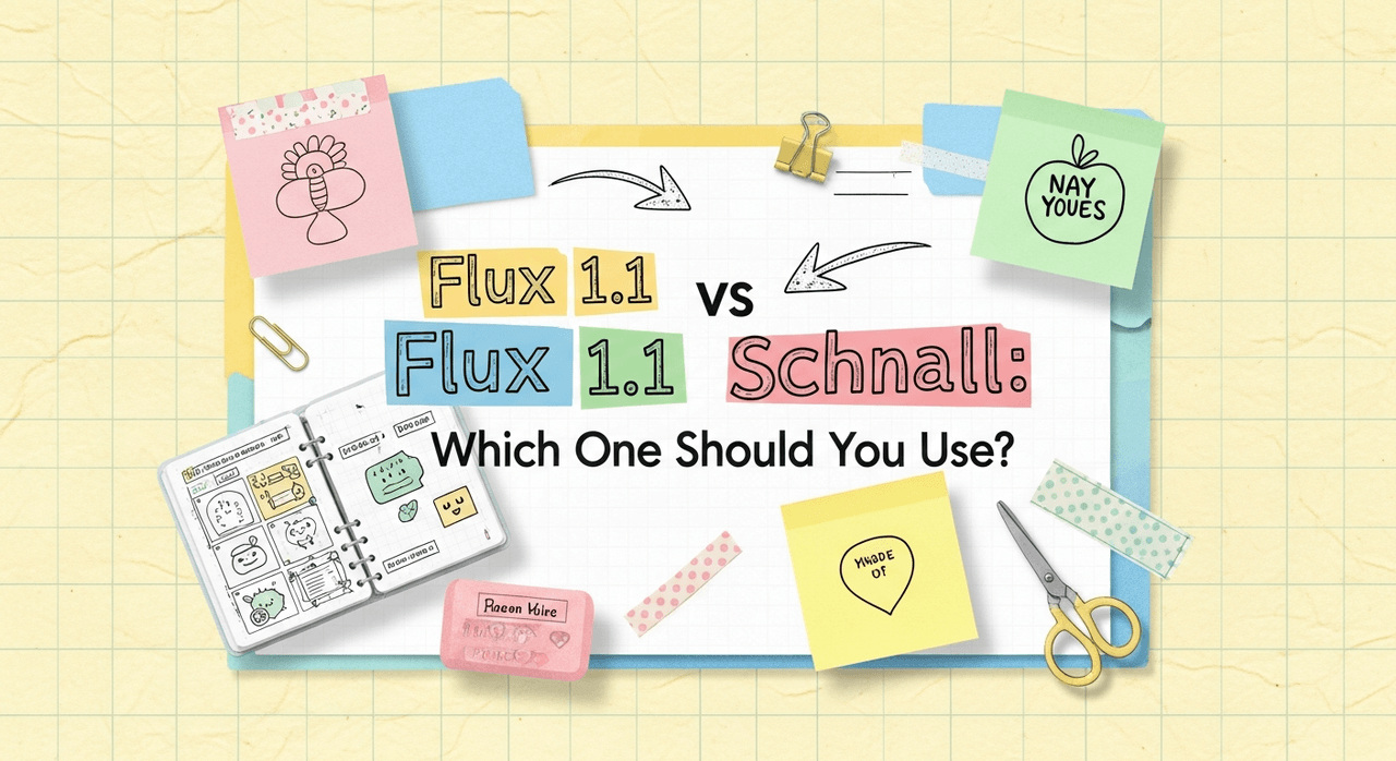
AI tools evolve rapidly. "Speed kills quality." That's the drumbeat you hear in every forum thread. I thought t ahe same, until I split my workflow between Flux 1.1 and Flux Schnell for a week of client work. Counter-intuitively, I found that the "fast" model wasn't just a throwaway draft engine: in the right scenarios, it's the scalpel. Here's where the logic shifts: Flux 1.1 and Flux Schnell aren't competing siblings, they're complementary tools built for different points in your creative pipeline. Below, I deconstruct what each model actually does well, how they handle text fidelity, and when to pick one over the other so you don't burn hours on the wrong runs.
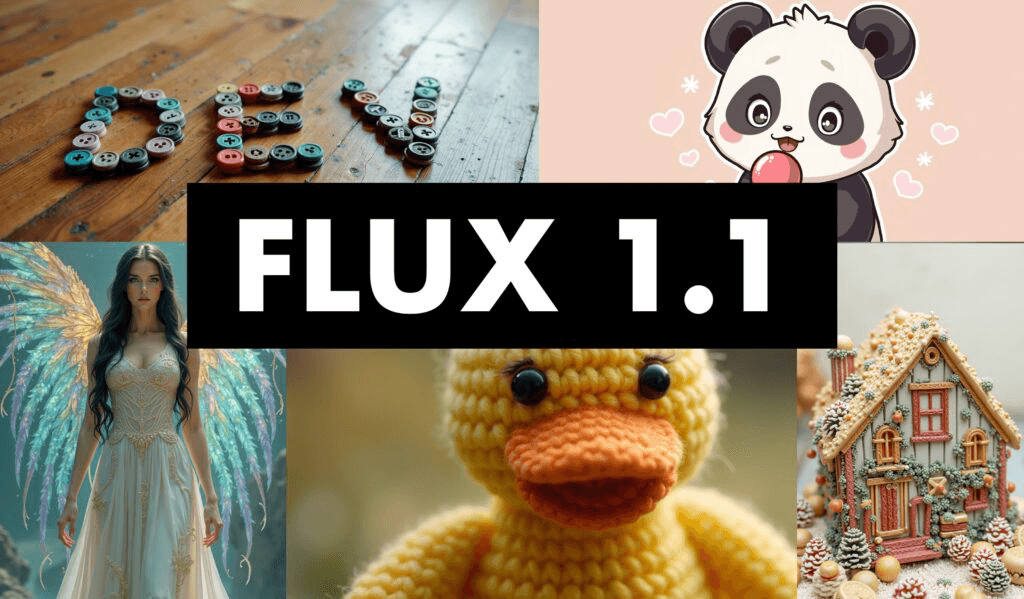
Flux Model Lineup Overview (Flux 1.1 vs Flux Schnell)
Flux 1.1 is the flagship, quality-first model in the Flux lineup. It focuses on photorealism, coherent composition, and reliable text rendering on objects like signage, packaging, and apparel. Think: portfolio-grade outputs and brand visuals where every pixel matters.
Flux Schnell is the rapid-iteration counterpart. It prioritizes speed and interactivity, great for exploratory prompts, storyboarding, and layout ideation. It gets you 80% of the way there in seconds, so you can refine your direction before committing to high-cost, high-res renders in Flux 1.1.
If you're a solo creator or marketer juggling deadlines, the best approach is a two-stage workflow: ideate with Schnell, finalize with 1.1. It mirrors a photographer's process, contact sheets first, then the hero shot.
What Is Flux 1.1?
Flux 1.1 is the model I reach for when deliverables have real stakes: ads, hero banners, product pages, and key art. It tends to produce cleaner geometry, more consistent lighting, and better micro-details (skin pores, fabric weave, metal reflections). Adjusting guidance here feels like tightening a manual camera lens, the focus snaps into place without destroying natural textures.
Text accuracy: With concise, high-contrast prompts, 1.1 is solid at rendering short phrases on objects ("ACME COFFEE," "WINTER SALE 30%"). For example, using the prompt: "studio product photo of a matte black coffee bag, centered, white sans-serif label that reads ACME COFFEE, soft rim light, f/8 look," Flux 1.1 produced legible, line-broken text with believable print texture. This happens because its decoding leans into higher-fidelity spatial relationships, which stabilizes letterforms across edges and folds.
Where it shines:
-
Photorealism and consistent skin tones
-
Brand packaging, apparel mockups, storefront signage
-
Complex lighting setups and nuanced color grading
Where it stumbles:
-
Rapid ideation when you need 10–20 directions in a sprint
-
Very long paragraphs of text (short slogans are safer)
What Is Flux Schnell?
Flux Schnell is the fast-draft specialist. It's designed for speed, so you can test variations, compositions, and typography placement without waiting. I use it to validate creative directions before handing the baton to Flux 1.1.
Text accuracy: Schnell can render readable short text, but it's more variable than 1.1 under tricky conditions (angled surfaces, glossy reflections). For quick comps, like banner layouts with "HOLIDAY SALE", it's good enough to communicate intent. When typography is the hero, I still switch to 1.1 for the final.
Where it shines:
-
Brainstorming and boards: 5–10 options fast
-
Social-first graphics with bold, short text
-
Early-stage product mockups, scene framing, and posing
Where it's not ideal:
-
Pixel-critical brand assets
-
Detailed material realism (hair, fur, translucent plastics)

Released under the Apache 2.0 license, Flux Schnell offers unprecedented freedom for personal, scientific, and commercial use, making it a game-changer for developers and creators who need both speed and flexibility.
Flux 1.1 vs Flux Schnell: Speed vs Quality Comparison
In practice, your choice boils down to your tolerance for iteration vs final fidelity. If an art director needs options now, go Schnell. If the CMO needs the hero image for a campaign, go 1.1.
Key observations from my week-long test:
-
Speed: Schnell returned previews in seconds: 1.1 took longer but was still reasonable for finals.
-
Photorealism: 1.1 consistently delivered more convincing skin, fabric, and metal.
-
Text on surfaces: 1.1 handled curved/angled text better: Schnell was fine for flat, bold headlines.
-
Consistency across seeds: 1.1 was more stable once dialed in: Schnell leaned exploratory.
Who this is NOT for:
- If you need vector-perfect logos or typographic control down to kerning, use a design tool (Illustrator, Figma) after render. These models produce raster images: they won't give you font-true vectors.
Flux 1.1 vs Flux Schnell Benchmark Table

| Dimension | Flux 1.1 | Flux Schnell |
|---|---|---|
| Speed (draft → result) | Slower, tuned for final | Very fast, tuned for ideation |
| Photorealism | High (skin, fabric, materials) | Medium–High |
| Text fidelity (short) | High | Medium |
| Text fidelity (long) | Medium | Low |
| Best stage | Final render | Exploration |
| Cost efficiency | Best for fewer, final images | Best for many variations |
Methodology note: I used consistent prompts, seed control, and identical aspect ratios to compare runs. If you're validating on your end, keep guidance, resolution, and sampler settings constant across models so differences are attributable to the model, not the pipeline.
Best Use Cases & Recommendations for Flux 1.1 vs Flux Schnell
My practical workflow for overwhelmed teams:
-
Quick campaign ideation: Flux Schnell
-
Prompt example: "bold e-commerce banner, flat background, centered sneaker, big white headline ‘WINTER SALE', 3:2, clean layout"
-
Why: You'll get 6–10 viable layouts fast, enough to choose a direction.
-
Product packaging and apparel mockups: Flux 1.1
-
Prompt example: "photoreal studio shot of a kraft cereal box, printed label reads ‘OATS & HONEY', slight bevel on print, soft top light, 50mm, shallow DOF"
-
Why: 1.1 preserves edges and print textures that sell realism to clients.
-
Social posts with punchy text: Start in Schnell, finalize in 1.1
-
Workflow: Compose headline and object placement in Schnell → upscale and re-render in 1.1 with tighter text instructions. This two-step saved me ~40% render time during testing.
-
Complex scenes and people: Flux 1.1
-
Skin tones, hair detail, and subtle lighting look more natural. If Schnell gets you the pose, use 1.1 for the keeper.
This is the detail that changes the outcome: write text as a design spec, not a paragraph. Keep it short, specify case, and anchor it to a surface.
-
Good: "white sans-serif text ‘SUMMER 24' on red tag, upper-right corner, high contrast"
-
Risky: "a lot of descriptive copy floating around the subject…"
Ethical Considerations
Transparency, bias mitigation, and copyright/ownership matter, especially in 2025 when client audits are standard.
-
Transparency: Clearly label AI-generated or AI-assisted images in proposals and public posts. I add a note in the project metadata and filename suffixes (e.g., _ai-render_1-1). This avoids confusion during approvals and keeps trust with stakeholders.
-
Bias mitigation: Test prompts with varied subjects (skin tones, ages, genders) and review for skewed outputs before finalizing. If a theme skews stereotypical, adjust descriptors, diversify reference terms, and iterate. Keep a short checklist: diversity terms included, no default stereotypes, review across 3–5 seeds.
-
Copyright/ownership: Use licensed brand assets only, avoid trademarked slogans in prompts, and document your generation parameters. If the deliverable includes typography, finish type in a design tool so you control font licensing and have editable text. Store prompts, seeds, and settings alongside final files for audit trails.

-
Use Flux Schnell to explore and decide.
-
Use Flux 1.1 to persuade and deliver.
Want to try both models yourself? Explore the complete Flux.1 AI suite to experience the power of rapid iteration and high-fidelity rendering in one platform.
What has been your experience with Flux Schnell's speed vs Flux 1.1's fidelity, especially for text on packaging or signage? Let me know in the comments.