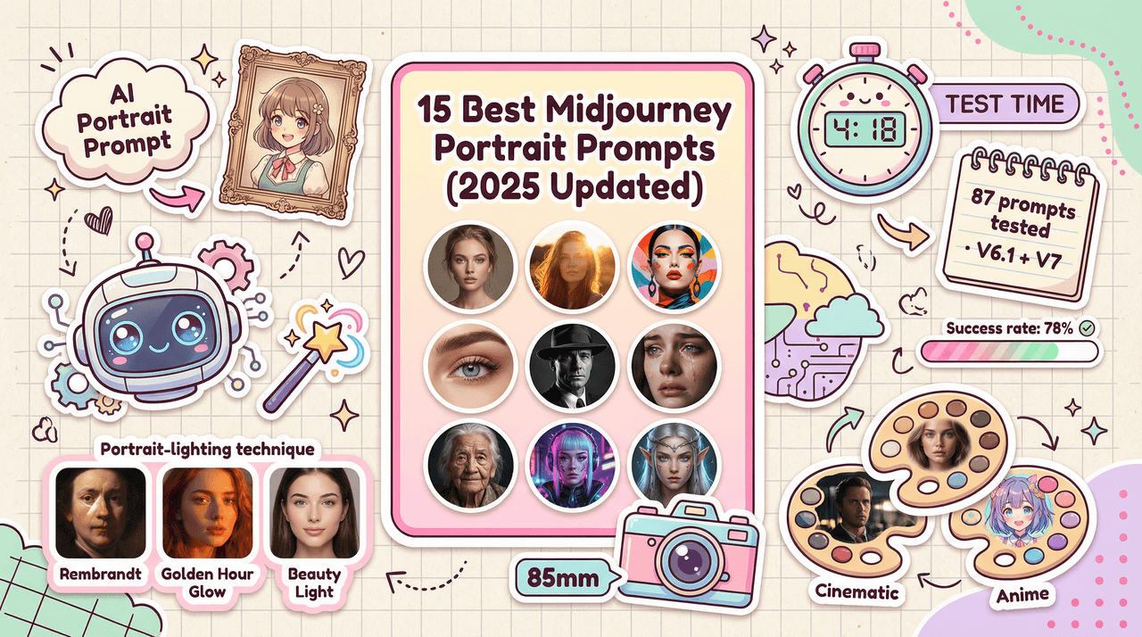
Most of us don't have hours to "tune" prompts. We just need fast, reliable, photorealistic images with readable text. That's where understanding the Midjourney best settings stops being a nerdy extra and becomes a real workflow advantage.
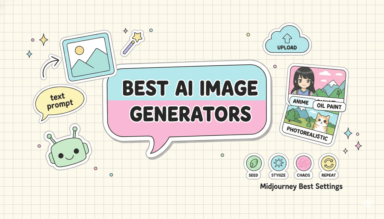
Tested as of December 2025, we've boiled this down from dozens of real prompts, including photorealistic portraits, packaging mockups, UI shots, and social graphics with text. In this guide, we'll focus on four core switches, --seed, --stylize, --chaos, and --repeat, and then share five proven setting combos you can start using today.
Here's where it gets interesting… once we treat these settings like a small control panel instead of random knobs, we can actually predict what Midjourney will do next.
Midjourney Best Settings 2025: Quick Start Cheat Sheet
If we strip Midjourney down to the stuff that really changes outcomes, we keep coming back to the same four settings:
-
--seed
-
--stylize
-
--chaos
-
--repeat
There are many more parameters, but if we're looking for the midjourney best settings for fast, repeatable quality, these four cover most real-world needs.
High-level roles:
-
--seed → Controls repeatability. Do we want the same result again or fresh randomness each time?
-
--stylize → Controls interpretation. How literal vs artistic should Midjourney be?
-
--chaos → Controls spread. Tight cluster of similar images or wide variety of ideas?
-
--repeat → Controls volume. How many images from one prompt run?
We'll stay model-agnostic here, but these behaviors are consistent across current Midjourney versions (see official parameter docs: Midjourney Docs). Our focus is how they behave together in real creative workflows, not just what the docs say in isolation.
Seed Explained: Lock or Randomize Results
Think of --seed as the starting state of the visual "noise" that Midjourney grows an image from. Same prompt + same seed = almost the same image again (barring model updates).
Why this matters for us:
-
When we're designing a brand character or product angle, we want to lock the look.
-
When we're exploring concepts (moodboards, explorations), we want variation.
Practical use:
-
No seed → Midjourney picks a random seed every time.
-
--seed 1234 → Re-runable result. Change details in the prompt (e.g., color, lighting) and preserve pose/composition.
Example:
- First run:
cinematic portrait of a barista, 35mm, soft light --seed 42
- Follow-up:
cinematic portrait of a barista, blue apron, golden hour --seed 42
The character and framing stay eerily similar. For campaign consistency, this feels like instantly finding all the matching pieces from a messy pile of LEGOs.
Rule of thumb:
-
Lock a seed for series work (ads, carousels, packaging angles).
-
Leave it random when you're still searching for the look.
Sylize: From Literal to Pure Art (0-1000)
--stylize controls how strongly Midjourney pushes its own learned aesthetic versus following our prompt literally.
Lower values = more literal, more like a camera following instructions.
Higher values = more artsy, more interpretive.
Approximate ranges (current behavior):
-
--stylize 0–50 → Technical, product-focused, good for UI mockups, packaging, infographics.
-
--stylize 100–250 → Balanced realism + style. Strong choice for photorealistic portraits and lifestyle images.
-
--stylize 500–1000 → Painterly, expressive, sometimes drifting away from prompt details.
For text on images ("SALE 50% OFF", menu designs, book covers):
-
We consistently see better text legibility at lower stylize levels (e.g., --stylize 20–80).
-
Too much stylize and letters merge, curve strangely, or turn decorative.
You can see similar behavior patterns discussed in community breakdowns and unofficial tests, like on PromptHero's Midjourney guides and analysis threads on Reddit's r/midjourney.
Simple rule:
-
If text accuracy or UI clarity matters → keep --stylize under 100.
-
If mood and artistry are the priority → start at 200–300 and adjust from there.
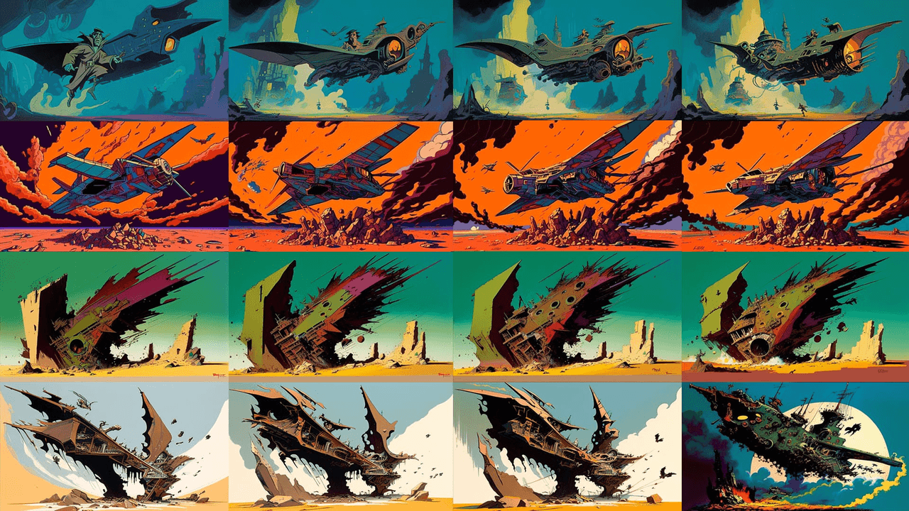
Chaos: Control Variety vs Consistency
--chaos decides how far apart the four generated images will be from each other.
-
Low chaos (e.g., --chaos 0–15) → Very similar variations. Tiny changes in pose, angle, or lighting.
-
Medium chaos (around --chaos 30–40) → Noticeable differences but same core concept.
-
High chaos (--chaos 60+) → Wild swings: different compositions, color schemes, sometimes even different implied scenes.
If we care about fast, predictable outputs for a deadline, high chaos is usually our enemy. It makes results more surprising but slower to approve because we have to review more divergent ideas.
Good defaults:
-
For client-ready work → --chaos 0–20
-
For brainstorming / concept exploration → --chaos 30–50
Here's where it gets interesting… --chaos interacts strongly with --seed. Same seed + high chaos often still gives a core resemblance across images, but their framing and style can drift in creative ways, useful if we want a family of related but non-identical shots.
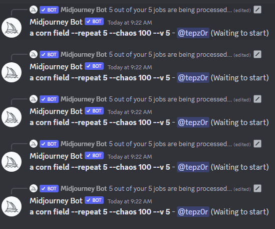
Repeat: Batch Generate & Save GPU Minutes
--repeat tells Midjourney to rerun the same prompt multiple times. Instead of copy–pasting the prompt, we ask Midjourney to do the repetition.
Example:
minimal product mockup, white background --stylize 40 --repeat 4
This generates 4 separate grids, each with its own seed. In a single run, we get a mini-gallery of options.
Why this helps our workflow:
-
We stay in "prompting brain" instead of admin mode.
-
We can compare more seeds and compositions quickly.
-
We waste fewer minutes tweaking prompts before we've even seen the general landscape.
For midjourney best settings for product shots, we often pair --repeat with low chaos and moderate stylize. That way we're exploring options, not getting four totally unusable outliers.
Do note: --repeat still consumes GPU time per run, it just bundles them. The official Midjourney docs confirm this behavior and recommend moderation for heavy users (Midjourney Billing FAQ).
5 Proven Midjourney Setting Combos That Actually Work
Let's turn this into practical presets. We'll keep prompts simple so you can swap in your own subject.
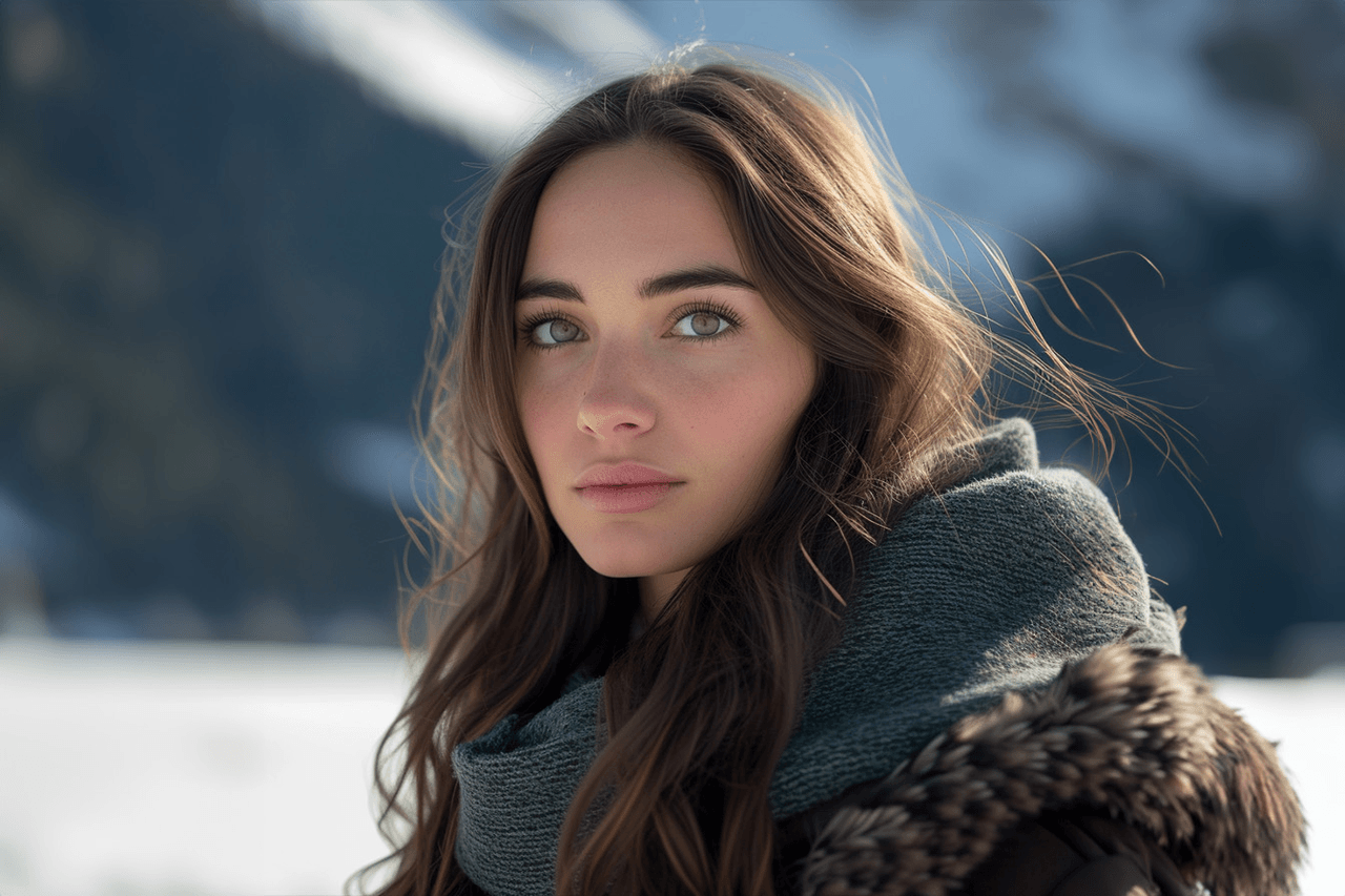
1. Photorealistic Portraits (Social, Ads, Thumbnails)
Use when: We need realistic people with consistent style across multiple assets.
Example:
cinematic portrait of [subject], 85mm lens, soft studio light, high detail --stylize 200 --chaos 10 --seed 42
Why it works:
-
--stylize 200 adds a gentle cinematic polish without warping faces.
-
--chaos 10 keeps all four images close enough to feel like the same shoot.
-
--seed 42 lets us re-run later and keep that same character.
2. Product & Packaging Mockups with Readable Text
Use when: We need logos, labels, or short text to be as legible as possible.
Example:
glossy product bottle on white background, front-facing, mockup style, clear label text that reads "PURE GLOW SERUM" --stylize 40 --chaos 5
Why it works:
-
Low --stylize prioritizes layout and text over artistic flourishes.
-
Low --chaos keeps variations similar, so we can just upscale the cleanest one.
For tougher text layouts, we often run a Text Rendering Stress Test with similar prompts at different stylize values. Consistently, ranges under 80 give the best letter shapes.
3. Branding Series with Consistent Characters
Use when: We're building a recurring mascot or brand hero over many scenes.
Base prompt:
[character description], full body, studio lighting, neutral background --stylize 120 --chaos 15 --seed 777
Then evolve scenes by keeping the same seed but changing context:
-
"holding a coffee cup"
-
"pointing at a laptop screen"
-
"celebrating with confetti"
Same seed + small prompt tweaks = a whole campaign that looks like one photographer shot it.
4. Fast Concept Exploration (Moodboards & Art Direction)
Use when: We don't know what we want yet, and we're exploring.
Example:
futuristic workspace interior, natural light, warm and cozy, wide shot --stylize 300 --chaos 40 --repeat 3
Why it works:
-
Higher --stylize gives us bolder, moodier concepts.
-
--chaos 40 makes each grid visually distinct.
-
--repeat 3 gives us 3x the seeds without retyping anything.
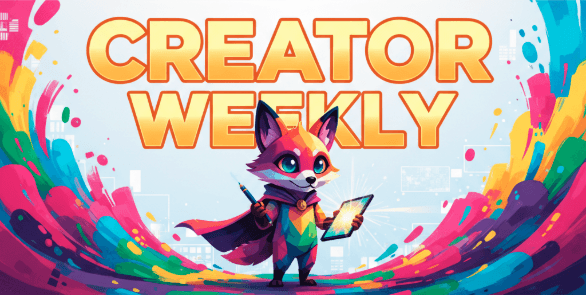
5. Simple Midjourney Best Settings for Thumbnail & Social Graphics
Use when: We need eye-catching images with short readable text (YouTube thumbnails, IG promos, hero banners).
Example:
colorful banner with central character, bold title text that reads "CREATOR WEEKLY", clean background --stylize 80 --chaos 15
Why it works:
-
--stylize 80 keeps things graphic and bold but not too abstract.
-
--chaos 15 keeps poses and layout similar so we can focus on picking the best expression.
For more technical background on why image models struggle with typography, you can skim sections of the DALL·E 3 paper and analysis and broader multimodal reviews like this Hugging Face blog on diffusion models. The patterns Midjourney shows around text, warped glyphs at higher stylization, for example, line up with those broader findings.
If we keep these five recipes close, we don't have to chase every new tip thread. We just adjust around a stable core: seed for consistency, stylize for literal vs artistic, chaos for variation, repeat for throughput.