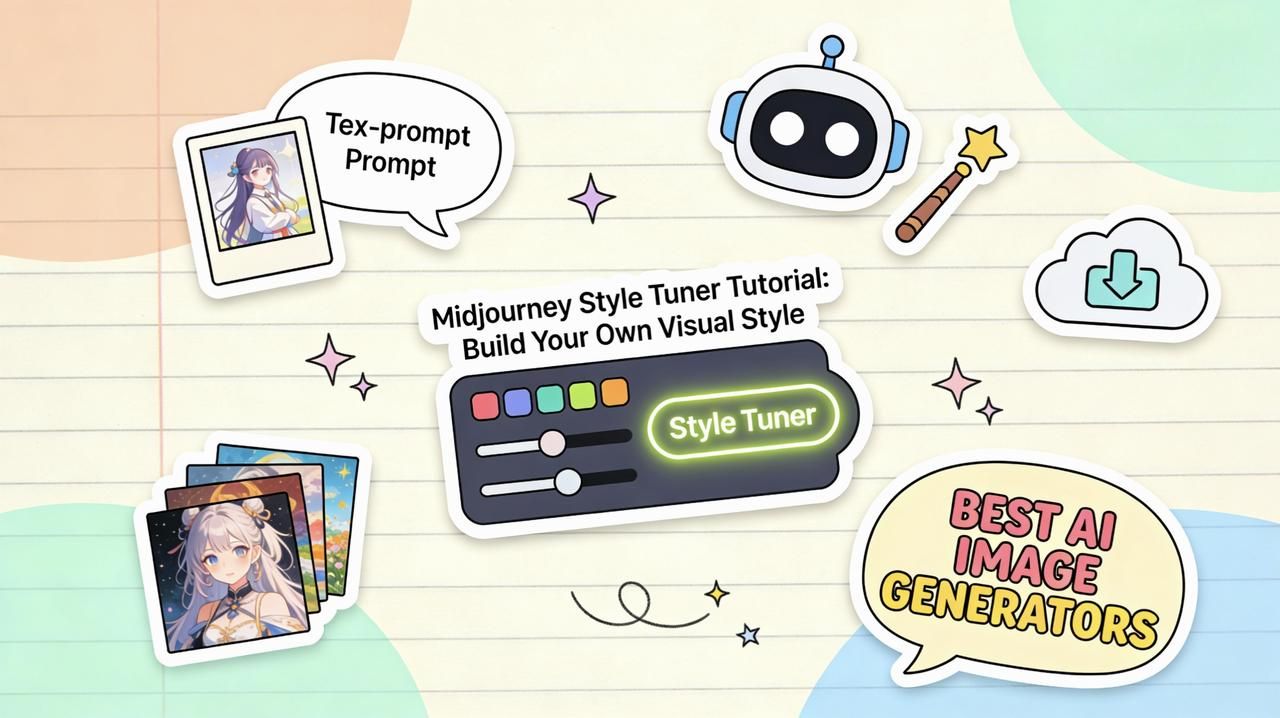
If you've ever tried to keep a consistent visual style across dozens of Midjourney images, you know how fast things can fall apart. One prompt tweak and suddenly your "brand style" looks like it came from three different artists. That's exactly the problem the Midjourney Style Tuner is designed to solve.
In this guide, I'll walk you through what the Midjourney style tuner actually does, how it works, and how I use it to build repeatable, photorealistic looks, without rewriting prompts from scratch every time. Tested as of November 2025, this workflow is aimed at busy creators and marketers who need results, not theory.
What Is Midjourney Style Tuner? (Quick Overview for Beginners)
At its core, the Midjourney Style Tuner is a tool that lets you create and reuse a consistent "style" across many images. Instead of relying only on long, descriptive prompts, you generate a style code that captures the visual look you like.
You run the tuner on a base prompt, choose your favorite variations from a grid Midjourney gives you, and Midjourney converts those preferences into a reusable style reference like --style <code>. After that, you can attach that code to any compatible prompt and get images that feel like they belong in the same universe.
This matters when:
-
You're building a brand visual language (social posts, ads, thumbnails)
-
You need consistent character or product shots
If you've struggled to keep images aligned from one campaign to the next, the style tuner is Midjourney's answer to "make this look like my previous work" without manual prompt gymnastics.
How Midjourney Style Tuner Works (Step-by-Step Breakdown)
Here's where it gets interesting: the Midjourney style tuner isn't just a preset. It's Midjourney learning your preferences from a structured test.
Step 1: Start from a base prompt
You choose a simple, general prompt like:
"portrait photo of a young woman, soft window light"
This base prompt should match the type of images you plan to generate often (portraits, products, environments, etc.).
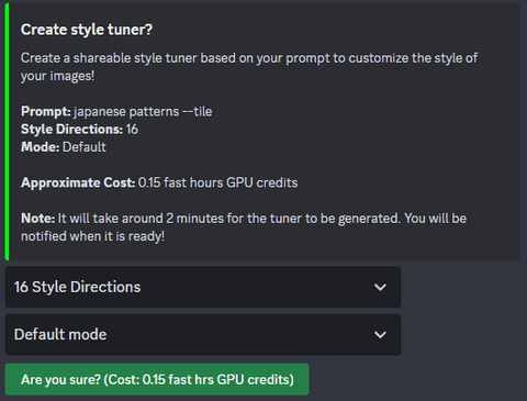
Step 2: Run the style tuner command
In Discord or the Midjourney interface, you trigger the style tuner flow (current syntax may evolve, so always double-check the official docs).
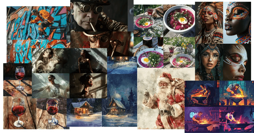
Step 3: Pick your favorites from each grid
You'll see multiple image sets with different stylistic variations: lighting, color grading, composition, texture, and more. In each round, you select the ones that feel closest to what you want your signature look to be.
It feels like instantly finding all the matching pieces from a messy pile of LEGOs.
Step 4: Midjourney generates a style code
Once you're done selecting, Midjourney processes your choices and gives you a style code. This might look like --style S_tuner_XXXXX. That's your custom style profile.
Step 5: Reuse that style code in new prompts
From now on, you append the code to new prompts:
"cinematic product photo of matte black headphones on a desk, --style S_tuner_XXXXX"
Behind the scenes, Midjourney applies the learned look, contrast, color, lighting, and overall mood, on top of your new content instructions.
Building Your Custom Visual Style in Midjourney (5 Easy Steps)
When I'm building a new visual style with the Midjourney style tuner, I follow a very specific workflow to keep things practical and repeatable.
1. Define one clear use case
Don't start with "everything." Decide:
-
"Instagram product shots in soft natural light" or
-
"Corporate headshots with neutral backgrounds" or
-
"Cinematic YouTube thumbnails, bold colors"
The clearer the use case, the more coherent your tuned style will be.
2. Craft a neutral, reusable base prompt
Your base prompt should be content-neutral enough to reuse, but still realistic:
"studio portrait photo of a person, looking at camera, shallow depth of field"
Avoid branding language or ultra-specific products here. You're tuning style, not content.
3. Run the Midjourney style tuner with patience
This is not the moment to rush. In each comparison grid:
-
Pick images that match your desired mood (bright vs moody)
-
Pay attention to skin tones, color grading, and sharpness
-
Ignore subject identity: focus on the visual language
If I'm aiming for photorealistic campaigns, I bias toward clean lighting, believable skin, and minimal surreal artifacts.
4. Save and document your style codes
When Midjourney generates your style code, store it somewhere you'll actually use: a Notion page, a brand doc, or even pinned messages in Discord. I also add quick notes like:
S_tuner_XXXXX – soft natural portraits – high contrast, muted colors
That tiny note saves you from guessing months later.
5. Stress test your style code
Before you commit, I run 5–10 prompts with the new style code:
-
Different subjects (people, products, spaces)
-
Different aspect ratios
-
Slight prompt wording changes
If the look holds together across variations, your Midjourney style tuning worked. If it falls apart, rerun the tuner with more careful choices.
Applying Tuned Styles Across Images (Real-World Examples)
Here's how I apply Midjourney style tuner outputs in real workflows for independent creators and marketers.
Example 1: Social media product grid
Goal: A consistent visual style for Instagram grid for a small skincare brand.
Strategy:
-
Tuner base prompt: "minimalist product photo of skincare bottle on neutral surface, soft daylight"
-
After tuning, I get a style code that leans toward pastel backgrounds, soft shadows, and slightly matte textures.
Application:
I then create:
-
Carousel posts for each product
-
Seasonal promo banners
-
Website hero images
All with prompts like:
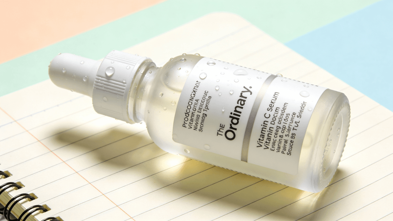
"minimalist product photo of vitamin C serum bottle with water droplets, --style S_tuner_XXXXX"
The result: images that feel consistent, like they were shot in the same studio session.
Example 2: Consistent YouTube thumbnails
Goal: Thumbnails that are bold, legible, and recognizably "on brand."
Strategy:
-
Tuner base prompt: "cinematic close-up of a person reacting, bold lighting, dramatic background"
-
During tuning, I favor stronger contrast, punchy colors, and simple backgrounds.
Application:
I then prompt:
"cinematic close-up of a designer looking surprised at laptop, large empty space on right, --style S_tuner_YYYYY"
For text, I typically add it later in a design tool because Midjourney text rendering is still not perfectly reliable. But the tuned style makes faces, lighting, and framing remarkably consistent across episodes.
Example 3: Brand moodboards and pitch decks
Sometimes I'm not producing final assets, just visual direction. I use a tuned style to generate:
-
Moodboards for client pitches
-
Style frames for video concepts
-
Layout references for future photo shoots
With a single Midjourney style tuner code, all slides look unified, which makes the concept feel more professional and intentional.
7 Common Mistakes in MJ Style Tuning (And How to Fix Them)
I see the same errors again and again when people try the Midjourney style tuner for the first time. Here's how I approach each one.
1. Using an overly complex base prompt
Problem: Long, specific prompts mix content and style, confusing the tuner.
Fix: Strip your base prompt to subject + setting + lighting. Save brand copy and ultra-specific details for later prompts.
2. Mixing too many aesthetics in one tuner
Problem: Trying to get "moody cinematic + bright lifestyle + flat lay" from one style code.
Fix: Create separate style codes for clearly different use cases. One for portraits, one for product flat lays, one for thumbnails.
3. Judging images by subject instead of style
Problem: Rejecting a great style because you dislike the face or pose.
Fix: Force yourself to look only at color, contrast, texture, and composition. Remember: content will change later.
4. Ignoring photorealism cues
Problem: Ending up with semi-illustrated, uncanny results when you wanted realism.
Fix: During tuning, always favor images with:
-
Natural skin texture
-
Believable lighting
-
Minimal distortions or painterly artifacts
5. Not stress-testing with real prompts
Problem: The style looks good in tuner previews but collapses in your actual workflow.
Fix: After getting the style code, test 5–10 prompts that match your real projects. If it fails, rerun the tuner and be more selective.
6. Expecting perfect text in images
Problem: Assuming the style tuner will fix Midjourney's text rendering limitations.
Fix: Use the tuner for visual style, not typography. For mission-critical text (logos, ad copy, UI labels), add text afterward in Figma, Photoshop, or Canva. Treat Midjourney text as a rough guide only.
7. Letting one style code do everything
Problem: Forcing a single style to work for every channel and format.
Fix: Think of each style code as a specialist, not a generalist, one for dark, cinematic ads: one for light, airy lifestyle shots: one for bold, thumbnail-friendly scenes.
Once you accept that the Midjourney style tuner is a fast way to create focused, reusable looks rather than a magic universal preset, it becomes a seriously powerful part of your image workflow.