I kept seeing creators ask if Flux 1.1 could handle real brand work, fast, on-brief, and with readable text. So I built a complete brand visuals workflow around Black Forest Labs’ Flux 1.1 model and stress-tested it on posters, thumbnails, banner sets, and social media packs. The goal: realistic AI images for marketing that also include accurate, legible text. If you've ever thought, "the image is right, but the text is wrong," this is for you. I'll show settings, prompt structures, and a few sanity checks that save hours. And yes, I'll say where Flux 1.1 struggles and how I patch it with other AI tools for designers.
What Flux Can Do
Flux 1.1 is a diffusion-based model tuned for brand-friendly visuals: clean lighting, controllable color palettes, and strong composition at social-native aspect ratios (1:1, 4:5, 16:9). It's quick to iterate, stable across seeds, and good at keeping shape integrity, useful for product shots and lifestyle scenes.
Where it shines for me:
-
Fast style exploration for campaigns
-
Photorealistic scenes with controlled depth of field
-
Solid typography zones (with help)
If you need AI images with accurate text, Flux 1.1 alone won't always be the best AI image generator for text. I pair it with a clean text layer pass (vector or SD/ControlNet text control) to lock readability. Still, it's my starting engine for brand-safe looks and fast comps.
Defining Style Direction with Flux 1.1
I start with a micro-brief: purpose, audience, palette, lighting, focal length, and text zones. Then I build a style scaffold in Flux 1.1.
My tested base prompt template:
"[brand vibe], [hero subject], [primary color hex + accent], cinematic soft key light, [lens mm], shallow depth of field, clean background, negative space for headline, minimal props, symmetrical balance, realistic skin tones, production-grade photo, subtle grain, high contrast but not crushed blacks."
Key settings that stayed stable across campaigns:
-
Steps: 28–36 for hero shots: 20–24 for social variants
-
CFG/guidance: 4.5–6.5 (lower to keep skin natural, higher for product packshots)
-
Aspect ratios: 1:1, 4:5, 16:9, generate natively: avoid extreme crops later
-
Seed: lock after you get the right composition
Several minutes later, I had already exported my first production-ready image. Locking the seed early avoids drift when you generate the rest of the pack. For AI tools for designers, this single habit pays off every project.
Highlighting Key Visual Elements
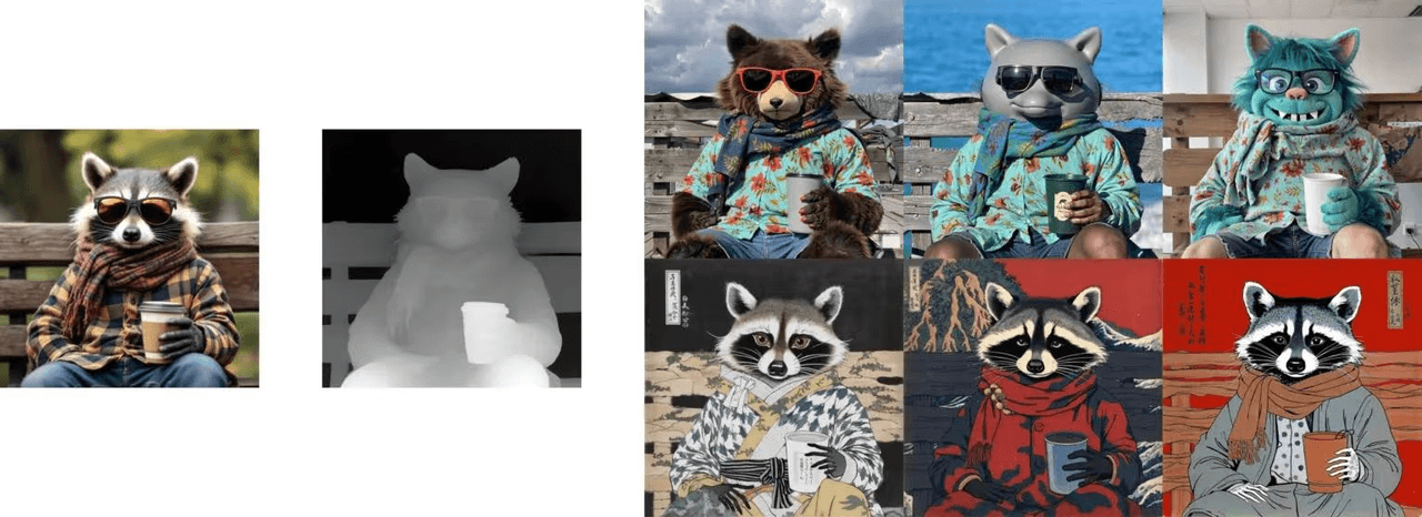
When a brand cares about one thing, logo, product label, fabric detail, I isolate it in the prompt and composition.
The focus triangle
-
Subject priority: "Primary focus on [object], tack-sharp"
-
Lighting callout: "soft key from camera left, rim light for edge separation"
-
Background discipline: "uncluttered background, no overlapping elements near [logo area]"
Prompt weights and negatives
-
Weight the subject: "(stainless water bottle:1.3)"
-
Negative prompt: "blurry text, warped label, extra fingers, over-sharpened edges, watermark"
"Typography zone" trick
Even before adding real text, I reserve space: "clean empty space top-right for headline, even tone background, no patterns." This nudges Flux 1.1 to leave a quiet area that won't fight your copy. Later, I layer true vector text for accuracy. It's the simplest way to get AI images with accurate text without wrestling the model for glyph perfection.
Creating Social Media Packs Efficiently
I build a 6-asset pack per concept: IG square, IG portrait, story, LinkedIn landscape, YouTube banner-safe crop, and a paid ad variant.
Workflow:
-
Generate master image at 1536–2048px on the longest side.
-
Lock seed. Re-roll 3–5 variants only by changing aspect ratio and minor framing words.
-
Export to a layout tool. Add vector text with styles from the brand sheet.
-
Batch color tune with a LUT so the whole pack feels unified.
Speed tips:
-
Keep a prompt macro for each channel ("wide negative space for LinkedIn headline," "center-safe composition for story polls").
-
Use consistent lens language across the pack (e.g., "50mm natural perspective").
This is how I deliver realistic AI images for marketing without spending hours per asset.
Designing Thumbnails & Banners
Thumbnails and banners live or die on clarity at tiny sizes. Flux 1.1 is great at bold shapes and lighting, but I don't trust it with microtype.
My guardrails:
-
Subject scale: 60–70% of frame for thumbnails
-
Edge separation: clear rim light or contrasting background
-
Color strategy: one dominant hue + one accent: avoid triadic chaos
-
Text: only 2–4 words, set in vector. No faux AI letters.
A quick comparison of text approaches:
-
Flux-only text: fast, but ~50–70% legible at 100% zoom: drops fast on mobile
-
Vector text pass: 100% legible, brand fonts preserved
If you're chasing the best AI image generator for text-on-image, Flux 1.1 isn't it alone, but as the image engine plus a manual text layer, it's efficient and consistent.
Maintaining Style Consistency
Consistency is the hidden brief. Here's how I keep Flux 1.1 from drifting:
-
Seed discipline: lock seed per concept: new seed only for new scene
-
Prompt blocks: reuse the same lens, lighting, and palette lines
-
Palette codes: write hex values into the prompt (e.g., "#0E1111 with #F7D154 accents")
-
Negative set: save a shared negative bank (blurry text, heavy bloom, lens dirt, Dutch angle)
-
Post chain: apply the same LUT and light grain in export
When a client requests a tweak, I change one variable at a time, usually lighting ratio first. This keeps the brand look intact while making them feel heard.
Client Handoff Workflow Using Flux 1.1
Clients don't want model talk: they want control and rights. My package includes:
-
A style one-pager: palette, lens notes, lighting diagrams, do/don't examples
-
Prompt sheet: the exact prompts, seeds, guidance values (so another designer can replicate)
-
Layered files: Flux 1.1 render + vector text layers
-
License notes: model/tool terms, stock usage, and a reminder to avoid real trademarks in-generation
-
Change map: what to edit in prompt vs. what to edit in layout
Handoff steps:
-
I demo a live re-roll with the locked seed to show how stable the system is.
-
I swap in an alternate palette to prove flexibility without style loss.
-
I export a batch and run a quick mobile legibility test on headlines.
Flux 1.1 won't replace typography. But paired with a clean layout pass, it's a reliable engine for brand visuals that move fast and stay on-brief. If you're juggling deadlines, this combo keeps the image right, and the text right, too.