AI tools evolve rapidly. Features described here are accurate as of December 2025.
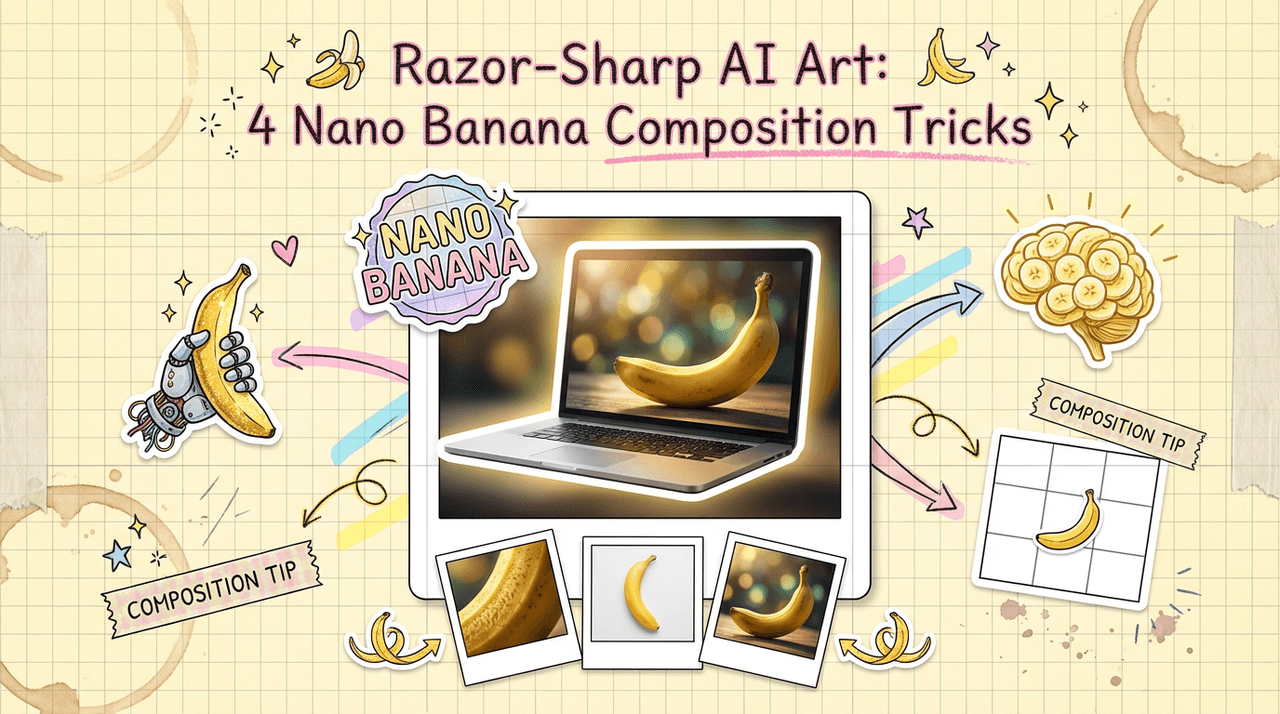
If you're generating AI images all day, you already know this: prompt wording alone isn't enough. The difference between "meh" and "studio-grade" often comes down to composition. That's where nano banana composition comes in, a shorthand I use for ultra-precise, small-scale framing decisions that make an image feel designed instead of random.
When I started, I wasted hours regenerating the same idea because I didn't control angles, foregrounds, or where the viewer's eye would land. Once I treated composition like a tiny, adjustable dial in every prompt, my hit rate jumped, and my images finally supported the text and layout I needed for real-world campaigns.
In this guide, I'll show you how I think about nano banana composition so you can get sharper, more intentional results with far fewer retries.
Why Nano Banana Composition is Key to Professional AI Art
Nano banana composition isn't a secret feature buried in some settings menu, it's a mindset. I use the phrase to remind myself that the smallest compositional tweaks can completely change how "professional" an AI image feels.
Here's what I mean:
-
Micro-level placement matters. Telling the model "banana on a table" gives you chaos. Saying "single ripe banana centered in frame on a dark wooden table, shallow depth of field, studio lighting" forces a controlled layout.
-
Text and layout need breathing room. If you're designing a thumbnail, ad, or social graphic, you don't just need a cool banana shot, you need negative space for a title, subtitle, and logo.
-
Consistency for a brand system. When I lock in a specific composition style (e.g., 3/4 angle, subject on the right third, soft background bokeh), it becomes way easier to build a cohesive visual series for a client.
This is the detail that changes the outcome: instead of asking the model to "invent a scene," you're specifying where the viewer should look first, second, and third. That's exactly what human photographers and art directors do.
If you want a deeper jump into why composition works the way it does, check out resources on classical photography and cinematography framing principles: Types of Camera Shots in Film, Adobe Rule of Thirds Guide, RunwayML Prompting Guide.
Mastering Nano Banana Framing: Essential POV Types and Angles
When I build prompts, I almost always specify point of view (POV) and angle. Otherwise, the model guesses, and its guesses rarely match what I'd use in an actual layout.
The core POV types I rely on
-
Eye-level shot – Neutral, documentary feel. Great for product explainers and how-to graphics.
-
High-angle shot (looking down) – Makes the subject feel smaller and more arranged. Think "flat-lay" spreads with multiple bananas, props, and typography space.
-
Low-angle shot (looking up) – Dramatic and larger-than-life. Perfect when you want a single banana to feel iconic or heroic in a commercial poster.
-
Macro close-up – This is peak nano banana territory: extreme detail of texture, water droplets, peel fibers. Ideal for backgrounds, patterns, or attention-grabbing thumbnails.
Practical angle prompts
Try wording like:
-
"macro close-up of a sliced banana, eye-level, ultra detailed texture, shallow depth of field"
-
"banana bunch shot from directly above, flat-lay composition, clean background, space on top for headline text"
Because adjusting angle feels like rotating a physical camera in a studio, I treat each prompt like I'm "walking around" the scene, describing exactly where the lens sits relative to the banana.
For more camera-angle inspiration, I constantly reference shot lists like this: camera shots and angles guide.
Applying Rule of Thirds AI Techniques for Balanced Visuals
The rule of thirds is still one of the fastest ways to make AI images feel intentional. Even if the model doesn't literally draw a grid, describing your layout in thirds tends to produce more balanced compositions.
How I phrase rule-of-thirds prompts
Instead of "banana in the middle," I'll say:
-
"single banana placed on right third of the frame, blurred background kitchen, empty negative space on left for bold white text"
-
"banana split dessert aligned along bottom third, city skyline bokeh filling top two-thirds"
Notice I'm telling the model both where the banana lives and what fills the other zones (background, negative space, or supporting props). That's what turns a generic image into a layout-ready asset.
Who this approach is NOT for
If you're making:
-
Abstract art with wild, chaotic energy
-
Background textures that will be heavily cropped
-
Or icon-style assets that need perfect centering
…strict rule-of-thirds prompts can actually fight you. In those cases, I lean on centered composition or symmetry prompts instead.
If you want to dig into the rule of thirds beyond AI, this photography guide is still one of the clearest explanations I've found: Adobe Rule of Thirds Guide.
Guiding the Viewer’s Eye with Leading Lines in Nano Banana
Leading lines are wildly underrated in AI prompting. In nano banana composition, I use them to steer the viewer's eye toward the subject or text.
What counts as a leading line?
In banana-focused scenes, lines can be:
-
The curve of the banana itself
-
Table edges, countertop seams, or cutting boards
-
Stripes of light or shadows
-
Cutlery, straws, or garnish elements
Prompting with leading lines
Here's how I write it:
-
"curved banana in foreground, wooden table planks forming strong diagonal lines pointing toward the banana, cinematic lighting"
-
"banana smoothie glass centered, countertop edges forming converging lines toward the glass, soft morning light from the left"
If I need space for accurate AI text (like a headline or call-to-action), I'll explicitly mention it:
"leading lines pointing from bottom corners toward empty top-right corner, reserved for bold headline text."
That little phrase tells the model to build composition around where your typography will sit, which saves a ton of time compared to manually trying to find space later in Figma or Photoshop.
For more on how lines affect perception, I like to cross-reference traditional cinematography resources: What are Leading Lines.
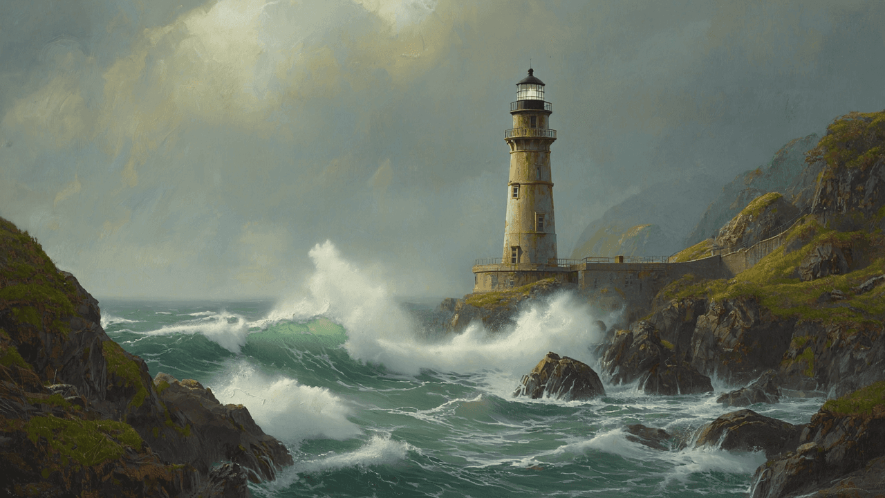
Creating Depth & Foreground Interest through Nano Banana Composition
Flat AI images feel cheap. Depth makes them look like real photography.
My go-to depth tricks
I usually layer the scene into foreground, midground, and background:
-
Foreground: out-of-focus objects close to the lens (banana peels, utensils, blurred text labels).
-
Midground: primary subject (banana, dessert, or branded product).
-
Background: soft, contextual elements (kitchen, café, studio backdrop, gradient).
Example prompt:
"shallow depth of field, blurred banana peel in foreground, sharp sliced banana in midground on ceramic plate, soft kitchen background bokeh."
Adding depth is like adding physical distance inside a flat screen, suddenly the viewer believes there's a real camera doing the seeing.
Ethical considerations in nano banana composition
As I've leaned harder into AI visuals, I've had to treat ethics as part of the workflow, not an afterthought.
-
Transparency. When an image is AI-generated, I label it as such in captions, credits, or alt text. Clients appreciate the clarity, and audiences are getting more sensitive to undisclosed AI use.
-
Bias mitigation. Even with something as simple as bananas, context matters. If I include people, I intentionally prompt for diverse body types, ages, and cultures instead of letting the model default to overly narrow beauty or lifestyle standards.
-
Copyright & ownership (2025 reality). I avoid prompts referencing specific photographers or brands ("in the style of X") and treat AI outputs like draft assets. Before using them in commercial work, I check platform terms, add my own retouching or compositing, and document which model and settings I used. When in doubt, I consult legal or stick to stock + human photography.
For a broader view on how major platforms are handling AI images, I regularly skim overview articles like this: Google Gemini Image Generation Blog.
Actionable Nano Banana Composition Prompt Examples to Try Now
To make this concrete, here are nano banana composition prompts you can paste into your favorite model and adapt.
1. Clean product-style hero image
ultra realistic photograph of a single ripe banana on a dark matte background, three-quarter angle, placed on right third of the frame, soft spotlight on banana, subtle vignette, empty negative space on left for bold white headline text, studio lighting, 85mm lens, f1.8
Use this for: ad banners, hero sections, or YouTube thumbnails where you'll add big typography on the left.
2. Macro texture background
macro close-up of banana peel texture with water droplets, extreme detail, shallow depth of field, abstract composition, diagonal leading lines across frame, soft yellow and green tones, no text, suitable as background
Use this for: subtle backgrounds behind UI screenshots or social posts.
3. Lifestyle flat-lay with text area
flat-lay composition, sliced bananas on a ceramic plate, oats and nuts scattered around, shot from directly above, warm morning light, top third of the image left empty for overlay text, clean minimal background, balanced rule-of-thirds layout, instagram-ready
Use this for: blog covers or Pinterest graphics.

4. Dramatic cinematic poster
cinematic low-angle shot of a banana glowing under a spotlight on a stage, dark smoky background, strong leading lines from floorboards converging toward the banana, centered composition, space at top for movie title text, high contrast, 35mm lens, anamorphic look
Use this for: playful campaign posters or social teasers.