Last Updated: December 05, 2025 | Tested Version: Nano Banana Pro (Dec 2025 build)
If you're juggling client deadlines, product launches, and a dozen ad sizes at once, you don't have time to wrestle with AI quirks. You need a Nano Banana workflow for ad creatives that gives you photoreal visuals and readable, accurate text, without a 40‑step ritual every time.
In this guide, I'll walk you through the exact workflows I use inside Nano Banana Pro for:
-
Clean static product ads
-
Lifestyle images that actually convert
-
Brand-consistent visuals across campaigns
-
Exporting assets for multiple platforms without quality loss
AI tools evolve rapidly. Features described here are accurate as of December 2025.
Why Nano Banana? Enhancing Modern AI Advertising Workflows
Most image models either excel at photorealism or at readable text. Nano Banana Pro sits in that rare middle ground where you can get both, if your workflow is disciplined.
- Text fidelity for ads
When I feed it product titles or short headlines, it keeps character shapes intact far better than generic diffusion models. I still avoid long, paragraph-style copy, but for brand names, short CTAs, and price tags, it's reliable.
- Lighting and material realism
Product surfaces, glass, metal, fabrics, render with convincing specular highlights and reflections. For e‑commerce-style ads, it behaves like a fast virtual studio. Google's own benchmarks on Nano Banana Pro for retail creatives line up with what I see in daily use.
- Promptable ad "intent"
Phrases like conversion-focused, high-CTR layout, or clean performance-banner composition don't magically optimize ROAS, but they nudge the composition toward tighter framing, clear hierarchy, and legible text areas. This is the detail that changes the outcome when you're iterating under pressure.
So instead of treating Nano Banana as a generic art toy, I treat it as a specialized ad engine with strict input rules, and my results got dramatically more predictable.

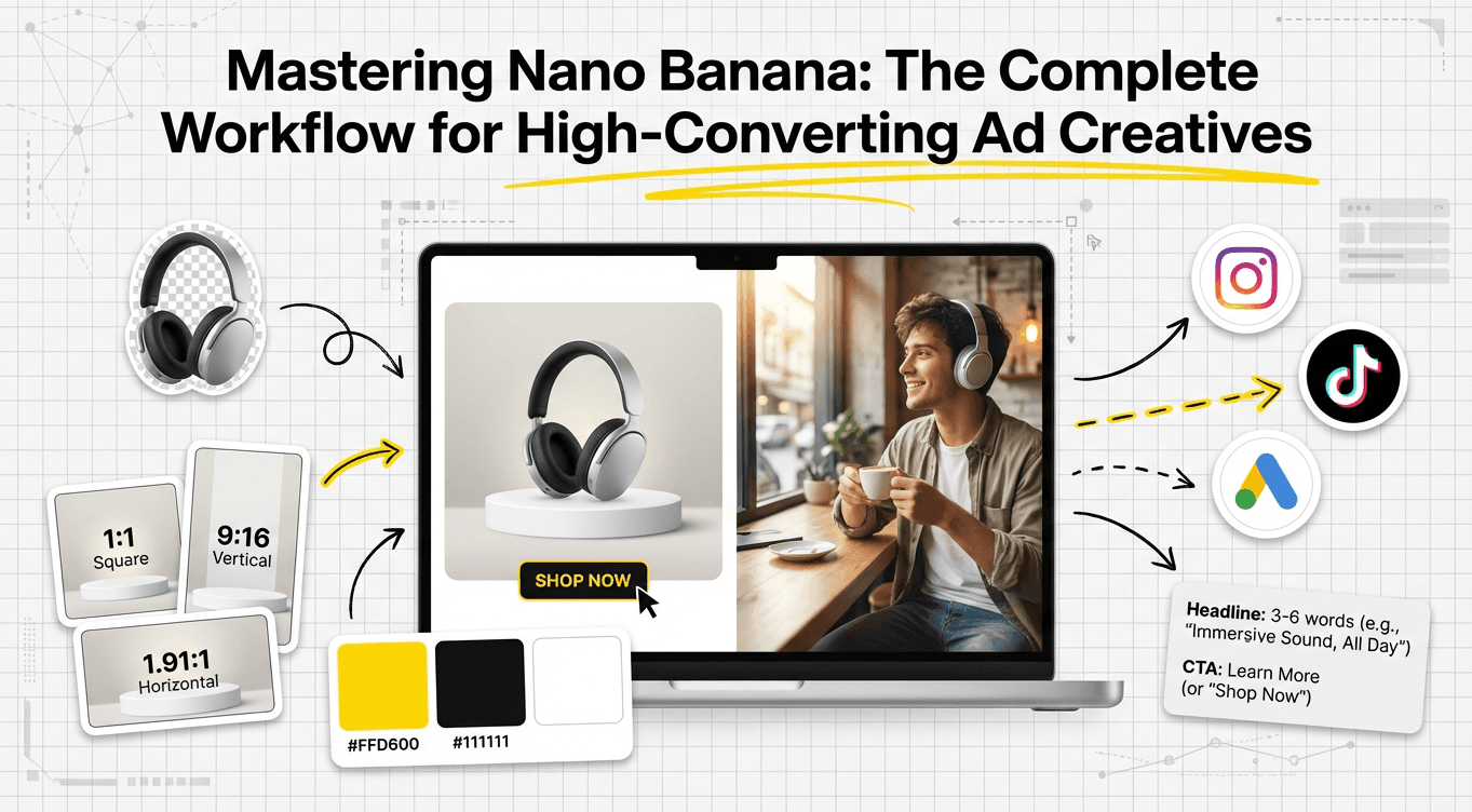
Static Ad Workflow: Proven Steps for High-Quality Nano Banana Designs
For static ads (banners, promos, hero images), my goal is: sharp product, uncluttered background, and copy that doesn't melt.
Static Ad Prerequisites
Before I generate, I always prepare:
-
A clean product cutout (PNG with transparent background)
-
Exact brand name and CTA phrase (10 words max)
-
Target aspect ratio (e.g., 1080×1080, 1200×628, 1080×1920)
Step-by-Step Static Nano Banana Workflow
-
Step 1: Choose the right template or canvas
-
In Nano Banana Pro, I start from a Blank Canvas with the platform size I need.
-
I set:
aspect_ratio: 4:5

style_preset: "studio_product_minimal"

text_mode: "precision"

sharpness: 0.65- Step 2: Structure the prompt around the ad layout
I use a layout-first prompt like:
clean e-commerce ad, center-focused product on subtle gradient background, ample empty space for text at top and right, high-contrast lighting, sharp focus, agency-grade art direction, conversion-focused banner design-
Step 3: Insert product and exact text
-
Upload the product PNG as the main reference.
-
In the text fields, I keep it strict:
-
Headline: 3–6 words
-
Subline: optional, max ~8 words
-
CTA: 2–3 words (e.g., Shop Now, Learn More)
-
Step 4: Generate variants with controlled randomness
I usually run 4–6 variants with:
guidance_scale: 6.5

variation: 0.25
This keeps branding and layout stable but explores lighting and angles.
- Step 5: Fix text and micro-details
When text is 80–90% correct, I use Nano Banana's text refinement or inpainting on just the type layer. If a headline keeps breaking, I:
-
Shorten it by 1–2 words
-
Avoid script fonts (they're more error-prone)
-
Remove symbols like # and & unless essential
For performance ads, I'd rather have a slightly boring but legible font than a beautiful illegible one.
Lifestyle Ad Workflow: Creating Context-Rich, Conversion-Driven Visuals with Nano Banana

Lifestyle ads carry more emotional weight: you're showing how the product fits into a real scenario.
Lifestyle Prerequisites
I clarify three things before touching the model:
-
Target persona (e.g., "busy millennial parent", "remote designer")
-
Setting (kitchen, gym, co-working space, street, etc.)
-
Key emotion (relief, excitement, calm, confidence)
Step-by-Step Lifestyle Nano Banana Workflow
- Step 1: Lock in narrative framing
My base prompt might look like:
lifestyle ad photo of [PRODUCT] in use, [PERSONA] in a [SETTING], natural candid lighting, shallow depth of field, focus on product, warm editorial color grading, social-media-ready composition, space for text in top left- Step 2: Add subtle performance hints
I layer in phrases like conversion-driven framing, scroll-stopping thumbnail composition, or mobile-first layout. They don't "optimize" your campaign by themselves, but they consistently produce tighter crops and stronger focal points.
- Step 3: Control realism and brand fit
For a more polished commercial look, I use:
realism_boost: 0.7

saturation: 0.1

skin_tone_consistency: "balanced"
This keeps skin tones believable and avoids that plastic HDR look you sometimes see in overcooked AI images.
- Step 4: Add text only after the scene works
I rarely ask Nano Banana to nail both the scene and text in one shot. I:
-
First generate a clean lifestyle frame
-
Then re-run with preserve_scene: true and add short text blocks
This two-pass approach dramatically reduces broken lettering and awkward overlaps in busy lifestyle shots.
Branding Consistency: Ensuring Cohesive Visuals Across All Campaigns
Great one-off ads are easy. Cohesive campaigns are harder.
My Nano Banana Brand Baseline
I maintain a small "brand sheet" prompt I reuse across projects:
brand_style: "clean, modern, high-contrast, minimal clutter"

primary_colors: "#111111, #FFD600, #FFFFFF"

typography_feel: "bold sans-serif, clear hierarchy, high legibility"

photography_style: "soft key light, natural shadows, subtle film grain"
I paste or paraphrase this into every Nano Banana prompt for that client or brand.
Where Nano Banana Fails (and Who It's Not For)
Nano Banana Pro is not a silver bullet:
-
If you need vector-perfect logos or typographic lockups, you're still better off in Illustrator or Figma.
-
For complex legal disclaimers or dense body copy, Nano Banana's text fidelity isn't there yet. I composite that text manually afterward.
-
For ultra-stylized illustration systems (e.g., flat geometric icon sets), a dedicated illustration tool or in-house illustrator will beat a diffusion-based pipeline.
Ethical Considerations in AI Ad Workflows
I'm careful about three things:
- Transparency
I label AI-assisted visuals in internal docs and, when relevant, in public-facing work (e.g., case studies). Clients deserve to know which parts are AI-generated.
- Bias mitigation
When generating people, I rotate through diverse prompts for gender expression, age ranges, and ethnic backgrounds instead of defaulting to a single template. I also manually review for stereotypes or harmful visual tropes and regenerate when necessary.
- Copyright and ownership (2025 best practice)
I avoid using trademarked characters, logos, or celebrity likenesses in prompts. Where clients provide reference photography or logos, we confirm they own or have licensed those assets before including them in the Nano Banana pipeline.
Responsible workflows aren't just "nice to have" now, they're part of staying legally and reputationally safe in 2025.
Export & Delivery: Best Practices for Multi-Platform Ad Creatives
Once the image looks right, I treat export as a mini-pipeline of its own.
My Export Checklist
- Size per platform
I export at native aspect ratios needed for:
-
Meta / Instagram: 1080×1080, 1080×1350, 1080×1920
-
Google Ads display: 1200×628 or 300×250 thumbnails
-
Pinterest / TikTok: 1080×1920 vertical
-
Resolution and format
-
Master export: PNG, 2× resolution of target size for safety
-
Delivery export: JPG, 80–90% quality unless the platform prefers PNG for transparency
-
Text sanity check per size
I do a quick zoomed-out pass at ~25% scale for each size and ask a teammate or client: Can you read the main message in under 1 second? If not, I go back into Nano Banana or my design tool to simplify.
- Avoid over-processing
Sharpening twice (once in Nano Banana and again in Photoshop) can make edges crunchy and "AI obvious." I keep one tool responsible for final sharpening.
When I'm happy with the batch, I package:
-
A master folder with full-res PNGs
-
A delivery folder with platform-ready JPGs named clearly (brand_campaign_platform_size_version)
Post your results so others can see how you build your Nano Banana workflow for ad creatives, and so you can benchmark your visuals against what's currently working.
Frequently Asked Questions
What is a Nano Banana workflow for ad creatives?
A Nano Banana workflow for ad creatives is a structured set of steps to generate photoreal product and lifestyle ads with accurate, readable text using Nano Banana Pro. It covers preparing assets, setting canvas and parameters, prompting for layout and narrative, refining text, and exporting platform-ready files at consistent quality.
How do I set up a static Nano Banana workflow for clean product ads?
Start with a blank canvas at your target aspect ratio and a style preset like “studio_product_minimal.” Upload a clean product PNG, limit headlines to 3–6 words and CTAs to 2–3 words, use moderate guidance and variation for stable layouts, then refine only the text layer via inpainting or text tools.
How can I use Nano Banana Pro for lifestyle ads that convert?
Define persona, setting, and key emotion first. Prompt around a clear narrative with the product in use, natural lighting, and space for text. Add subtle performance phrases like “conversion-driven framing,” boost realism moderately, and often run a two-pass flow: generate a clean scene first, then re-run with preserved composition plus short text.
How do I keep brand consistency across multiple Nano Banana ad campaigns?
Maintain a reusable “brand sheet” prompt including brand_style, primary_colors, typography_feel, and photography_style. Paste or adapt this into every Nano Banana workflow for ad creatives so lighting, color, and type feel stay cohesive across static and lifestyle visuals, even when you change products, formats, or campaign messages.
Can I rely on Nano Banana Pro for all ad text, or should I add copy in a design tool?
Nano Banana Pro handles short headlines, brand names, and CTAs well but struggles with long paragraphs, legal disclaimers, and fine typographic control. For dense or highly precise text, generate the image with minimal copy in Nano Banana, then add or polish the typography later in Figma, Illustrator, or Photoshop.