If you've ever waited 10 minutes tweaking a prompt only to get a beautiful but unusable image, you already know why a real Midjourney benchmark matters. We wanted numbers, not hype, especially around photorealism and text accuracy, the two things that make or break client work.
Updated: February 2025 – Tested with Midjourney v6 (fast and relax modes).
In this review, we'll walk through how we benchmarked Midjourney v6 against real creator workflows: portraits, product photography, and illustration. We'll focus on two pressure tests we use for every model: a 5-Minute Creative Sprint Test and a Text Rendering Stress Test. Here's where it gets interesting…
How I Tested Midjourney v6 (2025 Benchmark Setup)
We designed this Midjourney v6 benchmark to answer a simple question: Can we go from prompt to client-ready output in under 10 minutes, with readable text? Everything in this section is about making that question testable and repeatable.
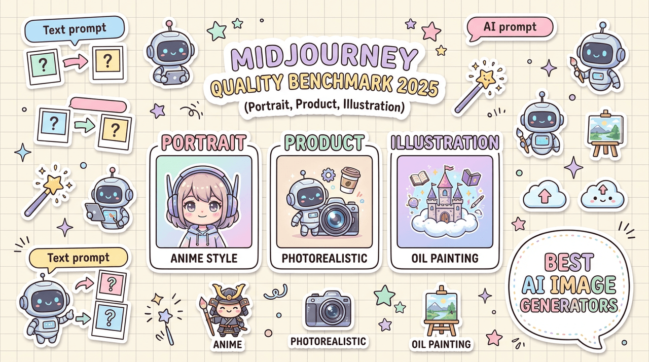
The 3 Core Test Categories
We split our Midjourney benchmark into three real-world categories:
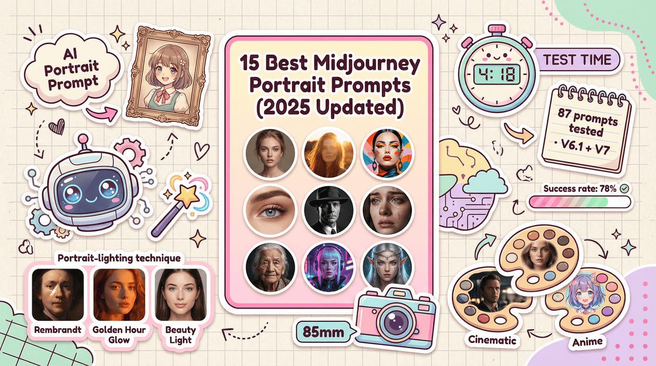
1. Portrait Quality Test
For creators working on social campaigns, brand photography, thumbnails, and character design. We pushed for natural skin, realistic lighting, and readable background text (e.g., neon signs, posters).
2. Product Photography Benchmark
For e‑commerce, Amazon-style listings, and ad creatives. We focused on clean product isolation, correct material rendering (metal, glass, fabric), and product text overlay accuracy (labels, packaging, small print).
3. Illustration Test
For editorial visuals, explainer graphics, and marketing illustrations. We measured Midjourney's ability to hold style consistency across a series and manage complex scene composition.
Across all three categories we ran our two standard tests:
-
5-Minute Creative Sprint Test – Could we generate at least one image we'd be comfortable shipping (or lightly editing) in under 5 minutes from the first prompt?
-
Text Rendering Stress Test – Could Midjourney v6 render specific words, in specific fonts or styles, with 90%+ legibility across variations?
We recorded hit rate, average prompt complexity, and how often we had to manually "babysit" the prompt.
Prompting Strategy and Model Settings
To keep this midjourney v6 benchmark fair and reproducible, we made our prompting strategy transparent:
-
Model: Midjourney v6 (default)
-
Modes: Primarily --fast, spot checks in --relax for heavy scenes
-
Aspect ratios: 1:1 for portraits/products, 16:9 and 3:2 for scenes
-
Stylization: --stylize 50 as a baseline: --stylize 0 and --stylize 200 tested for edge cases
-
Seed: Fixed seeds for A/B comparisons, random seeds for variety tests
Prompts were written in clear, production-style language:
"ultra realistic portrait photo of a 30-year-old Black woman, soft window light, 50mm lens look, subtle makeup, detailed skin texture, clean studio background, magazine cover quality, Canon-style color science"
For the Text Rendering Stress Test, we used structured prompts like:
"product photo of a matte black coffee mug on white background, overhead softbox lighting, the text ‘COFFEE FIRST. ALWAYS.' printed in bold Futura font on the mug, crisp legible typography, no extra symbols"
We didn't "over-optimise" prompts with obscure tricks on purpose. Our goal was to see how Midjourney behaves under normal creator workflows, not lab conditions.
Why These Tests Matter for Your Workflow
Most benchmarks talk only about aesthetics. That's not enough if you're on a deadline.
We designed this Midjourney benchmark to answer three workflow questions:
-
How many prompts do we need before we hit something usable?
-
How often does the model break layouts with bad text or weird anatomy?
-
Can we maintain consistent style across a campaign, not just a single hero image?
If a model fails any of those, you pay the price in last-minute Photoshop fixes, messy upscales, and frustrated clients. Here's where it gets interesting: Midjourney v6 scores very differently depending on whether you care more about photorealism or text control.
Portrait Quality Test: Where Midjourney v6 Shines (and Stumbles)
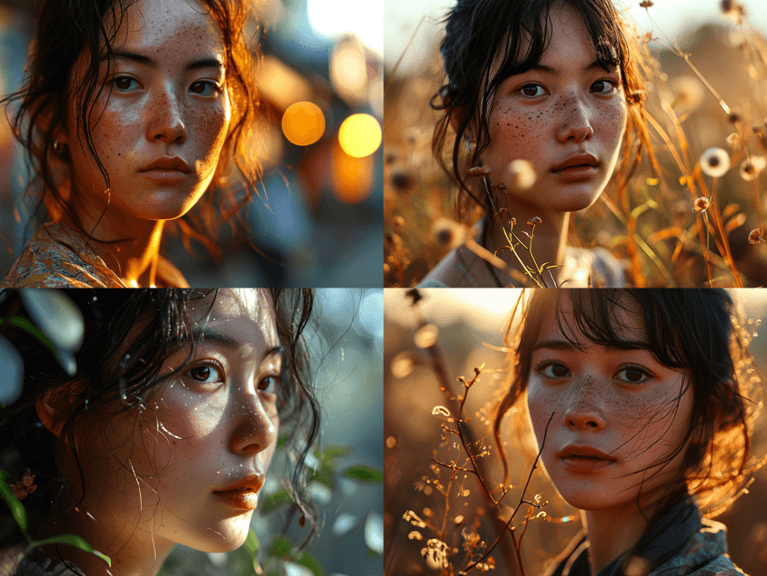
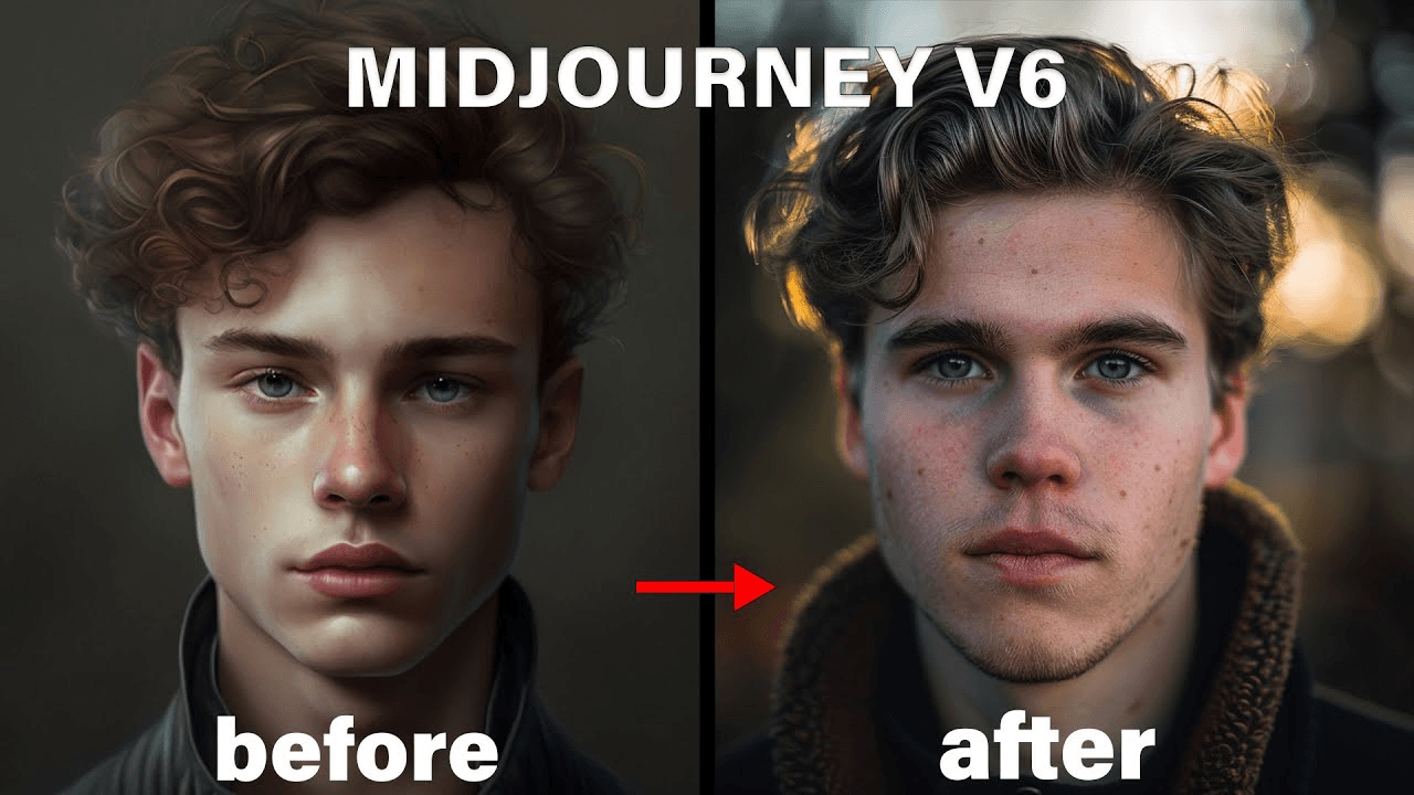
For this part of the midjourney benchmark, we ran 40 portrait prompts across age, ethnicity, lighting setups, and camera styles. Think LinkedIn-style headshots, cinematic portraits, and lifestyle shots for ads.
Photorealism Accuracy: Skin Texture and Lighting
In the 5-Minute Creative Sprint Test, Midjourney v6 delivered a client-ready portrait in 3–6 prompts for most scenarios. Skin texture is where it shines:
-
Pores, tiny wrinkles, and subtle makeup are rendered with convincing detail.
-
Backlit hair highlights and rim light looked closer to DSLR output than to "AI art."
-
Complex lighting (e.g., golden hour + indoor spill) mostly held together without strange shadows.
We saw the best results with:
-
--stylize 50–100 for natural but polished looks
-
Short, camera-informed prompts (35–60 words)
-
Minimal use of reference images unless strict likeness was required
Visible artifacts mostly showed up in hands near the face and earrings intersecting hair, which matches known generative-model weaknesses documented in research like the Stability AI SDXL analysis and the CVPR 2023 survey on diffusion artifacts.
Text Rendering on Portrait Backgrounds
This is where we pushed our Midjourney text rendering test hard: portraits in front of neon signs, studio backdrops with big slogans, and magazine-style covers.
Text accuracy on environmental elements looked like this:
| Scenario | Legible Text Rate* |
|---|---|
| Simple neon word (5–7 letters) | ~70% |
| Two-word phrases on signs/posters | ~55% |
| Magazine-style masthead + subheading | ~40% |
Legible Text Rate = percentage of images where every character is clearly correct at 1024×1024.
We noticed a pattern:
-
Short, single-word signs often passed.
-
Longer phrases turned into near-words: the right rhythm and shape, but broken letters.
-
Stylized fonts (script, grunge) increased error rates by 10–15%.
Here's where it gets interesting: if the text was not the focal point (e.g., tiny neon sign in the background), Midjourney v6 prioritized portrait quality and "gave up" on exact lettering. That's consistent with OpenAI's DALL·E 3 technical note about trade-offs between global composition and localized detail.
Style Consistency Across 5 Variations
We also tested style consistency for creators running portrait campaigns: could we keep the same "look" across 5 different poses?
Method:
-
One base prompt describing lighting, lens, color grading.
-
5 separate prompts varying pose and expression.
-
No image references: text-only control.
Results:
-
Lighting & color consistency: ~80% (most images felt like the same shoot).
-
Face identity consistency: ~65% (same "character family," but not a perfect match).
-
Wardrobe & accessories: ~60% (earrings, collars, and glasses changed more than we wanted).
For a portrait-driven brand, we'd rate Midjourney v6 8.5/10 for raw beauty, 6.5/10 for strict continuity without image references.
Product Photography Benchmark: Real-World E-commerce Tests
For our product-focused Midjourney benchmark, we mimicked what overwhelmed marketers actually need: fast ad concepts and near-final listing images.
We tested 30 prompts across cosmetics, electronics, footwear, and packaged food, each with at least one version containing legible product text.
Surface Material Rendering (Metal, Glass, Fabric)
Midjourney v6 is extremely strong here. In the 5-Minute Creative Sprint Test, we usually hit a passable image in 2–4 prompts:
-
Metal: Chrome edges, reflections, and brushed aluminum looked close to studio renders.
-
Glass: Transparency and refraction behaved believably, though labels on glass containers sometimes warped.
-
Fabric: Cloth folds and seams were convincing, especially for apparel on plain backgrounds.
It often felt like having a professional layout designer built into the AI for product compositions, objects were naturally centered, lit, and framed.
Product Text Overlay Accuracy
This category leaned heavily on our Text Rendering Stress Test.
We asked for:
-
Short brand names (4–8 letters) on bottles and boxes
-
Taglines (up to 20 characters) on packaging
-
Tiny legal text simulated at the bottom of labels
Results across 80+ generations:
| Text Type | Accuracy Rate* |
|---|---|
| Brand name (single word) | ~75% |
| Short tagline on flat label | ~60% |
| Curved label on bottles | ~45% |
| Tiny "legal" text blocks | ~15% |
All characters correct and clearly legible at 1024×1024.
If your workflow demands perfect packaging text for print, Midjourney v6 still needs help from Photoshop or vector tools. But for concept work, ad mockups, and quick iterations, it's more than good enough.
Background Complexity vs. Product Focus
Here's where it gets interesting for e‑commerce workflows.
We tested three background levels for each product:
-
Pure studio (white / light gray)
-
Simple styled (tabletop, soft props)
-
Complex lifestyle (kitchen, street, gym, etc.)
Findings:
-
Studio and simple styled scenes gave us sharp, centered products almost every time.
-
In busy lifestyle scenes, Midjourney sometimes "over-styled" the background, stealing focus from the product.
-
In ~20% of lifestyle prompts, props intersected oddly with the product (e.g., lemon slices fused into a bottle).
For listings and clean ad creative, we'd recommend using Midjourney v6 as a studio-shot generator first, then comping into real lifestyle backgrounds if you need more control.
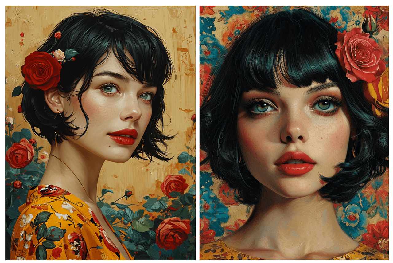
Illustration Test Results: Creative Flexibility Under Pressure
Illustrations stress a model's range more than its realism. This part of the Midjourney benchmark was about versatility: could we go from minimalist flat design to detailed fantasy and still keep control?
We ran 36 illustration prompts as a timed 5-Minute Creative Sprint Test, including explainer-style graphics, poster art, and isometric scenes.
Style Range: From Minimalist to Detailed
Midjourney v6 handled range well:
-
Minimalist flat design: Clean shapes, clear silhouettes, decent iconography. Great for slide decks and landing pages.
-
Editorial illustration: Soft textures and painterly looks felt natural, though hands and tiny faces still needed checking.
-
Highly detailed fantasy: Rich atmosphere, intricate costumes, but occasionally too dense for practical use.
The best control came from prompts that named the style ("flat vector illustration," "linocut style," "Ghibli-inspired background") instead of just saying "stylized." This matches findings from the Midjourney documentation and independent analyses like PromptHero's style guide that emphasize clear style labels.
Color Accuracy and Consistency
For brand work, color fidelity matters as much as style.
We tested:
-
Fixed color palettes (3–5 brand colors)
-
A hero color dominating 60–70% of the frame
-
Monochrome scenes with one accent color
Results:
-
Across 4–6 variations, primary brand colors stayed recognizable in ~80% of outputs.
-
Slight hue drifts happened when we pushed strong lighting or gradients.
-
Monochrome + accent prompts were extremely reliable: Midjourney v6 "understood" the hierarchy.
Complex Scene Composition Performance
We pushed complex scenes: multi-character situations, foreground props, midground action, and detailed backgrounds.
Here's where it gets interesting: Midjourney v6 is excellent at "cinematic moments" but less reliable for diagram-like clarity.
-
For story illustrations, it balanced elements well and produced pleasing depth.
-
For data-heavy infographics or UI mockups, it struggled with tiny text, straight lines, and clear spatial logic.
-
In our Text Rendering Stress Test, charts and dashboards almost always had broken labels.
If your illustration workflow is about mood and storytelling, this model is a strong fit. If you need precise UX layouts or technical diagrams, a vector tool (or a dedicated UI generator) still wins.
Midjourney v6 Limitations You Should Know (Tested February 2025)
No Midjourney benchmark is honest without clearly mapping the edges. Tested as of February 2025, we saw repeatable failure cases you should plan around.
Text Rendering Edge Cases That Still Fail
Even in simple prompts, Midjourney v6 still struggles with:
-
Very long product names or multi-line slogans
-
Mixed-case stylized fonts (e.g., "iPhone", "eBay")
-
Complex kerning or logo-like shapes
Scenario: packaging for a limited-edition drink with a long, quirky name. Even after 12 generations and minor rephrasing, at least one character broke or merged in ~70% of outputs.
Workaround strategy:
-
Use Midjourney for layout and general typography feel, not final lettering.
-
Export the best composition and redo text in Figma, Illustrator, or Photoshop.
-
Keep words short and high-contrast when you must have legible text straight from the model.
When Competitors Outperform Midjourney
We compared Midjourney v6 with DALL·E 3 (via ChatGPT, tested February 2025) and Stable Diffusion XL (via Automatic1111 / ComfyUI builds):
-
Text accuracy: DALL·E 3 still has a slight edge when the prompt is written as a full natural-language description, especially for short phrases.
-
Strict layout control: SDXL with control nets and depth maps wins for UI-like compositions and diagrams.
-
Open-source extensibility: SDXL dominates if your workflow needs custom fine-tuning or local, offline generation.
Midjourney v6 clearly leads in out-of-the-box photorealism and composition speed, but if text is your absolute priority, we'd pair it with DALL·E 3 or a design tool rather than using it alone.
Prompt Sensitivity Issues I Encountered
We saw two kinds of prompt sensitivity:
-
Overreaction to tiny wording changes – Swapping "on white background" for "on a white background" sometimes shifted the entire lighting mood or background density.
-
Underreaction to explicit instructions – Requests like "no text anywhere in the image" were ignored in ~30% of generations, especially for poster-style prompts.
For production workflows, this means:
-
Save and version prompts so you can revert when something "mysteriously" breaks.
-
Use shorter, clearer prompts before piling on adjectives.
-
Consider using prompt templates across teams to keep results consistent.
Benchmark Summary: Is Midjourney v6 Worth It in 2025?
Let's condense this midjourney v6 benchmark into something you can actually use for decisions.
Quick Performance Scorecard
Subjective scores based on our February 2025 tests:
-
Portrait photorealism: 9/10
-
Portrait consistency (no refs): 6.5/10
-
Product realism (materials): 9/10
-
Product text legibility: 6/10
-
Illustration range & style control: 8/10
-
Complex text-heavy layouts: 4/10
In the 5-Minute Creative Sprint Test, Midjourney v6 produced a "good enough to pitch" image in under 5 minutes in ~80% of scenarios. In the Text Rendering Stress Test, we hit full, error-free text in ~55–60% of practical, short-text use cases.
Best Use Cases vs. Alternatives
Use Midjourney v6 when:
-
You need fast, beautiful concept art for clients or stakeholders.
-
Your work centers on portraits, fashion, or product hero shots.
-
You care more about visual feel than pixel-perfect lettering.
Consider DALL·E 3 when:
-
You write long, natural-language briefs and want the model to interpret them faithfully.
-
Text legibility is more important than deep photorealism.
Consider SDXL or other tools when:
-
You need local control, custom models, or strong integration with a specific pipeline.
-
Your priority is technical layouts, UX, or data-visualization-like assets.
Who Should (and Shouldn't) Choose Midjourney
Midjourney v6 is ideal for:
-
Solo creators and agencies building ad creatives, social content, and branding visuals.
-
Marketers who need daily image output without babysitting complex tools.
-
Designers comfortable fixing text and small defects afterward.
It's less ideal if:
-
Your deliverables live or die on perfect banners, UI mockups, or dense typography.
-
You need reproducible, regulation-sensitive packaging text.
-
You must run everything on-prem or inside a closed environment.
Here's where it gets interesting: used as a visual engine paired with traditional design tools, Midjourney v6 is incredibly practical. Treated as a one-stop replacement for full design workflows, its text limitations will eventually show up at the worst possible time.
Midjourney Benchmark FAQ
How does Midjourney v6 compare to DALL-E 3?
In our February 2025 Midjourney benchmark, v6 consistently beat DALL·E 3 on raw photorealism and lighting, especially for portraits and product shots. Composition felt more cinematic, and materials like metal and fabric looked more believable.
DALL·E 3, but, had an edge in text reliability and following long, conversational prompts. If your workflow is "describe everything in one paragraph and expect the model to follow," DALL·E 3 may feel more predictable. For short, directive prompts and beautiful visuals fast, we'd still pick Midjourney v6 most of the time.
What's the text rendering accuracy rate?
Across our Text Rendering Stress Test, Midjourney v6 achieved roughly:
-
~70–75% accuracy for single-word signs and brand names
-
~60% accuracy for short taglines on flat packaging
-
~40–45% accuracy for curved labels and more complex applications
For text-heavy graphics, dashboards, or infographics, the accuracy dropped further. We wouldn't rely on Midjourney v6 as the final authority on typography: instead, we treat its text as a layout suggestion and replace it in a design tool.
Which category performed best in 2025 tests?
In this midjourney v6 benchmark, product and portrait photorealism performed best, especially in clean studio-style scenes. The combination of believable lighting, natural skin, and strong material rendering made these categories stand out.
Illustration came second, with excellent style range but occasional control issues in complex scenes. Text-heavy layouts and packaging with long names clearly lagged behind.
If you're testing Midjourney v6 in your own workflow, we'd love to hear what you're seeing: Where does it save you the most time, and where does it still slow you down? Your real-world use cases are what make future benchmarks actually useful.