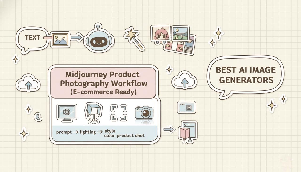
If you're trying to build reliable Midjourney product photography workflows, you've probably hit the same wall I did: beautiful images that don't quite feel "store-ready." The lighting is off, the angle is wrong, or the background screams AI. In this guide, I'll walk you through how I now design studio and lifestyle product shots in Midjourney in a way that actually fits real e‑commerce standards.
I'll share my 5-minute test workflows, the lighting and angle prompts I rely on, and the export decisions that matter for Amazon, Shopify, and Etsy. Tested as of December 2025, focused on fast, repeatable results, not theory.
Studio vs Lifestyle Product Photography in Midjourney
When to Choose Studio (White Background, Amazon-Ready)
When I'm aiming for marketplace compliance (especially Amazon), I treat Midjourney like a very picky studio assistant. To ensure the AI understands my technical constraints, I consult the official Midjourney Parameter List to tweak settings like --stylize and --no correctly.
"single [product name] on pure white background, professional product photo, even studio lighting, no shadows on edges, midjourney v6"
Studio-style Midjourney product photography works best when:
-
You need clear, distraction-free listing images.
-
The platform has strict rules (pure white, no extra props, no text).
-
You plan to reuse the same product image across multiple channels.
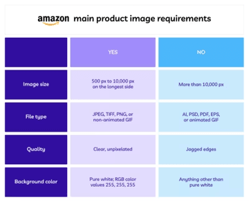
I also add cues like centered composition, high detail, and no reflections on background to keep the result clean. This alignment is critical because strict marketplaces like Amazon will suppress listings that don't meet their Product Image Requirements (pure white backgrounds being the most common hurdle).
When Lifestyle Shots Drive Better Conversions
Lifestyle product photos from Midjourney shine when you need context and emotion more than raw clarity. For example:
"[product name] on a wooden kitchen counter, soft morning light, shallow depth of field, midjourney v6"
I reach for lifestyle shots when:
-
The product benefits from showing scale or usage (kitchen tools, fitness gear, home decor).
-
I'm designing social ads or landing hero images.
-
I want to test different audiences by changing the scene (cozy home office vs minimal tech desk).
Here's where it gets interesting… I often generate lifestyle images first to find the right emotional tone, then backfill with compliant studio shots for marketplaces.
My 5-Minute Test: Comparing Both Approaches
For each new product, I run a quick 5-Minute Creative Sprint Test:
-
1 minute: Prompt 2–3 pure studio variations (white background, centered).
-
2 minutes: Prompt 3–4 lifestyle scenes (kitchen, desk, outdoor) with different moods.
-
2 minutes: Pick 1 studio + 1 lifestyle result and upscale both.
What I look for:
-
Does the studio version look consistent and sharp at 100% zoom?
-
Does the lifestyle shot tell a story within one second of viewing?
-
If I hide the product name, can I still guess the use from the scene?
This quick comparison prevents me from over-investing in the wrong visual direction early on.
Lighting Templates for Product Photography
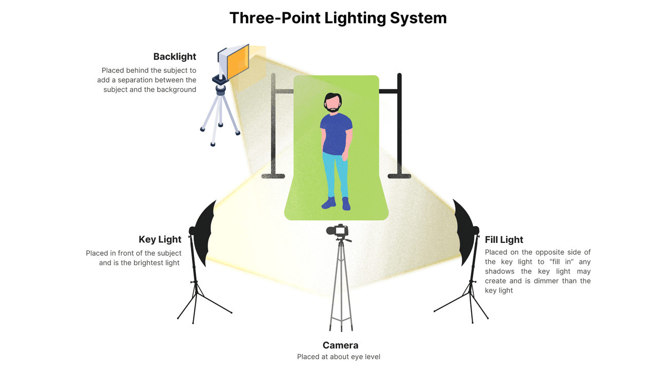
Classic Three-Point Lighting Setup (Key, Fill, Rim)
Midjourney doesn't know lighting diagrams, but it understands the vocabulary of professional photography. I use terms derived from the classic Three-Point Lighting Technique to force the AI to define shape and depth:
"studio three-point lighting, strong key light, gentle fill light, subtle rim light, no harsh shadows"
This works especially well for electronics, tools, and packaged goods where you want crisp shape definition without crunchy shadows.
Soft Diffused Light for Beauty & Cosmetics
For beauty products, harsh light looks cheap. I get more natural results with:
"soft diffused daylight, large softbox look, minimal shadows, glossy highlights on bottle"
This makes cosmetics look like they were shot near a big window or in a professional beauty studio. It also helps avoid over-sharpened "AI plastic skin" on any hands or faces in the frame.
Dramatic Side Lighting for Tech & Luxury Goods
For premium tech or luxury products, I lean on side lighting:
"dramatic side lighting, deep shadows, high contrast, reflective surface control, studio environment"
This creates that high-end, moody catalog feel, especially effective for watches, headphones, and premium gadgets.
Common Lighting Mistakes That Scream "AI-Generated"
When I review Midjourney product photography, I see the same giveaways:
-
Inconsistent shadow direction from one angle to another.
-
Glows or light leaks that don't match any visible light source.
-
Overly perfect reflections that look plastic rather than glass or metal.
To fix this, I explicitly specify single light direction, grounded shadows, or even subtle imperfections so the image feels physically believable. When in doubt, I compare against real product shots from large retailers to sanity-check the look.
Camera Angles That Sell Products
The Hero Shot: Front-Facing 45° Angle
My default selling angle is:
"hero shot, 45 degree front angle, eye-level, centered composition, product photography"
This gives a dynamic but still informative view. It shows the front, a bit of the side, and enough depth to feel real. I use this as the main image on landing pages.
Flat Lay for Fashion & Accessories
Flat lays are fast wins in Midjourney. According to Shopify’s Guide to DIY Product Photography, consistent angles like flat lays help build a cohesive brand identity.
"flat lay product photography, shot from above, on [surface], neatly arranged"
They're ideal for jewelry, stationery, and fashion accessories, especially when you need multiple items in one frame. I keep props simple and color-coordinated so the main product pops.
Detail Close-Ups: Macro Lens Keywords
For textures and details, macro prompts make a big difference:
"macro product shot, extreme close-up, sharp focus on [detail], blurred background"
I use these for stitching on bags, surface finish on gadgets, or label clarity on bottles. It feels like having a professional layout designer built into the AI when you can pair a macro detail with a hero shot in the same product gallery.
360° Rotation Workflow (Multi-Angle Consistency)
True 360° is still tricky, but I approximate it with a multi-angle set:
-
Keep the same core prompt and seed (if available).
-
Change just the angle terms: front view, back view, left side, 45 degree top.
-
Use similar lighting and background wording in every prompt.
This doesn't give pixel-perfect continuity, but it's usually consistent enough for carousel galleries or comparison layouts.
Scene Composition & Background Matching
Minimalist Studio Backdrops (White, Gray, Gradient)
For clean e-commerce, I lean on simple language:
"on seamless white backdrop"
or:
"light gray gradient studio background, soft falloff"
Gradients help products feel grounded without violating "plain background" expectations on most platforms.
Contextual Lifestyle Scenes (Kitchen, Desk, Outdoor)
When matching scenes, I always specify location + surface + time of day:
"on a wooden kitchen counter, bright morning light"
"on a minimalist white office desk, soft afternoon light"
This keeps the product from floating in a vague, fake-looking room.
Props & Styling: What Works in Midjourney v6
Midjourney v6 is better at props, but I still keep them simple:
-
1–2 supporting items that logically belong (coffee mug near a keyboard, towel near skincare).
-
Colors that echo the product but don't match exactly.
-
Clear instruction: no extra copies of product, no distorted props.
Avoiding Busy Backgrounds That Kill Focus
Overstuffed scenes are one of the fastest ways to tank conversions. If the product doesn't immediately stand out at thumbnail size, the background is too busy.
To avoid this, I add:
"clean composition, negative space around product, blurred background details"
Then I zoom out and check: if my eye goes to the plant or the chair first, I regenerate with fewer props or stronger blur.
Export Settings & Upscaling for E-commerce
Resolution Requirements (Amazon, Shopify, Etsy Standards)
Standards change, but as of late 2025 most platforms are happy with:
-
Amazon: At least 1000px on the longest side for zoom.
-
Shopify: I follow the Shopify Product Media definitions which suggest up to 4472 x 4472 px, but I stick to 2048px square as a fast, future-proof baseline.
-
Etsy: The Etsy Seller Handbook explicitly recommends 2000px on the shortest side for best quality.
So I usually upscale Midjourney product photography to at least 2048 px on the longest side.
Upscale Strategy: When to Use Midjourney vs External Tools
Midjourney's built-in upscalers are decent, but for very crisp product edges I often:
-
Use Midjourney's subtle upscale or high-res mode.
-
If needed, run the result through an external upscaler like Topaz Gigapixel AI.
I avoid aggressive AI sharpening, it can make edges look "crunchy" and synthetic.
File Format Best Practices (PNG vs JPEG for Transparency)
My quick rule:
-
PNG for images needing transparent backgrounds or further compositing.
-
JPEG for final, full-bleed listing images where file size matters.
I'll often generate with a solid background, then cut out the product in Adobe Photoshop and save as PNG when I need layered layouts.
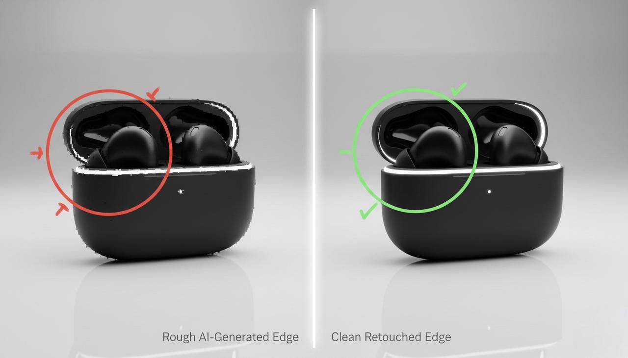
Quick Photoshop Touch-Ups for Product Edges
Almost every AI product image benefits from a 2-minute cleanup:
-
Refine the product outline to remove tiny jagged artifacts.
-
Check for warped logos or labels and correct or replace them.
-
If the shadow looks wrong, I'll recreate a soft one manually.
This final pass is what usually makes the difference between "cool AI demo" and "looks like a legit studio shot."
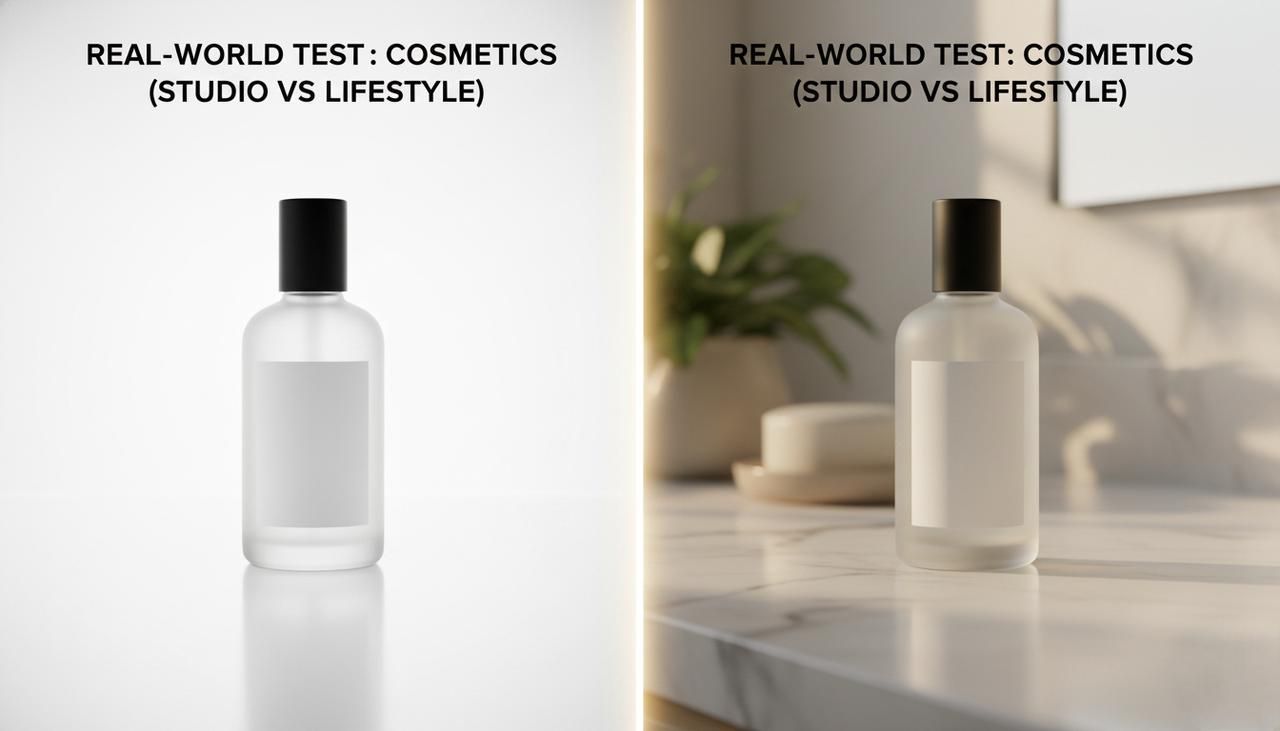
Real-World Product Photography Test Cases
Test 1: Cosmetics Bottle (Studio + Lifestyle Comparison)
For my 5-Minute Creative Sprint Test, I used a generic skincare serum bottle.
-
Studio prompt: white background, soft diffused light, front 45° hero shot.
-
Lifestyle prompt: same bottle on a bathroom counter, towel and plant, morning window light.
Result: the studio image was perfectly marketplace-ready, but the lifestyle version dramatically improved perceived value when shown in ads. Here's where it gets interesting… a simple tweak like subtle water droplets on bottle instantly made it feel premium.
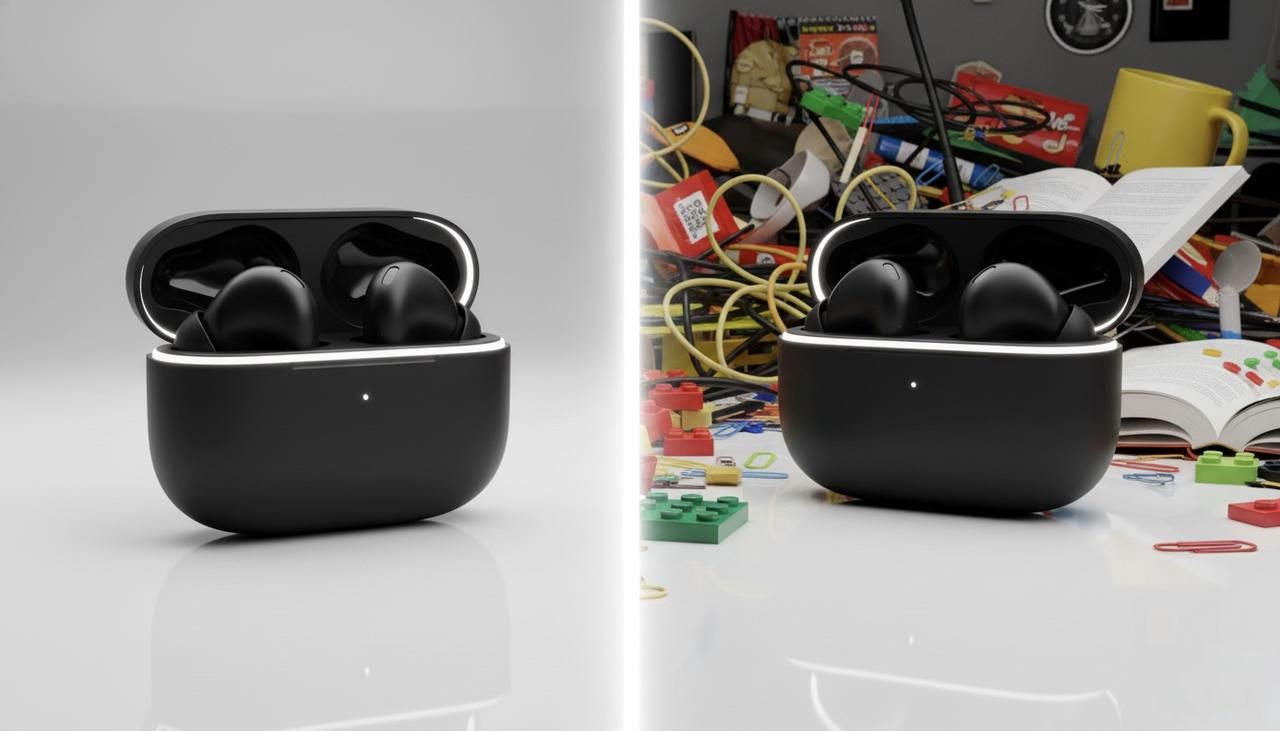
Test 2: Tech Gadget (Lighting Variation Results)
Next, I tested a small wireless earbud case.
-
Version A: soft, even lighting for clarity.
-
Version B: dramatic side lighting with strong contrast.
Version A worked better for instructional content, but Version B got more attention in mock ad layouts. It supported what I've seen in real campaigns: bold lighting pulls the eye first, but neutral lighting explains the product better.
What I Learned: Prompt Adjustments That Made the Difference
Across these tests, a few prompt patterns kept showing up as wins:
-
Explicit light direction terms (from left, from above).
-
Clear surface descriptions (on matte black table, on marble counter).
-
Constraints like single product, no duplicates, no text on background.
These small changes reduced visual glitches and made the overall workflow far more predictable.
Ethical Considerations in AI Product Photography
Transparency in E-commerce Listings (Disclosing AI Use)
As AI images get more photorealistic, I think it's fair to explain when a product photo is representative rather than literally photographed. Some brands now note this in the description or use a small "AI-generated image" label for concept shots.
This matters most when the exact appearance is critical—color matching, material texture, or scale. Staying compliant with broader FTC guidelines on truth in advertising ensures you build trust rather than deceiving customers with impossible renderings.
Avoiding Misleading Product Representations
The biggest ethical risk with Midjourney product photography is overselling: showing finishes, accessories, or packaging that customers don't actually get.
To stay on the right side of this, I:
-
Match the real packaging and colorways as closely as possible.
-
Avoid adding accessories that aren't included in the box.
-
Use AI lifestyle images as illustrative, not as the only proof of what ships.
If your AI images differ from the real item, it's better to treat them like concept renders and be open about that. In the long run, trust converts better than any perfect product shot.
For deeper dives into AI image behavior and limitations, I recommend checking Midjourney's official documentation, recent diffusion model papers on arXiv, and industry analyses from sites like Towards Data Science. They're great companions when you start pushing your own workflows further.
I've shared what actually works in my tests: now I'm genuinely curious about yours. If you've tried Midjourney for your own product photography, which part tripped you up first, lighting, angles, or exports? And what did you change that finally made the images feel "store-ready" to you?