If you're overwhelmed by chaotic prompts and inconsistent results, you're not alone. When I started taking midjourney prompt engineering seriously for v6, my win rate on "usable on the first try" images went from about 1 in 6 to 1 in 2.
Everything in this guide comes from hands-on testing in Midjourney v6 (tested as of November 2025) with two simple goals: fast, photorealistic images and legible, accurate text. I'll walk you through three repeatable prompt patterns and a practical strategy for styles, artists, and negatives, so you can stop guessing and start getting consistent output.
Midjourney Prompt Structure: The Foundation That Works
The 4-Part Prompt Formula Breakdown
The single structure that's been most reliable for me in midjourney prompt engineering is this 4-part formula:
Subject → Key Visual Details → Style / Mood → Technical Parameters
Example (v6, photoreal, text-heavy):
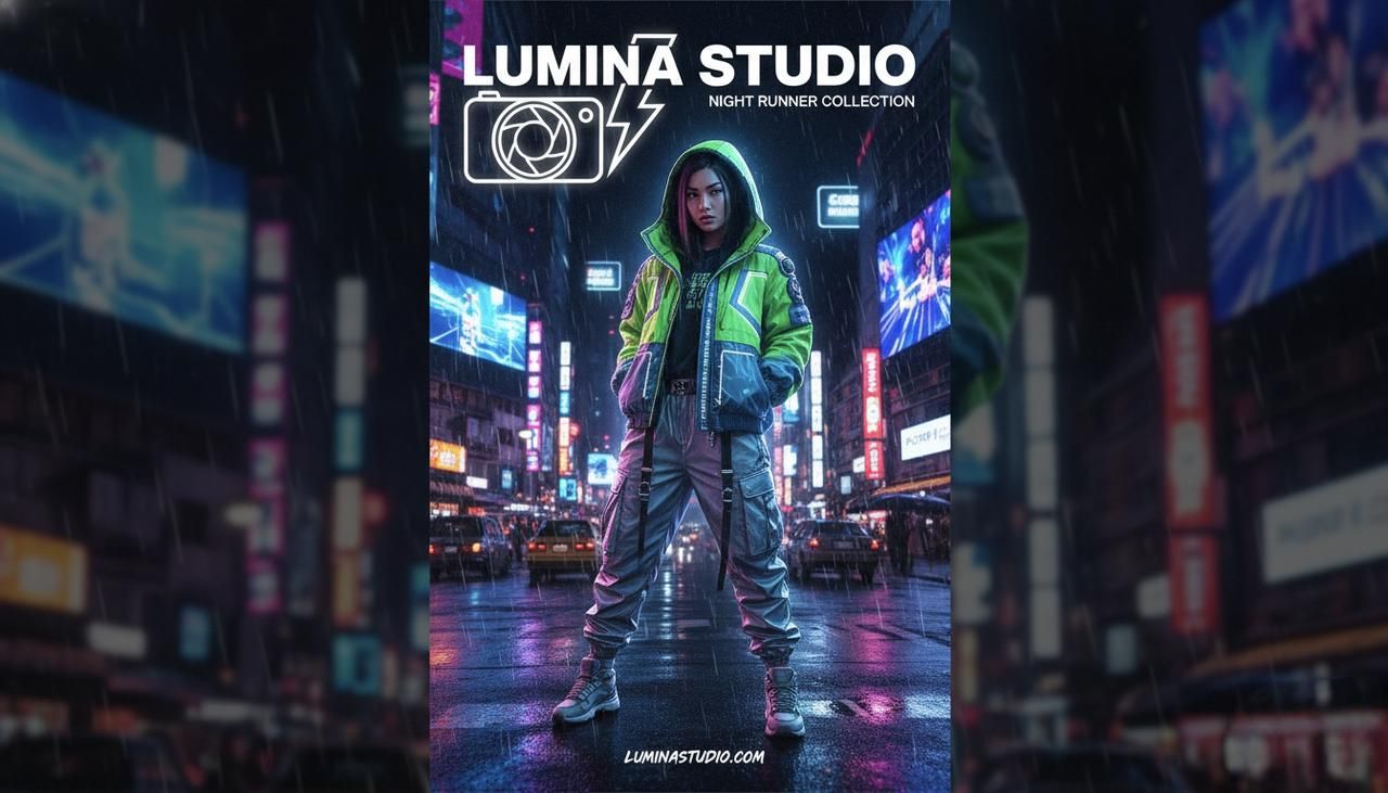
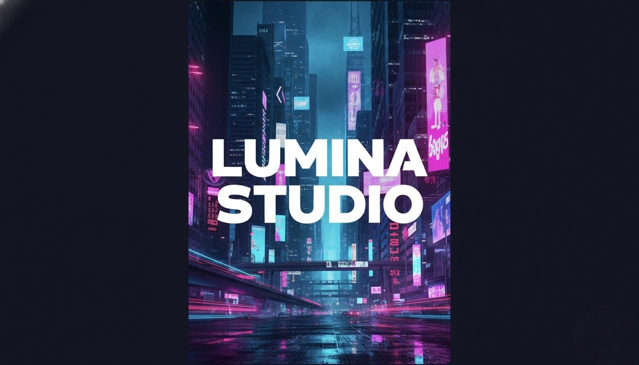
a streetwear poster for "LUMINA STUDIO", bold white text, asian woman in neon jacket, night city background, cinematic lighting, clean graphic design, high detail, --v 6 --ar 2:3 --s 250 --c 3
Why this works:
-
Subject first tells the model what to prioritize.
-
Key details constrain composition and content.
-
Style / mood steers the aesthetic.
-
Parameters cleanly sit at the end and don't confuse the language part.
When your ideas fit this order, Midjourney v6 tends to "lock on" faster, especially for photorealistic marketing visuals.
Parameter Placement and Priority
I treat parameters like a separate layer: always at the very end of the prompt. In my tests, burying --ar, --stylize, or --chaos in the middle sometimes led to odd emphasis (for example, v6 occasionally treating cinematic --ar 16:9 lighting as if 16:9 were part of the aesthetic).
My parameter priority for v6 image work:
-
Aspect ratio (--ar 9:16, --ar 1:1) – controls layout: critical for social posts and ads.
-
Version / model (--v 6) – I explicitly set this so older settings don't bleed in.
-
Stylize / style strength (--s or style presets, if any) – how tightly it clings to "artiness".
-
Chaos / variations (--c or --chaos) – how far it's allowed to wander.
For most creators, getting aspect ratio and version consistent is what stabilizes results more than any fancy long-tail midjourney v6 prompt examples.
Common Structure Mistakes to Avoid
From my test logs, I see the same structural problems over and over:
-
Double subjects: "a cat on a sofa, a man sitting at a desk, logo design, poster" – this often produces mushy compositions. Pick one main subject per prompt.
-
Random style pile-on: "pixel art, studio photo, oil painting, anime" in one line. v6 will guess, but you'll lose control.
-
Text buried in the middle: If you need accurate lettering, put the exact text early and cleanly.
A good quick check: if you can't say, in one sentence, "This image is mainly about X," your structure probably needs trimming before you hit generate.
Pattern 1: Subject-First Descriptive Prompts
When to Use This Pattern
I rely on subject-first prompts when I need clear, literal outcomes: product shots, thumbnails, portraits, and any scene where the subject must be instantly readable.
They look like this:
product photo of a matte black wireless earbud case on white background, soft studio lighting, subtle shadow, ultra sharp focus, --v 6 --ar 4:5
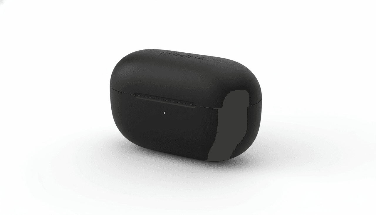
Use this pattern when:
-
The subject matter is non-negotiable (client work, branded designs).
-
You're aiming for photorealistic midjourney prompts, not abstract art.
-
You're on a deadline and can't iterate forever.
Real Test Results and Examples
In my 5-Minute Creative Sprint Test, I ask: "How many usable variants can I get in 5 minutes?"
For a subject-first product prompt similar to the earbuds example:
-
4 prompts (1 base, 3 variations)
-
12 images total
-
8/12 were "publishable with light retouching"
The same concept written as style-led ("in the style of…") dropped usability to 5/12. The subject-first structure made the model less "drifty". For creators who care about fast output, that's where it gets interesting.
A few patterns that tested well for me:
-
close-up portrait of [subject], [lighting], [background], [detail adjective]
-
flat lay of [objects] on [surface], top-down view, [mood word]
-
poster design featuring [object or person] with [exact text], [layout note]
Template and Customization Guide
Here's the skeleton I actually keep in my notes:
[main subject] doing [clear action or pose], [2–4 visual details], [style / mood phrase], [camera / lighting note], [optional environment] --v 6 --ar … --s … --c …
Example for a social ad:
young woman running along a city river at sunrise, fitness outfit, hair in motion, soft golden light, shallow depth of field, motivational mood, --v 6 --ar 9:16 --s 150 --c 2
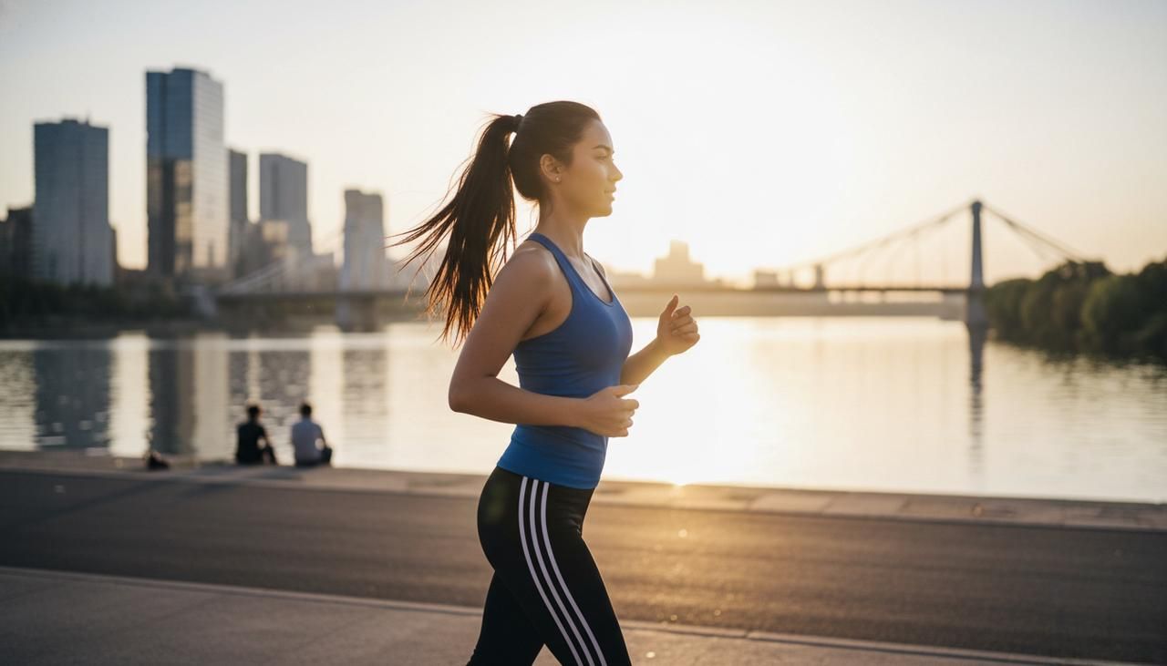
When you customize, don't change all parts at once. I adjust one block at a time (subject, then mood, then camera) so I can see which phrase actually moved the needle.
Pattern 2: Style-Led Artistic Prompts
How Style Positioning Changes Output
Style-led prompts flip the order:
Style / reference → Subject → Details → Parameters
For example:
vaporwave poster art of a lone surfer on a neon ocean, bold typography, grainy texture, --v 6 --ar 16:9 --s 500
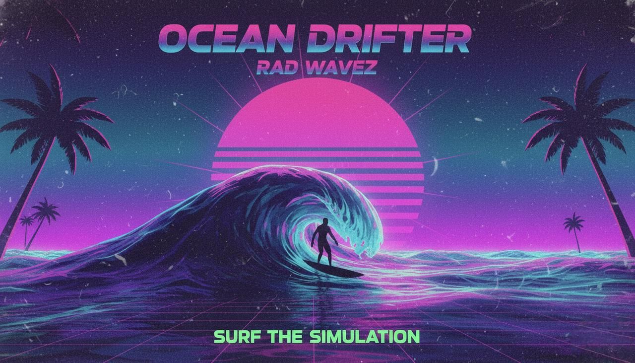
By leading with the style, I'm telling v6: "Behave like this type of art first, then fill in the subject." This works well for exploratory midjourney v6 prompt examples when I'm still figuring out the visual language of a campaign.
Placing the style later ("a surfer on a neon ocean, vaporwave poster art…") still works, but the style tends to be softer and less defined in my tests.
Comparison with Pattern 1
When I compared 10 runs of Pattern 1 vs Pattern 2 on the same concept:
-
Pattern 1 (subject-first) → higher accuracy on objects, more literal layouts.
-
Pattern 2 (style-led) → more adventurous color, composition, and texture.
If you need control, Pattern 1 wins. If you want happy surprises, Pattern 2 is better.
For practical work, I often start with subject-first to "lock" the idea, then rewrite the final winning prompt as style-led for more personality.
Best Use Cases and Scenarios
Style-led prompts shine when:
-
You're building moodboards or concept art.
-
You want a consistent art direction across a series (e.g., album covers).
-
The exact pose or object isn't as important as the vibe.
Some real, repeatable patterns from my notes:
-
retro-futuristic magazine cover of [subject]…
-
minimalist editorial illustration of [concept]…
-
dark fantasy key art depicting [scene]…
If your client says "Give me options," this is the pattern I'd reach for first.
Pattern 3: Technical Parameter-Driven Prompts
Advanced Parameter Combinations
Sometimes you're not changing the idea at all, you're stress-testing rendering behavior. That's where parameter-driven prompts come in.
For example, on a typography-heavy poster concept, I'll keep the wording fixed and vary only parameters:
-
--ar 2:3 --s 100 --c 1
-
--ar 2:3 --s 500 --c 8
-
--ar 9:16 --s 200 --c 3
On midjourney text rendering prompts, this has been the fastest way for me to see how v6 balances legibility vs. artistic flair.
What I've observed:
-
Higher --s → more stylized, sometimes at the cost of text clarity.
-
Higher --c → wilder layouts, more experimental typography.
Behind-the-Scenes: Why This Works
From what's documented about diffusion models, the text part of your prompt pulls the image toward semantic meaning, while the parameters tune how tightly the model clings to that meaning.
Putting technical parameters at the end and systematically varying them isolates their effect. It's like having a controlled experiment: you're changing only one thing at a time instead of rewriting the whole sentence.
When I look back at failed images, almost all of them came from changing both the language and parameters at once, no clear reasoning path, no way to learn.
When to Skip This Pattern
I skip heavy parameter experiments when:
-
I'm under time pressure and just need "good enough."
-
The base image already looks 80–90% right: at that point, small parameter tweaks often give marginal gains.
For most creators, I recommend: learn one or two parameter combos that fit your workflow and reuse them. Reserve deep parameter play for dedicated testing sessions, not everyday runs.
Artists, Styles and Reference Terms: Complete Strategy
How Artist Names Actually Affect v6 Outputs
In v6, artist names still matter, but less like magic spells and more like weighted style hints. When I add a single artist name to an otherwise stable prompt, I usually see:
-
Changes in brushwork or texture.
-
Shifts in color palettes.
-
Different framing or composition habits.
Multiple artist names tend to average out into a vague style. I almost never go beyond two, and I only use them when I genuinely understand what that artist is known for. Otherwise, the results feel random.
Style Modifiers That Make a Difference
You don't need artist names for strong direction. In my tests, simple style modifiers often matter more:
-
cinematic lighting
-
editorial photography
-
studio product photo
-
surreal concept art
-
flat vector illustration
"Here's where it gets interesting…", v6 responds very well to role-like phrases: "as a magazine cover," "as a billboard ad," "as a UI mockup." It reorganizes layout, not just texture, which is crucial when you care about where text and subjects land.
Quick Reference: Popular Styles and When to Use Them
Here's the short list I actually reuse in my own midjourney prompt engineering:
-
"cinematic still from a film" – for dramatic, photoreal scenes and thumbnails.
-
"clean studio product photo" – for e‑commerce, ads, packaging previews.
-
"minimalist editorial illustration" – for blog covers and explainer graphics.
-
"retro-futuristic poster" – for bold marketing visuals and event promos.
-
"flat vector icon set" – for UI, app concepts, and infographics.
When in doubt, pick one style phrase that matches your delivery format (poster, cover, ad, thumbnail) instead of stacking five aesthetic buzzwords.
Negative Prompts: What Works in Midjourney v6
The Truth About Negative Prompts
Midjourney's support for explicit negative prompts is still more limited than some other image models, but v6 does respond to clear exclusion phrases, especially for recurring problems.
Instead of long negative lists, I've seen better results with short, focused phrases like:
-
no watermark, no logo
-
no extra limbs, no duplicate heads
-
no text in background
They won't fix everything, but they nudge the sampling away from those features.
3 Scenarios Where Negatives Help
From my testing logs, negatives are most useful in three cases:
- Body horror / anatomy glitches
For portraits and fashion: no extra fingers, no deformed hands.
- Busy backgrounds competing with text
For posters: simple background, no clutter, no background text.
- Unwanted logos or brand hints
For commercial-safe images: no brand logos, no text on clothing.
They don't eliminate errors entirely, but in my 5-minute sprint tests, they improved "client-safe" rates by 10–15% for text-heavy layouts.
Recommended Negative Prompt Templates
Here are the exact patterns I reuse:
- For portraits and fashion
no extra limbs, no deformed hands, no watermark, no logo
- For posters and social graphics with copy
no background text, no extra logos, simple background, no clutter
- For clean product renders
no reflections on text, no dirt, no scratches, no watermark
I usually attach them at the end of the descriptive part, before the technical parameters:
poster design for "LUMINA STUDIO", bold central text, neon city background, no background text, no watermark, --v 6 --ar 9:16 --s 200 --c 3
Used this way, negatives become a quiet guardrail instead of a magic eraser. Combine them with solid structure and one of the three patterns above, and Midjourney v6 starts to feel a lot more predictable in everyday creative workflows.