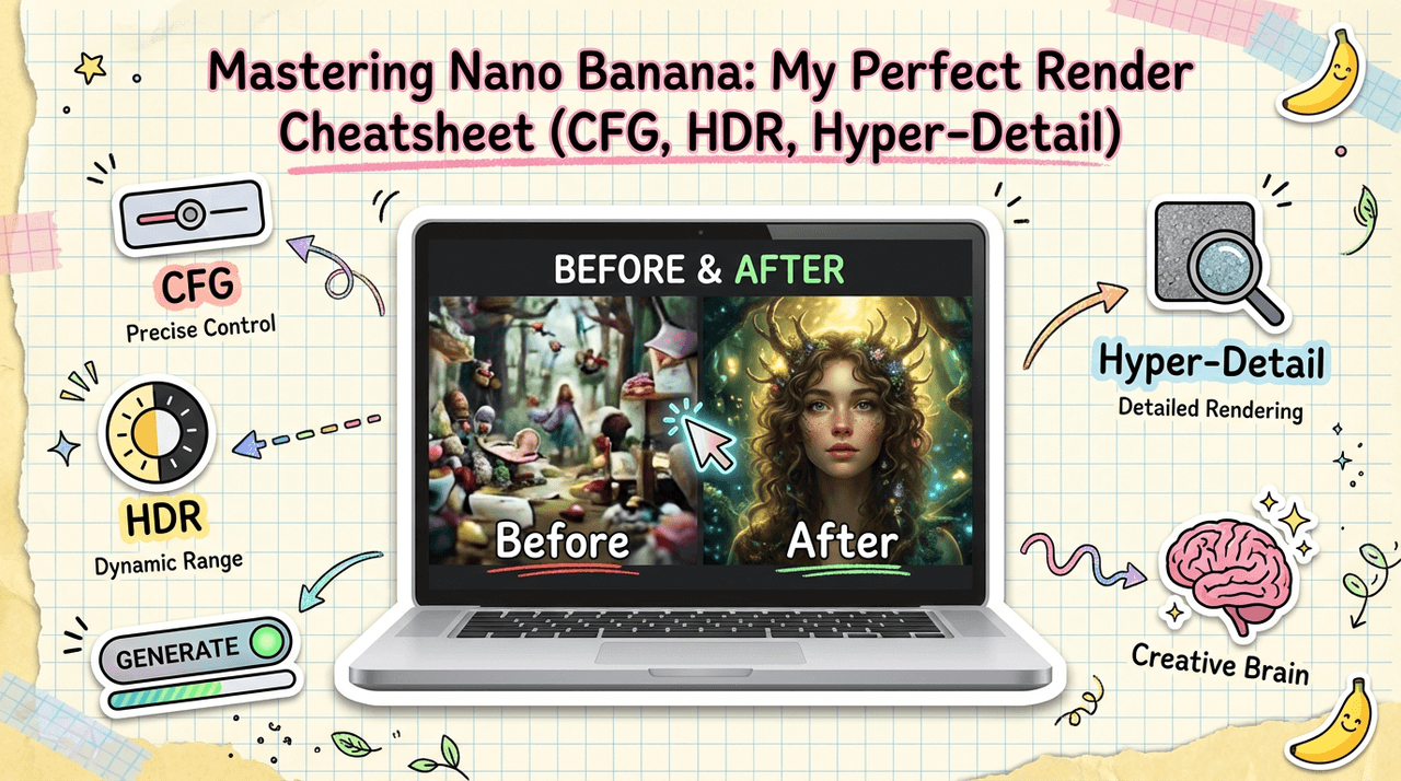
If you've ever sat staring at a muddy, half-coherent render from Nano Banana wondering what went wrong, you're not alone. When I first started experimenting with Nano Banana settings, I bounced between overcooked HDR, cartoonish faces, and text that looked like it was written by a tired toddler.
In this guide, I'll deconstruct the core settings that actually matter, CFG scale, HDR, and Hyper-Detail, and show you how I dial them in for clean, photorealistic images and legible text. I'll also share my go-to presets for different creative scenarios and the most common mistakes I see creators make.
AI tools evolve rapidly. Features described here are accurate as of December 2025.
Understanding Nano Banana Settings: A Complete Overview
Before I touch any fancy features, I think about Nano Banana in three layers:
-
Base intent – your prompt, aspect ratio, and resolution.
-
Interpretation control – mainly CFG Scale, which decides how strictly the model follows your prompt.
-
Rendering flavor – HDR and Hyper-Detail, which shape contrast, sharpness, and texture.
Most creators I talk to try to fix everything at layer 3 (toggling modes) when the real problem is that layer 2 is off. This is the detail that changes the outcome... if CFG is mis-set, no amount of HDR or Hyper-Detail will save the render.
At a high level, here's how I think about the main Nano Banana settings:
-
CFG Scale – Think of this like tightening or loosening the focus ring on a camera lens. Low values give you dreamy, loose interpretations: higher values force strict adherence to your instructions.
-
HDR Mode – Boosts dynamic range and local contrast. Great for dramatic lighting, metal, glass, and scenes with strong highlights and deep shadows.
-
Hyper-Detail Mode – Adds ultra-fine textures and micro-contrast. Ideal for product shots, close-up portraits, and macro-like renders.
Once I understood that these three aren't random toggles but a small, coordinated system, my hit rate for usable images went way up.
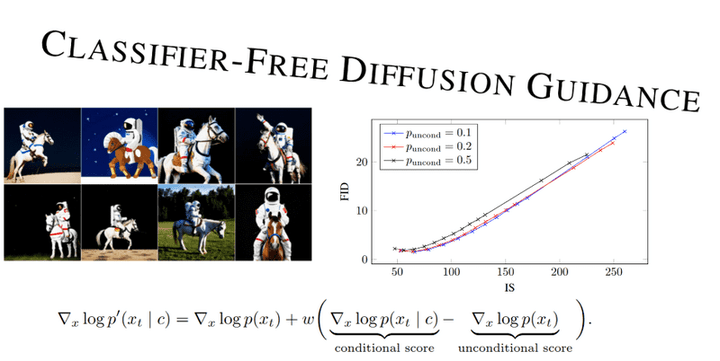
If you want a deeper technical jump into how diffusion models respond to guidance scales, check the general literature on guidance in diffusion models and explore classifier-free guidance techniques that power modern image generation. For broader context on image generation capabilities, there are excellent resources available.
CFG Scale Settings: Fine-Tuning Style and Control in Nano Banana
I treat CFG Scale in Nano Banana as my main steering wheel. Here's how I usually frame it:
-
CFG 3–5 – Loose, artistic, more stylized. Great for concept exploration, mood boards, or when I'm not obsessed with accuracy.
-
CFG 6–8 – Balanced control. This is my default range for realistic photography and scenes with readable text.
-
CFG 9–12 – Very strict. Useful when I need the model to stick closely to product specs, layout, or brand elements, but it can introduce stiffness and weird artifacts if pushed too far.
For creators who need accurate text in images, I've found CFG 7–9 to be the sweet spot. Below 6, Nano Banana tends to improvise lettering: above 9, the letters become rigid and sometimes distort at the edges.
When I'm testing a new prompt:
-
I start at CFG 7 for realism.
-
If the composition is good but details drift from the prompt, I nudge up to 8–9.
-
If the image looks over-sharpened or "crunchy," I drop back to 6–7 and lean more on prompt wording.
For more on guidance scales in image models in general, it's worth reviewing multimodal image generation documentation and exploring advanced generation techniques.
How to Use HDR Mode for Enhanced Dynamic Range
HDR Mode in Nano Banana is powerful, but it's easy to overdo. When I first toggled it on for everything, my images ended up looking like early-2010s HDR photography, glowy halos and surreal contrast.
Here's how I approach HDR Mode now:
When I enable HDR Mode
-
Product photography – To make metals, glass, and plastics pop with clean highlights.
-
Cinematic portraits – Backlit hair, rim lighting, or strong key light.
-
Landscape or architecture – Scenes with bright skies and detailed shadows.
How I set HDR intensity
If Nano Banana exposes an HDR Strength slider (0–1 or 0–100 style), my typical ranges are:
-
Low (0.2–0.4) – Subtle polish, almost always safe.
-
Medium (0.5–0.7) – Strong punch: good for YouTube thumbnails, ads, and hero images.
-
High (0.8+) – Only for stylized or surreal looks. I rarely go here for client work.
When HDR is too strong, I look for:
-
Halos around high-contrast edges.
-
Skin that looks metallic or plastic.
-
Shadows that feel unnaturally lifted.
If I see those, I reduce HDR strength and compensate by improving my lighting description in the prompt instead (e.g., "soft window light, gentle contrast") instead of letting HDR brute-force it.
For a broader perspective on HDR and dynamic range in AI image generation, understanding native image generation approaches can provide valuable insights.
Hyper-Detail Mode: When and How to Apply Ultra-Fine Rendering
Hyper-Detail Mode is where Nano Banana can really impress, or completely overwhelm your image.
When I turn on Hyper-Detail
-
Close-up portraits – Pores, hair strands, fabric texture.
-
Product shots – Packaging, labels, brushed metal, woven textiles.
- Macro-feel visuals – Coffee beans, jewelry, watch faces, tech gadgets.
I'm careful with it for:
-
Human skin – Too much micro-contrast can create a gritty, aged look.
-
Backgrounds – Hyper-detailed clutter distracts from the subject.
Practical ranges and combos
If Hyper-Detail has levels (e.g., Low/Med/High or numeric values), my go-tos are:
-
Low with CFG 6–7 – Natural, tactile detail without crunch.
-
Medium with CFG 7–8 – Portfolio-ready product or portrait work.
-
High only when I'm intentionally going for a hyper-real, almost 3D-render look.
I also avoid stacking max HDR + max Hyper-Detail + high CFG. That trio can make images feel like sandpaper, everything is sharp, but nothing is pleasant. Instead, I pick two to emphasize and let the third stay moderate.
For developers implementing similar features, the Gemini API documentation and Firebase image generation guide offer practical implementation details. Research on scaling and efficiency in diffusion models also provides theoretical foundations.
Optimal Nano Banana Settings for Different Use Cases
Here are the Nano Banana settings that consistently work for me across common creator workflows.
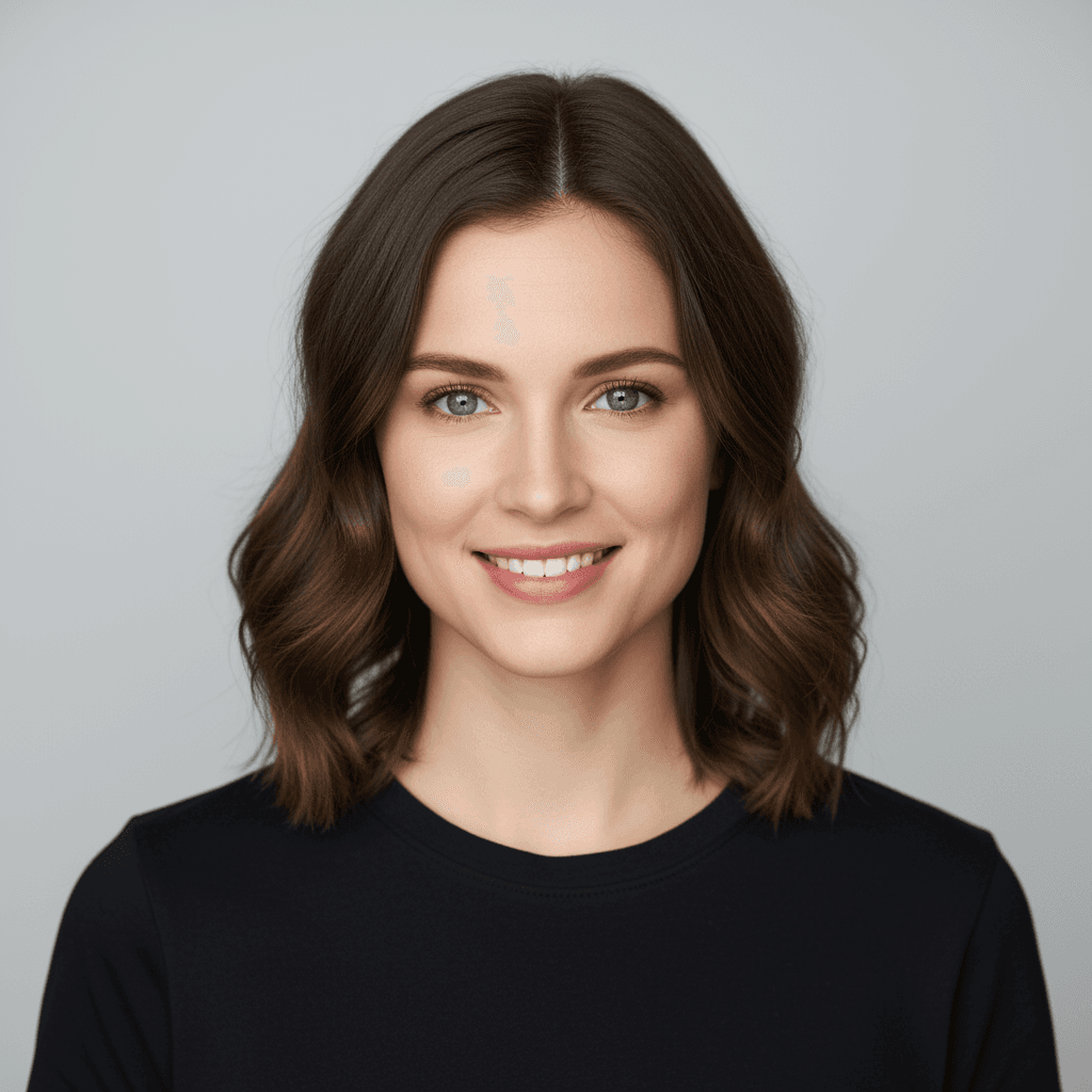
1. Social media portraits & creator headshots
-
CFG: 7–8
-
HDR: Low–Medium
-
Hyper-Detail: Low (or Off for softer looks)
Why: This keeps skin believable, eyes sharp, and avoids turning hair into a noisy mess.
2. Product mockups & e-commerce visuals
-
CFG: 8–9
-
HDR: Medium
-
Hyper-Detail: Medium
Why: Strong adherence to shape and labeling with crisp materials. I pay special attention to text areas on packaging: if they wobble, I may drop CFG slightly and rephrase the prompt with clearer type instructions (e.g. "bold sans-serif, 3 words, centered label").
3. Ad creatives with big, readable text
-
CFG: 7–9
-
HDR: Low–Medium
-
Hyper-Detail: Low
Why: Hyper-Detail can distort lettering, so I mostly reserve it for background texture, not text. I also explicitly mention "clear, legible typography" in the prompt.
4. Cinematic key art & thumbnails
-
CFG: 6–8
-
HDR: Medium–High
-
Hyper-Detail: Medium–High (on subject only if masking is available)
Why: Drama matters more than accuracy here. I'm okay with some stylization as long as the central idea is obvious at a glance.
These aren't rigid rules, but they're stable starting points that save me from reinventing the wheel every project.
Troubleshooting: 5 Common Nano Banana Configuration Errors to Avoid
When Nano Banana misbehaves for me, it's almost always one of these five issues:
1. Over-cranking CFG "for more accuracy"
Pushing CFG to the max can cause warped faces, stiff compositions, and broken text. If images feel brittle or robotic, I step CFG down by 1–2 points first.
2. Treating HDR like a magic "make it better" switch
HDR is about dynamic range, not general quality. If everything starts glowing or looking fake, I lower HDR and refine my lighting prompt instead.
3. Stacking max HDR and max Hyper-Detail
This combo often creates harsh, noisy renders. I pick one to emphasize and keep the other at a moderate level.
4. Expecting perfect logos or vector-quality icons
Nano Banana is a diffusion-based model, not a vector tool. If I need pixel-perfect logos or brand icons, I generate a close approximation in Nano Banana and then refine or rebuild it in a proper vector editor like Illustrator.
5. Ignoring resolution and aspect ratio
Running extreme aspect ratios with very high detail settings can create stretched or smeared areas. I stick to common ratios (16:9, 4:5, 1:1) and only push edges when I've already validated a prompt at a standard size.
Ethical considerations when using Nano Banana
Even when I'm deep in settings and sliders, I try to keep three ethical principles in mind:
-
Transparency – If an image is AI-generated or heavily AI-assisted, I label it accordingly, especially for clients and audiences who may assume it's a traditional photo shoot.
-
Bias awareness – My prompts avoid stereotypes for gender, race, age, and body type. I regularly test the same prompt with different demographic descriptors to see how Nano Banana responds, then adjust wording if I notice biased patterns.
-
Copyright and ownership – In 2025, legal frameworks are still evolving. I avoid training or fine-tuning on unlicensed artwork, and I'm cautious about generating lookalikes of specific artists or brands. For commercial campaigns, I keep a written record of prompts, seeds, and settings as part of the project file, so usage decisions can be reviewed later if needed.
What has been your experience with Nano Banana settings? Let me know in the comments.
Frequently Asked Questions About Nano Banana Settings
What are the most important Nano Banana settings to adjust first?
The three Nano Banana settings that matter most are CFG Scale, HDR Mode, and Hyper-Detail. CFG controls how strictly the model follows your prompt, HDR shapes dynamic range and contrast, and Hyper-Detail adds fine texture. Dialing in CFG correctly should come before experimenting heavily with HDR and Hyper-Detail. For additional guidance, consult official image generation support.
What is the best CFG Scale range in Nano Banana settings for realistic images and clear text?
For realistic photography and legible text, a CFG Scale of 7–9 works best in Nano Banana. Start around 7 for natural realism, nudge up to 8–9 if details drift from your prompt, and drop back toward 6–7 if the image looks too crunchy, stiff, or over-sharpened.
How should I use HDR Mode in Nano Banana without making images look fake?
Use HDR Mode sparingly. Low HDR (0.2–0.4) adds subtle polish and is safe for most images. Medium (0.5–0.7) suits dramatic portraits, products, and thumbnails. Avoid regularly pushing HDR above 0.8, and if you see halos, metallic skin, or lifted shadows, reduce HDR and refine your lighting prompt instead.
What Nano Banana settings work best for product photos versus social media portraits?
For social media portraits, use CFG 7–8, low–medium HDR, and low Hyper-Detail to keep skin natural and eyes crisp. For product mockups, push CFG to 8–9, run medium HDR, and medium Hyper-Detail to emphasize materials, labels, and packaging while maintaining accurate shapes and mostly clean text.
What are good Nano Banana settings for stylized art like anime or concept illustrations?
For stylized art or anime, use a slightly lower CFG Scale, around 4–6, to allow more creativity and softer shapes. Keep HDR low or off unless you want strong dramatic lighting, and use low–medium Hyper-Detail so line work and shading feel cohesive instead of overly textured or gritty.