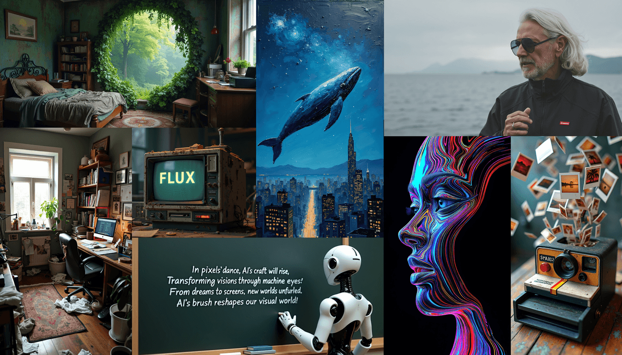
Hey, Dora is here. I kept seeing creators ask how to keep characters consistent across a whole book, so I ran a full story project using my Flux 1.1 illustration workflow, end to end. The goal: a repeatable system that produces cohesive scenes, clean page layouts, and AI images with accurate text where needed. If you're juggling deadlines, this workflow cuts guesswork so you can ship faster. It also plays nicely with AI tools for designers you already use.
Seven minutes after setup, I had my first production-ready spread. Not flashy, just usable. That's the point.
Why Use Flux 1.1 for Storybook Illustration
Flux 1.1 shines when you need expressive characters, soft lighting, and painterly coherence across scenes. In my tests, it handled repeated poses and environments better than I expected, and it's forgiving with minor prompt changes (a big win for iterative storytelling).
What I noticed:
-
Strong style cohesion: backgrounds don't drift wildly between pages.
-
Natural rendering of hands and clothing folds at print sizes.
-
Text accuracy on signs/covers is hit-or-miss. I can get readable text, but I still validate every page.
-
Complex multi-character scenes need a pose reference to avoid face drift.
Is it the best AI image generator for text? Not always. But for storybook visuals with occasional text elements (store signs, book titles), Flux 1.1 is workable if you build in checks. For pure copy-heavy layouts, I still set text in a design app.
Where it fits vs others:
-
Midjourney: faster out-of-the-box style, but harder to lock a single character identity for 20+ pages.
-
SDXL: ultra-tunable with ControlNet/LoRA, great for power users, but slower to dial in.
-
Firefly: safer defaults and licensing clarity: style can skew corporate. Flux 1.1 hits a nicer "storybook" look without wrestling.
Character Style
I start by defining a single visual sentence that never changes during the project. Think of it as a style spine.
My style spine (example):
"cozy watercolor storybook, soft rim light, warm palette (ochre, sap green), gentle film grain, lens at 50mm, subtle vignette"
Tested settings that were stable for me:
-
Resolution: 1024×1536 (single page) or 1536×1024 (spread)
-
Steps: 22–28
-
Guidance scale (CFG): 3.5–5.0 (lower = more adherence to reference)
-
Seed: lock per character once you like the face
Prompt pattern I reuse:
"[character name], age [x], [distinct hair/feature], wearing [signature outfit], in [mood], [style spine]."
I generate 12–16 variations, star my top 3, then fix one seed as the "hero seed." Body shape and facial ratios hold better that way.
Tip: give each main character a signature color and prop. It's basic, but it improves recognition at a glance.
Reference Sheets
I build three sheets before any scenes:
- Character turnarounds
-
Front, 3/4, side, back. Same outfit, neutral pose.
-
Use the hero seed and vary only the angle keywords.
- Expression grid
-
9 squares: happy, worried, surprised, sleepy, focused, laughing, shy, thinking, excited.
-
Keep lighting and camera constant. This prevents mood swings from breaking likeness.
- Prop + texture sheet
-
Signature items (e.g., red scarf, sketchbook, wooden toy).
-
Background materials: painted wall, old wood, soft fabric. These become the story's visual glue.
For AI images with accurate text, I also run a mini "text sanity" card. I prompt small signage like "BAKERY," "LIBRARY," "PARK." If Flux 1.1 gives me legible letters at 100% zoom, I keep the approach. If not, I plan to add vector text later. Either way, I know before I design layouts.
Scene-by-Scene Workflow
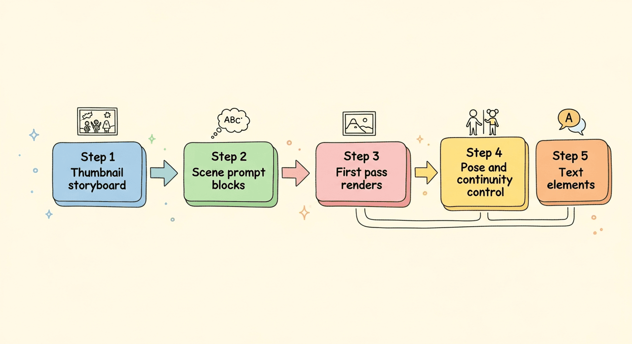
Here's the spine of my Flux 1.1 illustration workflow from script to pages.
Step 1, Thumbnail storyboard
- 10–20 rough frames. Just composition and beats.
Step 2, Scene prompt blocks
-
I write one paragraph per scene: location, time, mood, action, camera.
-
I paste the style spine and the hero seed reference.
Step 3, First pass renders
-
Settings: 1536×1024 for spreads, 22–24 steps, guidance 4.0.
-
Keep character name, outfit, and signature prop literal in prompt.
Example prompt core:
"Inside a small neighborhood bakery at sunrise, soft flour dust in the air, [Character] reaches for the top shelf, warm backlight through window, 50mm lens, gentle vignette, cozy watercolor storybook, warm palette (ochre, sap green)."
Step 4, Pose and continuity control
-
If faces drift, I reuse the hero seed or pass a pose reference.
-
Keep camera terms consistent per location (e.g., bakery = 50mm: park = 35mm).
Step 5, Text elements
-
For simple signage (BAKERY), I attempt native generation.
-
If letters bend, I inpaint with a clean plate OR set the text in Figma/Illustrator. This is faster than chasing a perfect render.
This balance gets me realistic AI images for marketing-quality mockups and story pages without spiraling into endless tweaks.
Maintaining Style Consistency in a Flux 1.1 Storybook
What actually keeps pages coherent isn't magic, it's repetition.
My simple guardrails:
-
Lock the hero seed per character: don't change it mid-book.
-
Reuse the style spine verbatim on every scene.
-
Fix camera language per location (wide/normal/telephoto).
-
Maintain a 3-color palette across the book and sprinkle others sparingly.
-
Limit wardrobe changes. If you must, change one item at a time.
-
Use negative prompts for "hyper-real detail, photoreal skin pores" to keep the look storybook-soft.
For teams using AI tools for designers across apps, keep a shared doc with exact prompt blocks, palette hex codes, and camera notes. Boring? Yes. Effective? Absolutely.
Preparing for Print
Print needs discipline. Here's my checklist that avoids sad surprises:
-
Size and DPI: design at final trim with bleed (e.g., 8×10 in + 0.125 in bleed), 300 DPI.
-
Upscaling: if needed, upscale 1.5–2× before layout. Inspect at 100% for paint edges and banding.
-
Color: work in RGB for generation: soft-proof to CMYK at export. Expect slight shifts in greens.
-
Text: set all narrative text in a layout tool (InDesign, Affinity, or Figma). Keep it vector and live.
-
Black text: rich black for large titles, 100% K for body copy to avoid fuzz.
-
Margins: give text breathing room: Flux loves cozy vignettes that can crowd gutters.
I also keep layered files per spread: art layer, typography layer, safety guides. If a client wants a change, I'm not re-rendering an entire scene, just swapping a layer. That saves hours.
Publishing Notes
Licensing and delivery can make or break a project.
-
Rights: confirm model and platform terms for commercial use. If anything's unclear, I route character names, logos, and fonts through my own assets.
-
Accessibility: add alt text that actually describes the scene ("child reaching for a bread loaf in warm morning light").
-
Metadata: include title, author, series number in file metadata so your catalog stays tidy.
-
Platforms: export a print PDF (PDF/X-1a or /X-4) plus web JPG/PNG. For KDP or Ingram, follow their exact bleed templates.
-
Backup: version your spreads v1, v2, v3. I keep the hero seed and style spine in the filename.
If you need heavy copy on the cover, Flux 1.1 can suggest composition, but I still place titles in a design app. That's the practical path. If you want my plain take: use Flux 1.1 for art, your editor for text, and you'll move faster with fewer surprises.