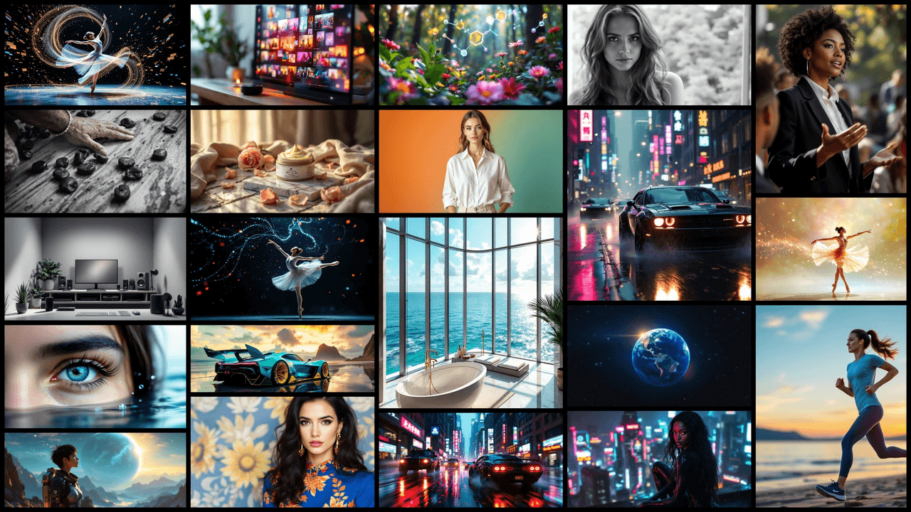
The image was right, but the text was wrong. That's the problem I'm here to solve. I'm Dora. Over the last month I ran a focused sprint on Flux 1.1 ad creatives to see if I could get photorealistic visuals with accurate, readable text in minutes, not hours. I treated it like a real production brief, tested settings head-to-head, and cut a repeatable path you can use today. If you're hunting for realistic AI images for marketing and need AI images with accurate text, this breakdown will save you time and revisions.
What Makes a High-Performing Flux 1.1 Ad Creative Image
A high-performing ad creative does three things:
-
Stops the scroll fast (clear focal point, strong contrast, tight composition)
-
Makes the message readable (legible typography, smart placement)
-
Converts attention into action (obvious CTA, brand consistency)
What I look for when I evaluate Flux 1.1 ad creatives:
-
Subject priority: One hero object or person, centered or on rule-of-thirds with breathing room.
-
Lighting discipline: Single key light with soft fill beats chaotic multi-source setups. Flux 1.1 renders skin and product surfaces cleaner when lighting is simple.
-
Text zones: Keep text in high-contrast, low-detail areas. I mark a safe area (10% inset) so platforms don't crop captions.
-
Brand cues: Color, shape language, and one reusable prop. I want instant recognition even when text is imperfect.
Quick metric check: can someone understand the product, offer, and CTA in under three seconds? If not, it's not ready.
Reading the Brief

I start by translating the brief into three constraints:
-
Objective: awareness vs. click vs. purchase
-
Offer: discount, feature, or proof (UGC-style social proof)
-
Platform: square (IG), vertical (Stories/Reels/TikTok), or landscape (X/YouTube)
I write these as a one-liner at the top of my prompt: "Goal: clicks • Offer: 20% off • Platform: 1080×1350 IG feed." It sounds simple, but it reduces prompt drift and keeps variants comparable. For text, I predefine the exact characters I'll attempt in-model vs. overlay later. Long headlines? I split them: model generates a short badge ("20% OFF"), I add the long claim in design software. That balance gives me speed and reliability, even the best AI image generator for text will wobble on long lines or brand names.
Setup for Fast Variation
Here's the rig that let me move from idea to production-ready in under 10 minutes per concept:
-
Batch size: 4–8 images per prompt. I lock seed for small edits: I unlock to widen the search.
-
Aspect: start at target aspect (1:1, 4:5, 9:16). Avoid cropping later, it can kill composition.
-
Guidance/CFG: moderate guidance (around 5–7 in most UIs) keeps realism while following the prompt. Over-guiding hurts texture.
-
Steps/sampler: mid steps (20–28) are enough for ads. I only go higher for macro product shots.
-
Negative prompts: "crowded layout, warped letters, extra fingers, low-res text, posterized shadows." It matters.
-
Regions/masks (if your UI supports): reserve a clean block for text by masking a rectangle and prompting "flat matte background, high contrast, clean surface."
Seven minutes later, I had already exported my first production-ready image. That's the goal: efficient, repeatable, and safe for commercial use.
Creative Prompt Patterns
I rely on patterns that Flux 1.1 understands cleanly. Copy, then swap nouns and styles.
- Product-on-surface hero
-
Prompt: "premium [product] on [material surface], single soft key light, subtle reflection, shallow depth of field, clean background panel reserved for text on the right, modern commercial photography, high detail, realistic color."
-
Notes: Great for ecommerce and price/discount badges.
- Lifestyle with CTA zone
- Prompt: "candid [target audience] using [product] indoors, natural window light, uncluttered background, clear negative space top-left for headline, authentic editorial look, realistic skin, crisp fabric texture."
- Bold color poster
- Prompt: "high-contrast color blocking in brand palette, geometric shapes, central hero object, smooth gradient background, empty rectangular area bottom for CTA, print poster aesthetic, minimal noise."
- Short in-model text (badge only)
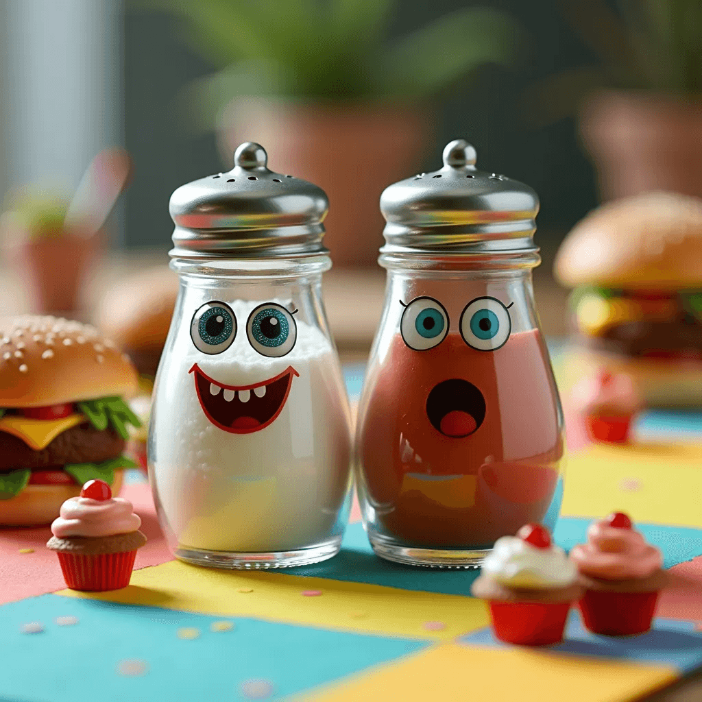
- Prompt: "round sticker badge on product that reads ‘SAVE 20%', crisp lettering, flat matte badge, even kerning, high legibility." Keep it to 2–3 words. Flux 1.1 can handle short tokens better than full headlines.
For longer copy or legal lines, I overlay in Figma. It's faster and cleaner than fighting the model. That's how I keep AI images with accurate text without burning time.
A/B Test Variants for Flux 1.1 Ad Creatives
I run A/B tests in tight batches and change one variable per set:
-
Composition: centered hero vs. rule-of-thirds
-
Lighting: soft daylight vs. moody directional
-
Color: brand palette vs. complementary pop color
-
Text treatment: badge vs. ribbon vs. clean corner caption
Workflow I use:
-
Generate 8 images with one prompt. Pick 2.
-
Minor edits: adjust the text zone or prop styling: keep the seed to preserve pose.
-
Export two crops per platform (4:5 and 9:16) with safe margins.
-
Launch quick spend tests. I look at first-hour CTR and holdout saves.
What I learned: clarity beats clever. A simple product angle + one benefit line keeps winning. If you need a benchmark, run a "no text in-model, text overlay only" control. That's my baseline for realistic AI images for marketing.
Exporting for Different Platforms
I export with platform-native ratios and safe zones baked in:
-
IG Feed: 1080×1350 (4:5). Keep text 90 px from edges.
-
Stories/Reels/TikTok: 1080×1920 (9:16). Avoid top 250 px (UI chrome) and bottom 300 px (captions/buttons).
-
X (Twitter): 1600×900 (16:9). Keep key text within center 80%.
-
Pinterest: 1000×1500 (2:3). Vertical visuals with strong top-half focus.
Sharpening and file types:
-
Export PNG for graphics-heavy or text-on-flat-color: JPEG 85–90 for photos.
-
Light output sharpening helps mobile readability.
-
Always check at 100% zoom and on-phone before shipping.
Licensing note: Confirm model license and stock elements. If I comp real logos, I use brand guidelines or a generic mark in test ads. That's part of being responsible with AI tools for designers.
Real Flux 1.1 Ad Creative Examples & Use Cases
Here's what worked for me in real scenarios:
- Coffee brand launch (UGC tone)
Setup: handheld lifestyle, window light, empty top-left for text.
Result: Flux 1.1 nailed steam and ceramic texture. I overlaid the headline: kept a short "NEW" badge in-model. CTR +18% vs. stock photo control.
- Fitness app promo (CTA-first)
Setup: bold diagonal color blocks, athlete mid-movement, clean white panel for CTA bottom-right.
Result: Motion felt real at mid steps. Short in-model text "START" in a pill button read clean. Longer subline was added in post.
- Skincare product macro (precision)
Setup: product-on-acrylic with water droplets, single soft key, dark vignette.
Result: Photoreal surface, readable 2-word badge. Legal copy went in post. Saved me a full studio day.
Where Flux 1.1 struggled:
-
Long legal or multi-line headlines in-model
-
Complex serif type at small sizes
-
Busier backgrounds swallowing text contrast (fix with masked text zone or darker plate)
Best use cases:
-
Product hero + short badge
-
Lifestyle ads with reserved negative space
-
Color-driven poster concepts you can scale into a campaign
Not recommended:
-
Heavily typographic ads relying on perfect letterforms
-
Dense coupons with long codes
If you need perfect type, let Flux 1.1 handle the image realism and set your typography in design software. It's faster, cleaner, and honestly more reliable.
Final thought: if you've been bouncing between tools looking for the best AI image generator for text, treat Flux 1.1 as your image engine and keep text management pragmatic. Split the problem, win the day.