AI tools evolve rapidly. Features described here are accurate as of December 2025.
If you're an independent creator or marketer, building a full brand visual system can feel like trying to paint a mural with a ballpoint pen, slow, frustrating, and never quite how you pictured it.
That's where a Nano Banana workflow for brand visual systems comes in. By treating Nano Banana-style prompting as a repeatable system, I can go from "rough brand idea" to consistent logos, mockups, posters, and social visuals in a single afternoon, without drowning in settings.
In this guide, I'll walk you through exactly how I structure my Nano Banana prompts, parameters, and file workflow so you can get photorealistic images with accurate text that actually stick to your brand rules.
Nano Banana Brand Visuals: Core Principles for Effective Brand Design
Nano Banana isn't a tool: it's a prompting pattern popularized in Gemini docs that forces you to think in tiny, precise chunks instead of messy, run‑on ideas.
When I use it for brand visual systems, I treat each "banana" as a single, atomic decision: one for logo style, one for color, one for camera, one for text, one for layout, and so on.
Here's the mental model I rely on:
-
Micro blocks, macro consistency – Each part of the prompt controls one visual dimension. That makes it trivial to reuse across assets.
-
Brand-first, aesthetics-second – I start with brand values and audience, then translate those into Nano Banana blocks. Pretty comes after precise.
-
Repeatable scaffolding – I keep the same prompt skeleton and only change what's necessary: product name, text copy, or format.
A stripped-down example Nano Banana prompt for a brand visual:
Task: photorealistic brand key visual

Brand: eco-friendly coffee subscription, modern, trustworthy, warm

Logo style: minimal wordmark, clean sans-serif, no emblem

Colors: deep forest green, warm cream, muted copper accents

Layout: centered product, subtle depth of field, clean negative space

Text: "Evergreen Roast" headline, legible, high contrast, no distortion

Camera: 50mm, studio lighting, soft shadows

Output: 4:5 vertical, suitable for Instagram feed
Counter-intuitively, I found that shorter lines with very specific roles give me more consistent results than long, poetic prompts.
If you're starting from zero, write these building blocks once based on your brand strategy, then reuse them everywhere.
Helpful background reading:
Mastering Color and Style Consistency with Nano Banana
Color and style drift is the fastest way to make your brand look cheap or chaotic. With Nano Banana, I lock these down as non‑negotiable blocks.
Locking your color system
First, I define my palette like I would in a design system:
Colors: primary #143924 deep forest green, secondary #F6F0E8 warm cream,

accent #C47A48 muted copper, no neon, no gradients
Then I copy‑paste this same line across:
-
Logo generation
-
Product renders
-
Posters
-
Social posts and stories
Think of this line as the paint you never swap out mid‑mural.
Fixing visual style
Next, I stabilize overall style:
Style: clean commercial photography, subtle film grain, realistic textures,

no heavy vignettes, no cartoon elements
I keep this line untouched for all brand assets unless I'm intentionally creating a spin‑off campaign.
Recommended base parameters
When I want reliable color and text fidelity in Gemini 2.5 Flash Image, I start with something like:
CFG (style strength): 6–7

Resolution: 1024 x 1024 or higher

Variations: 4

Text emphasis: high (if available), prioritize legibility
If your images come out washed out or inconsistent, reduce wild creativity (lower CFG/style strength slightly) and tighten your color & style lines instead of adding more adjectives.
Step-by-Step: Setting Up Your AI Brand Workflow
Here's the workflow I actually use when I'm building a full brand system from scratch.
1. Clarify the brand in 5 bullet points
Write these down before you touch the model:
-
Who you're talking to
-
3 adjectives for how the brand should feel
-
Core product/service
-
Any hard color constraints
-
One or two visual references (e.g., "like Aesop packaging, but brighter")
2. Build your Nano Banana base prompt
Create a re-usable scaffold like this:
Task: [key visual type]

Brand: [what you sell] for [audience], [3 adjectives]

Logo style: [wordmark / symbol / monogram]

Colors: [your locked palette]

Style: [photo/3D/illustration + mood]

Layout: [simple layout rule]

Text: [exact text, capitalization, no typos]

Camera: [focal length + lighting]

Output: [aspect ratio + platform]
Save this in a doc or notes app so you're not rebuilding it every time.
3. Set up a versioning routine
-
Create a folder per brand: /BrandName/
-
Subfolders: /logo/, /packaging/, /posters/, /social/
-
Name files with version numbers: brand-logo-v01.png, poster-launch-v02.png
This sounds nerdy, but when a client asks for "that earlier version with the darker green," you'll actually be able to find it.
4. Run controlled experiments
When adjusting the system, I only change one banana at a time:
-
Color line
-
Style line
-
Layout line
This way, I can see why a result improved or got worse instead of guessing.
Creating Assets: Logo Generation and Mockups in Practice
Logos and product mockups are where most people hit friction, especially with text accuracy.
1. Generating a wordmark with accurate text
I start with a tight prompt:
Task: brand logo wordmark

Brand: Evergreen Roast, modern eco-friendly coffee subscription

Logo style: minimal wordmark, clean geometric sans-serif, no icon, no cup symbol

Colors: primary #143924, secondary #F6F0E8, no gradients

Background: plain warm cream

Text: "Evergreen Roast" only, correct spelling, no extra symbols

Output: horizontal layout, transparent-feel background, high resolution![]()
Tips I've learned:
-
Put Text: on its own line and spell-check carefully.
-
Avoid asking for multiple text elements in the same run.
-
If the logo text keeps warping, generate a clean symbol only, then typeset the name manually in Figma or Illustrator.
2. Creating photorealistic product mockups
Once I have a logo direction, I move to packaging or hero shots:
Task: product packaging mockup

Brand: Evergreen Roast coffee

Logo style: use existing minimal wordmark on front

Colors: primary #143924 bag, cream label, copper accent strip

Style: studio product photography, soft controlled shadows, subtle steam

Layout: 1 coffee bag centered, faint reflection on surface

Text: front label reads "Evergreen Roast" and "Organic Blend"

Camera: 50mm lens, front three-quarter angle

Output: 4:5 vertical, for website hero and Instagram
If Gemini doesn't perfectly adhere to your existing logo, I treat the result as a reference render and composite the final logo in a design tool.
Where this workflow struggles (and who it's not for)
This approach is not ideal if:
-
You need mathematically precise vector logos for trademarks.
-
Your brand relies on complex grids or typographic systems.
-
You expect pixel-perfect reproduction across dozens of SKUs.
In those cases, I still recommend a traditional vector workflow in something like Illustrator, using AI images as concept sketches rather than final assets.
Extending the Brand: Designing Posters and Social Visuals
Once the logo and hero imagery feel solid, extending into posters and social visuals becomes fast and surprisingly fun.
1. Poster design with the same Nano Banana scaffold
Task: campaign poster

Brand: Evergreen Roast, modern eco-friendly coffee subscription

Logo style: use existing wordmark in top-left corner

Colors: primary green background, cream typography, copper accent line

Style: clean commercial poster, minimal, no clutter

Layout: hero cup on right, headline on left, strong negative space

Text: headline "Brew Calm Mornings" plus small subtext "Evergreen Roast"

Output: 2:3 vertical, printable, 300 DPI look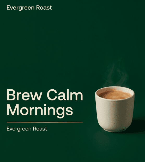
I keep Colors, Style, and often Camera identical to my product images so the whole system feels like it was shot in the same studio.
2. Social-first variations
For social feeds and stories, I mainly change:
-
Task: "Instagram story" or "Carousel slide 1 of 3"
-
Layout: "centered product" or "split layout: product right, text left"
-
Output: 9:16 for stories or 1:1 for grid
Everything else (brand, colors, style) stays locked.
Example for a story visual:
Task: Instagram story visual

Brand: Evergreen Roast coffee, calm, modern, warm

Logo style: small wordmark at top center

Colors: same palette as brand system

Style: soft, inviting, lifestyle photography, natural light

Layout: coffee cup in hand at bottom, headline centered

Text: "Your 6am ritual, simplified" plus "Evergreen Roast" small

Output: 9:16 vertical for Instagram story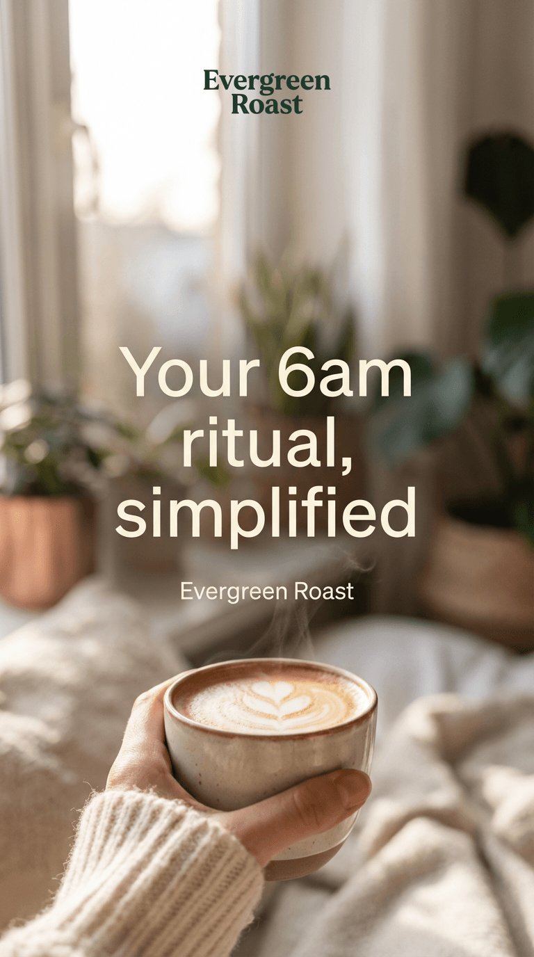
Ethical considerations for AI brand systems
As I build AI-driven brand visuals, I've had to put a few guardrails in place:
-
Transparency – I always tell clients (and audiences, when relevant) when an image was AI-generated. In 2025, expectations are shifting, and labeling AI visuals in credits or captions is simply honest practice.
-
Bias mitigation – When I generate lifestyle or people-focused imagery, I deliberately specify diverse ages, body types, and backgrounds in my Nano Banana lines. I also review outputs for stereotypes and discard anything that reinforces them.
-
Copyright & ownership – I avoid asking the model to imitate specific brands, photographers, or artists. Instead, I describe moods and qualities. For final logos, I treat AI results as concept references and redraw them in vector form to clarify authorship and control.
This isn't legal advice, but treating AI as a concept companion rather than a shortcut to copy someone else's work has kept my workflows cleaner and easier to defend.
If you try this Nano Banana workflow for your own brand visual system, save your base prompt, show it some love over a few projects, and you'll end up with a quiet little engine for fast, consistent visuals.