Last Updated: December 09, 2025 | Tested Version: Nano-Banana Pro (current public release)
If you're trying to use Nano-Banana Pro for academic figures, you've probably hit the same wall I did: the model is brilliant at photorealistic imagery, but journals don't care how pretty something looks if axis labels are wrong, colors are misleading, or the layout breaks their guidelines.
In this text, I'll walk through the exact workflow I use to go from rough research idea to journal-ready figure with Nano-Banana Pro's image generation capabilities, without spending hours in trial-and-error prompts. I'll cover the architecting phase, rendering, editing for submission, advanced tricks, and how to stay on the right side of ethics and journal policies.
AI tools evolve rapidly. Features described here are accurate as of December 2025.

The Philosophy of AI Scientific Art: Nano-Banana Pro Workflow Overview
When I started experimenting with Nano-Banana Pro for enterprise applications for figures, I made one big mistake: I treated it like a magic renderer instead of a collaborator. Scientific art needs three distinct roles:
-
The Architect – translates research into a logical visual plan.
-
The Renderer – uses Nano-Banana Pro to create high-fidelity, on-brief images.
-
The Editor – refines, corrects, and aligns with journal and field standards.
If I skip any of these, the figure usually looks impressive but fails at least one critical test: accuracy, readability, or compliance.
So my workflow for academic figures with Nano-Banana Pro always follows this sequence:
-
Step 1 – Architect: Define the scientific story, choose a layout, and write a schema-level prompt.
-
Step 2 – Renderer: Use Nano-Banana Pro with specific constraints (text clarity, aspect ratios, style) to generate the core assets.
-
Step 3 – Editor: Fix text, adjust colors, remove artifacts, and finalize in vector software.
The real power of this feature lies in treating Nano-Banana Pro as the renderer in a broader figure-design pipeline, not as a one-click solution.
Step 1: The Architect – Logical Construction & Schema Design
Defining the Goal: Translating Research into Visual Tasks
I always start away from the AI, on paper or a whiteboard.
Ask yourself:
-
What question is this figure answering?
-
What does a skeptical reader need to see in 3 seconds to understand the main point?
-
Which data types are involved (images, plots, schematics, workflows)?
Then I break the figure into visual tasks:
-
"Clean micrograph background, highlight region A."
-
"Schematic pipeline: data collection → preprocessing → model → outputs."
-
"Side-by-side comparison: baseline vs Nano-Banana Pro-enhanced method."
Each task later maps to a separate Nano-Banana Pro prompt or sub-prompt.
Layout Strategy Selector: Choosing the Right Scientific Composition
Before writing a single prompt, I decide on a layout style. Common patterns:
-
Figure with panels (A–D) – for multi-step workflows or comparisons.
-
Single conceptual schematic – for methods or model diagrams.
-
Hybrid – schematic plus one or two representative images.
When I know the target journal, I quickly review their figure guidelines and recent papers:
-
Maximum figure width and aspect ratios.
-
Preferred label styles (A–D in bold, upper-left corner, etc.).
-
Color expectations (e.g., color-blind-safe palettes, minimal neon).
I then annotate a rough thumbnail: where each panel goes, where labels will sit, and what text must be pixel-perfect (axis labels, units, variable names).
Generating the Schema: Rules for Structural Integrity
Now I write a "schema prompt" that describes structure, not style. I keep this as a reusable template.
Example schema (for a 3-panel method figure):
Create a clean academic figure layout with 3 panels labeled A, B, C.

Panel A: overview schematic of the experimental setup.

Panel B: simplified workflow diagram of data processing.

Panel C: comparison of baseline vs proposed method, side-by-side.

Use ample white space, even margins, and alignment.

Reserve space under each panel for captions (no text there).

Keep all colors muted and color-blind friendly.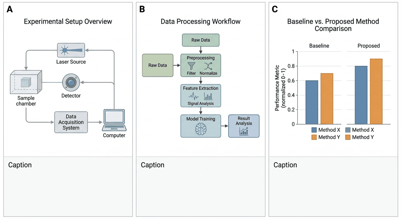
I don't worry about exact text or micro-details yet: I just want Nano-Banana Pro to respect the grid and hierarchy.
Executing Prompt 1: The Foundation Layer
With the schema in place, I move to Nano-Banana Pro.
Workflow for Prompt 1 (layout-only render):
-
Set aspect ratio to match journal layout (for a 2-column figure, something like 3:2 often works).
-
Choose a minimal style: "flat vector, academic, clean lines, no decorative elements".
-
Avoid long text, use short labels like Input, Model, Output.
Example Prompt 1:
Flat vector academic figure layout with 3 panels labeled A, B, C.

Panel A: simple block diagram of imaging setup.

Panel B: linear workflow of data preprocessing → Nano-Banana Pro model → predictions.

Panel C: two bar plots, baseline vs Nano-Banana Pro performance, without actual text.

Use soft grayscale and one accent color.

Clean white background, lots of white space, no decorative elements.
If the layout is roughly correct, I keep it as my foundation layer and plan to replace or clean any labels later in vector software.
Step 2: The Renderer – High-Fidelity Visualization with Nano-Banana Pro
Selecting Tools & Rendering Goals
Nano-Banana Pro shines when I give it tight constraints. For academic figures, I decide early:
-
Which panels need photorealism (e.g., microscopy-like textures).
-
Which panels should stay diagrammatic.
-
Where exact text will be added later outside of the model.
To keep things reproducible, I log:
seed: 42
style_strength: 0.6
sharpness: 0.8
text_fidelity: high
aspect_ratio: 3:2
These aren't literal UI labels for every interface, but I keep equivalent parameters consistent. This way I can benchmark changes, not guess.
Style Consistency & Academic Constraints
Mismatched styles across panels scream "AI collage". To avoid that, I:
-
Reuse the same style description in every prompt:
-
"clean academic style, subtle gradients, no glossy 3D effects"
-
Stick to a single font family look (even if I'll retype text later).
-
Limit the palette to 3–4 colors and ensure they're color-blind-safe.
For colors, I cross-check palettes using tools like ColorBrewer and accessibility guidelines for readers with color vision deficiencies.
Executing Prompt 2: Bringing Details to Life
Now I generate the content for each panel, sometimes as separate renders.
Example Prompt 2 for a photoreal-style microscopy surrogate image:
Photorealistic scientific illustration mimicking fluorescence microscopy.

High resolution cells with clear membrane edges and bright nuclear signal.

Background is dark and noise-free.

Use two channels only: cyan for membrane, magenta for nucleus.

No text labels, no scale bar, no watermark.

Style: clean, academic, optimized for print at 300 dpi.
Example Prompt 2 for a workflow schematic:
Clean vector workflow diagram showing 4 steps:
1) Raw image data
2) Nano-Banana Pro enhancement
3) Feature extraction
4) Classification results

Each step is a rounded rectangle with a simple icon inside.

Arrows connect steps from left to right.

White background, thin gray outlines, one accent color.

No long text in boxes, use short labels only.
Step 3: The Editor – Iterative Refinement for Journal Submission
The Philosophy of Precision Editing
At this stage, Nano-Banana Pro is done. Everything else happens in traditional tools.
My goals:
-
Ensure every label (variables, units, gene names) is correct and spelled properly.
-
Improve alignment, spacing, and legibility.
-
Check print readiness (300 dpi+, CMYK-safe colors if needed).
I import the renders as layers, lock them, and draw clear vector shapes and text on top. I treat the AI output as a detailed sketch, not the final ink.
Troubleshooting Case A: Polishing Minor Flaws in Layouts
Typical small flaws and my fixes:
-
Slight misalignment of panels:
-
Use guides and snapping: never rely on the AI's spacing.
-
Text almost correct but fuzzy:
-
Delete it. Replace with real text in your vector tool.
-
Colors slightly too saturated:
-
Apply a global saturation reduction or switch to a predefined palette.
-
Border thickness inconsistent:
-
Redraw key boxes and lines with consistent stroke widths.
Whenever I spot a flaw that recurs (e.g., arrows too thick), I note it so I can adjust prompts next time.
Troubleshooting Case B: Recovering from Layout Failures
Sometimes Prompt 1 or 2 gives me:
-
Panels overlapping.
-
Labels floating in random places.
-
Completely wrong panel structure.
Instead of wrestling with that output, I:
-
Return to the schema and simplify.
-
Explicitly describe positions:
Panel A in the top left, Panel B in the top right, Panel C spanning entire bottom row.

Equal margins and padding between panels.- Generate separate layouts per panel and assemble them manually.
If Nano-Banana Pro keeps ignoring a structural rule, I stop asking it to solve that part and handle it myself in vector software. It's faster and safer for scientific work.
Advanced Techniques: Elevating Figures from Usable to Impactful
Human-in-the-Loop: The Scientist's Role in AI Art
I've learned that my job isn't to outsmart the model: it's to constrain it with domain knowledge:
-
Decide which visual metaphors are acceptable in your field.
-
Reject renders that look cool but misrepresent mechanisms or scales.
-
Use lab notebooks or raw data as the ground truth while reviewing figures.
For complex workflows, I sometimes share drafts with a co-author to catch misleading arrows or over-simplified steps.
Reference Images: Guiding AI with Scientific Accuracy
Nano-Banana Pro responds well to strong visual references. When allowed by your data-sharing rules, I:
-
Provide anonymized or downsampled experimental images as references.
-
Pair them with prompts like:
Match the structure and approximate proportions of the reference image,

but render as a clean, stylized academic illustration.
If data can't be shared, I include numerical descriptors: size scales, aspect ratios, or typical shapes.
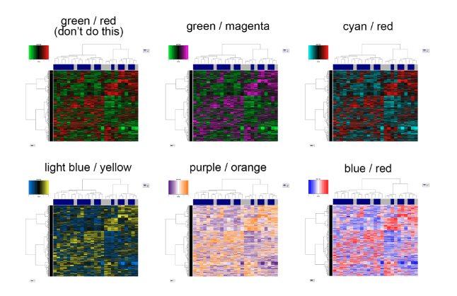
Parametric Color Control for Data Clarity
Color is where many otherwise good figures fail.
My routine:
-
In prompts, specify exact roles for colors:
-
"blue: control", "orange: treatment", "gray: background".
-
Avoid red–green combinations unless I'm certain about accessibility.
-
After rendering, I use external tools to check contrast and color-blind safety, referencing best practices for accessible scientific figures.
If necessary, I remap colors in vector software rather than chasing the perfect palette via repeated prompts.
Removing Watermarks & Artifacts Professionally
For academic ethics and clarity, the generative source should be acknowledged in the caption or methods, not as a logo floating in the image.
If Nano-Banana Pro adds artifacts or pseudo-watermarks:
-
I remove them with vector tools or a raster editor.
-
I explicitly state in the caption or methods section that Nano-Banana Pro was used for visualization, following current guidance from publishers on AI-generated content.
Post-Processing: The Final Polish in Vector Software
Before export, I run a final checklist:
- All text uses a journal-approved font and size.
- Line widths are consistent across panels.
- Axis labels and units match the main text.
- Figure works in grayscale (or at least remains interpretable). Then I export to PDF, EPS, or high-res TIFF as required by the journal.
Ethics & Integrity: Navigating AI Limitations in Academia
Identifying Hallucinations & Scientific Errors
Nano-Banana Pro can create visually plausible but scientifically false imagery. I look for:
- Structures that don't exist in my system (extra organelles, non-physical flows).
- Improper scales: arrows suggesting causality where none is proven.
- Over-smoothing that hides noise or variability essential to interpretation. My rule: if a viewer could misinterpret the AI embellishment as real data, I strip it out or replace it with an abstract schematic.
The Red Lines: What Constitutes Academic Misconduct?
Based on current publisher guidance on generative AI, ACS AI policy standards, and IEEE author guidelines for AI-generated text, I treat the following as red lines:
-
Presenting AI-generated images as raw experimental data.
-
Using Nano-Banana Pro to "clean" data in ways that hide real artifacts or outliers.
-
Failing to disclose that AI tools were used for illustration.
For ethical use in 2025, I follow three principles:
-
Transparency – I label AI-assisted figures in captions or methods (e.g., "schematic generated with Nano-Banana Pro and edited in Illustrator").
-
Bias Mitigation – I avoid prompts that reinforce biased representations (e.g., human subjects, demographics) and check outputs for stereotypes.
-
Copyright & Ownership – I ensure that training-data concerns and license terms of Nano-Banana Pro align with my institution or journal rules, and I avoid feeding in third-party material I don't have rights to.
If I'm unsure, I check the latest AI and authorship policies from my target journal or publisher before submission.
Compliance Strategy: Handling Journals with Strict AI Policies
Some journals now require granular declarations of AI use, or even forbid certain types of AI-generated content. Resources like Wiley's protocols for AI use in research and evidence-based guidance on AI in scientific publishing help navigate these requirements.
My compliance workflow:
-
Map policies early: before designing figures, I read the journal's AI and image integrity policies.
-
Classify each figure: data figure, schematic, or illustrative cartoon.
-
Document the pipeline: which parts Nano-Banana Pro touched, which were purely human-crafted.
Where Nano-Banana Pro is not a good fit:
-
Journals that disallow any AI-generated imagery, even schematics.
-
Figures that must be vector-perfect (e.g., corporate logos, regulatory symbols) – I use dedicated design tools instead.
-
Situations where visual ambiguity could carry legal or clinical risk.
When policies are unclear, I err on the side of over-disclosure and conservative use.
If you adopt a similar workflow, you can still benefit from Nano-Banana Pro for academic figures without risking rejections or corrections after publication.