I've tested Z-Image for kids across real family scenarios, posters, coloring pages, classroom flash cards, because the image was right, but the text was wrong is a common headache. My goal: make kid-friendly images that are safe, usable, and include AI images with accurate text. If you're an overwhelmed designer, creator, or parent, here's how I build realistic, production-ready images with Z-Image in minutes, not hours. I'll share exact prompts, settings, and traps to avoid, with a few quality-of-life tips for AI tools for designers.
Kid-Safe Generation: How to Use Z-Image for Kids Safely
I start every kid-focused session by hardening my guardrails. Z-Image includes content filters, but I never rely on defaults.
My baseline setup (tested):
-
Safe mode: Enabled (strict)
-
Allowed styles: "Cartoon", "Line art", "Sticker", "Flat vector" (avoid hyper-real adults)
-
Negative prompt: "violence, gore, scary, realistic weapons, mature themes, brand logos, unsafe objects"
-
Seed: Fixed (e.g., 12345) for repeatability
-
Guidance/CFG: 6–7 for balanced adherence
-
Resolution: 1024×1024 for print-friendly outputs
Why this matters: kid-safe generation isn't just about filtering. It's about steering. When I let the model freestyle, it sometimes adds props I didn't ask for. With a strict negative prompt and a fixed seed, I get consistent, child-appropriate results.
Quick workflow I use for posters/cards:
-
Draft prompt: "friendly cartoon astronaut, waving, bold simple shapes, pastel palette, smiling, no text"
-
Second pass adds text with a caption box: "Add a sign that reads: ‘READ'. block letters. centered."
-
If text warps, I regenerate only the text area using inpainting (mask the sign) with a higher CFG (8–9). This gets me AI images with accurate text more often than full re-renders.
✅ Good fits: animals, vehicles, space, food, sports, geography
⚠️ Be careful with: licensed characters or brands (copyright)
❌ Avoid: realistic firearms, mature fashion, edgy horror themes
Licensing note: If you're producing classroom or commercial assets, check Z-Image's license and your source model's terms. I never include real brand logos in kid work: I prompt for "generic logo shape" instead.
Seven minutes later, I had already exported my first production-ready image, safe, colorful, and readable.
Cartoon Styles Using Z-Image for Kids
I've found three style presets work fastest for kid projects: flat-vector, soft-cartoon, and storybook watercolor. All three print cleanly and scale well for posters or worksheets.
My style recipe (copy/paste and tweak):
-
Flat vector: "flat vector, bold outlines, primary colors, minimal shading, large shapes, high contrast"
-
Soft cartoon: "soft shading, rounded forms, gentle gradients, warm pastels, friendly eyes"
-
Storybook: "textured watercolor, pencil outlines, light grain, cozy palette, hand-drawn vibe"
For text reliability, I add: "caption box with text: ‘MATH DAY', uppercase, sans-serif, centered, high contrast." And I nudge the model: "no extra letters, no symbols." It's simple, but it works.
If you're after realistic AI images for marketing aimed at kids (e.g., birthday promos), I keep faces stylized and typography bold. Photorealism tends to complicate safety filters and text fidelity.
Popular Cartoon Art Styles Kids Love
Here's what consistently lands in classroom tests and family projects:
-
Kawaii minis: tiny bodies, big heads, pastel cheeks. Prompt: "kawaii fruit characters, smiling, sticker sheet layout."
-
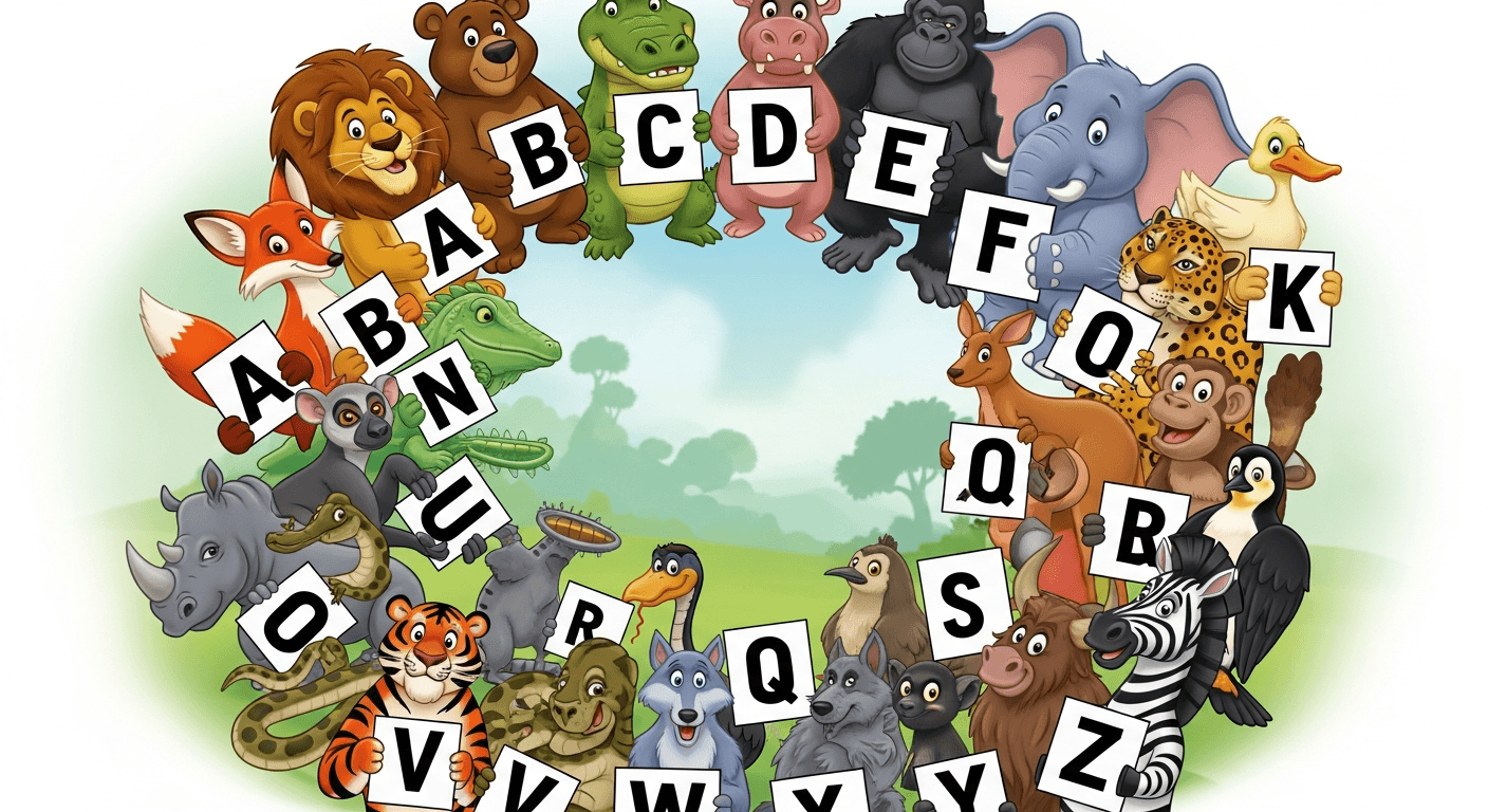
Animal pals: "cartoon zoo animals in a circle, each holding a sign: ‘A', ‘B', ‘C'…" (Regenerate masked letters until each is perfect.)
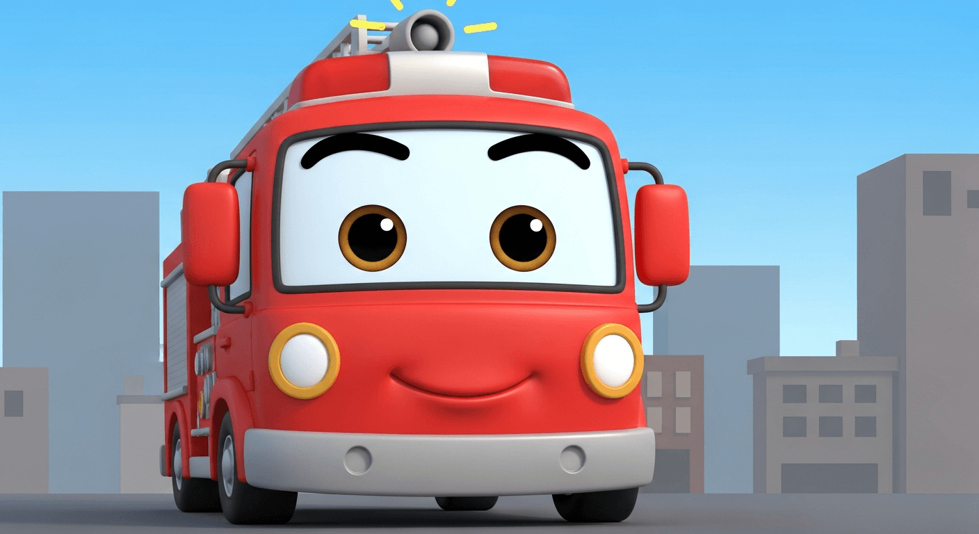
- Vehicle heroes: "friendly fire truck with eyes on windshield, simple city backdrop."
- Fantasy cozy: "storybook dragon, soft watercolor, no flames, holding a banner: ‘READ'."
Tip: When letters wobble, I isolate each sign and inpaint one at a time (seed locked). It's slower, but it yields AI images with accurate text you can ship.
Coloring Pages
Coloring pages are where Z-Image is quietly excellent. I ask for "clean black line art, no shading, white background, thick outlines, printable." Then I add a title line at the top for kids to trace.
My tested prompt:
"black-and-white line art of farm animals, thick outlines, large empty spaces for coloring, title area reads: ‘FARM FRIENDS', uppercase, centered, no gradients, no gray."
If the title looks warped, I mask just the title bar and re-run with: "block letters, sans-serif, even spacing, no extra symbols." For worksheets, I sometimes add traceable letters: "dotted outline text: ‘cat'."
Why this works: fewer details = fewer deformation points. And line art simplifies text generation. For bulk sets, I lock seed and swap nouns. It's efficient and consistent, the kind of workflow that beats trial-and-error.
Educational Images Through Z-Image for Kids
I build simple, readable learning visuals: alphabet cards, number posters, shapes, and science diagrams. The trick is to constrain composition and typography.
Layout formula I reuse:
-
Top: big illustration (minimal detail)
-
Bottom: text label in a solid rectangle
-
Font instruction: "uppercase, geometric sans-serif, even kerning, high contrast, ‘A' only"
Example prompt:
"flash card for letter A, flat vector apple, happy face, bottom label reads: ‘A is for Apple', uppercase, geometric sans-serif, centered, no extra icons."
If the model invents extra words, I add a hard negative: "no additional text, no watermarks, no signatures." For numbers, I ask: "digit ‘7' only, large, centered, drop shadow: none."
Compared with other tools (Midjourney, Firefly), Z-Image gives me faster, repeatable labels when I inpaint text areas. For teams hunting the best AI image generator for text, this surgical approach beats full-scene retries and saves budget.
Parent Tips: How Parents Can Guide Kids Using Z-Image
I've co-created dozens of kid projects with families. A little structure goes a long way.
✅ What works
-
Set a theme ("Ocean Week") and keep prompts consistent.
-
Use a fixed seed so characters look the same across pages.
-
Save a text template: "caption box reads: ‘OCEAN DAY'."
❌ What derails sessions
-
Open-ended prompts ("make something cool").
-
Letting the model pick text freely.
-
Chasing hyper-real faces for kids, adds risk and complexity.
Healthy Screen-Time Rules When Kids Use Z-Image
My simple rules:
-
20–30 minute creation blocks, then print and color offline.
-
Co-view generation, kids don't browse outputs alone.
-
No personal photos, no real school names in prompts.
-
Save and review before sharing.
I treat Z-Image like a creative lab, not an infinite feed. That mindset keeps energy high and creepiness low.
How Parents Can Co-Create Z-Image for Kids Projects at Home
Try this quick project plan I use:
-
Pick a 4-page mini book (Theme: Seasons).
-
Page prompts:
-
"spring scene, kid planting seeds, soft cartoon, caption reads: ‘SPRING'."
-
"summer beach, kite, safe props, caption reads: ‘SUMMER'."
-
"autumn leaves, scarf, caption reads: ‘AUTUMN'."
-
"snowman with mittens, caption reads: ‘WINTER'."
-
Lock seed for character consistency.
-
Inpaint any messy letters. Print and staple.
For creators and marketers, the same flow scales into branded kits, swap captions, keep style. It's clean, fast, and reliable. And if a tool fights your letters, don't brute-force, mask, inpaint, increase CFG by 1, and try again. That's the tiny tweak that saves an hour.
If you need more polish, pair Z-Image with a vector app for final type. But honestly, with disciplined prompts, I ship straight from Z-Image most days. It's practical, and it sticks.

