Last Updated: December 2025 | Tested Version: Seedream 4.5
If you're an independent creator, designer, or marketer, you probably don't have hours to wrestle with AI models that produce gorgeous images but garbled text. I've been there, beautiful poster, nonsense headline.
In this guide, I'll walk through how I actually use Seedream 4.5 for poster and graphic design: from layout-focused prompts, to consistent text placement, color control, templates, and finishing a print-ready file. I'll also call out where Seedream 4.5 struggles, so you don't burn time chasing results it can't reliably deliver.
AI tools evolve rapidly. Features described here are accurate as of December 2025.
Mastering Layout: Prompting Strategies for Seedream 4.5
Good posters start with structure, not decoration. When I work in Seedream 4.5, I treat the prompt like a mini layout brief rather than a vague aesthetic wish.
Describe the page like a blueprint
Instead of simply asking for "a music festival poster", I get specific about regions:
-
Overall format: "vertical A3 poster, centered composition, generous margins"
-
Zones: "large headline area at top, medium image block in the middle, small text block at bottom"
-
Alignment: "grid-based layout, left-aligned body text, centered headline"
A sample layout prompt that consistently gives me usable foundations:
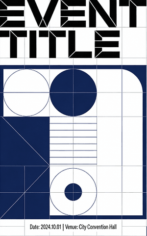
"Vertical A3 event poster, clean grid-based layout, bold sans-serif headline area at top, central illustration block in the middle, small details section at bottom, wide margins, minimalistic Swiss-style graphic design, high resolution, Seedream 4.5."
When I layer that with the visual theme (e.g., "sunset gradients, modern tech conference"), Seedream 4.5 tends to respect the structure surprisingly well. This structure-first approach is different from generating purely illustrative environments—if you are looking for inspiration on that front, you might check our collection of best Nano Banana scene prompts—but for posters, grid layout is king.
Use composition keywords Seedream actually listens to
I've noticed Seedream 4.5 responds strongly to a few composition phrases:
-
"Poster layout" or "magazine cover layout" – pushes it toward clear hierarchy
-
"Strong visual hierarchy" – usually enlarges the headline or key visual
-
"Negative space" – gives breathing room instead of clutter
-
"Centered focal point" / "rule of thirds composition" – changes how it anchors the main visual
This is the detail that changes the outcome: if I don't specify layout concepts, the model treats the poster more like a generic illustration on a rectangle.
For a deeper jump into physical poster hierarchy (which absolutely helps you prompt better), I recommend cross-checking with traditional design resources like this guide to effective poster design and this breakdown of poster anatomy. I model my prompts on these fundamentals and let Seedream fill in the style.
Best Practices for Consistent Text Placement
Text is where most AI poster tools fall apart. Seedream 4.5 is better than older diffusion models, but it still needs coaching.
One main text block per pass
When I try to cram multiple precise text blocks into a single generation (headline + subhead + body + CTA), the model often jumbles letters or merges words. I get far better results when I:
-
Design for one primary text block in the prompt (usually the headline).
-
Treat secondary text as suggested areas, not exact content (e.g., "small detail text at bottom").
Then I either:
-
Regenerate until the letters are mostly right, or
-
Use the image as a layout base and add final typography in Figma, Illustrator, or Canva.
If you absolutely need the model text to be presentable, I keep the headline short, all caps, and common letters. Something like:
"HEADLINE: FUTURE FEST"
inside the prompt tends to fare better than a long, mixed-case sentence.
Prompting for accurate text areas
When I want Seedream 4.5 to reserve clear text zones, I phrase it like this:
"Concert poster, large blank rectangular area at top reserved for title text, secondary blank area at bottom reserved for details, no overlapping elements on these areas, sharp edges, graphic layout."
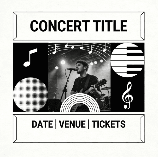
Seeds generated from that prompt usually give me obvious "slots" for typography that I can later fill manually.
For more background on readable poster layouts, I still reference resources like Vistaprint's poster layout tips and visual hierarchy rules to sanity-check what the AI is giving me.
Where Seedream 4.5 fails for text
If your priority is pixel-perfect, brand-locked typography, exact fonts, letterspacing, and trademarked slogans rendered flawlessly, Seedream 4.5 isn't the last step. I treat it as:
-
A layout and mood generator, not a final typesetter.
-
A way to test variations of hierarchy and image–text balance.
For rigid identity work (logos, corporate lockups, long copy), I still rely on traditional tools and just feed them Seedream's composition as a visual reference. If your focus is heavily on consistent logo generation across assets, you might find our guide on the Midjourney branding workflow to be a useful comparison, but for layout composition, Seedream remains my go-to.
Generating High-Impact Color Schemes with AI
Good color can carry a mediocre composition: bad color will ruin a great one. I lean on Seedream 4.5 as a fast color lab.
Give it a scheme, not just a vibe
Instead of saying "colorful" or "vibrant", I describe actual schemes:
-
"Analogous teal–blue–indigo palette"
-
"Warm triadic color scheme: orange, magenta, cyan accents"
-
"Muted earth tones with one neon accent color"
A prompt I've used for a product launch poster:
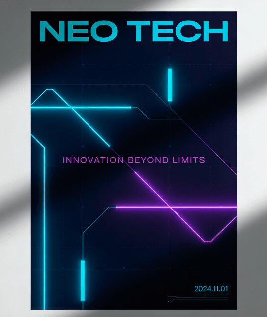
"Minimal tech poster, dark navy background, cyan and electric purple accent lines, high contrast, neon triadic color scheme, cinematic lighting, Seedream 4.5."
The model consistently produced gradients and glows that matched this direction. I then exported a few favorites and sampled the hex values to build a brand-adjacent palette.
Control contrast and mood explicitly
I've noticed that words like "high contrast", "pastel", "soft muted", and "monochrome with one accent color" have a strong influence on Seedream's output.
For example, when I used:
"High-contrast poster, almost-black background, bright cyan text area, subtle magenta rim light, cinematic mood."
I got clear, legible text zones and a bold focal point. The strong dark–light separation also held up well in print tests.
If you're new to color, pairing Seedream experiments with theory-focused resources like this overview of poster color schemes helps you name what you want more precisely in your prompts.
Using Seedream 4.5 Templates for a Streamlined Workflow
When I'm on a deadline, I don't start from a blank prompt. I build a small library of Seedream 4.5 poster templates, prompts and settings that already gave me good results, and adapt them.
Using Seedream 4.5 Templates for a Streamlined Workflow
When I'm on a deadline, I don't start from a blank prompt. I build a small library of Seedream 4.5 poster templates, prompts and settings that already gave me good results, and adapt them.
My basic template structure
Most of my go-to templates follow this spine:
-
Format & use case: "A2 vertical poster for [event/product]"
-
Layout: "clear headline area at top, image in center, details at bottom, strong grid-based layout"
-
Style: "minimal, Swiss design" or "bold, collage-style, experimental typography"
-
Color: one line describing palette
-
Model ref: "high-resolution, Seedream 4.5"
I duplicate that, then just swap:
-
Event type (conference, concert, sale)
-
Imagery theme (city skyline, abstract waves, product render)
-
Color direction
Over time, this becomes a poster-generation routine rather than a guessing game.
How I validate a new template
To see if a template is actually reliable, I:
-
Run 5–10 variations with different seeds.
-
Check if the headline area stays clear and readable across runs.
-
Print a quick A4 test (just on a basic printer) to see if contrast holds.
If 70–80% of the variations look usable with light tweaking, I keep the template. Otherwise, I revise wording or structure.
For more technical detail on what's happening under the hood in Seedream and the ModelArk pipeline, I recommend skimming the official documentation:
These aren't required reading to make good posters, but they help me understand why certain prompts behave the way they do.
Final Polish: Upscaling and Exporting Print-Ready Posters
Once I'm happy with the layout and mood, I focus on resolution, print safety, and ethics before anything leaves my screen.
Technical finishing steps
I run through a quick checklist:
-
Upscale thoughtfully. If Seedream 4.5's native output isn't large enough for print, I upscale using a print-focused tool. I double-check edges and text, because upscalers sometimes over-sharpen letters.
-
Check size & DPI. For common poster sizes (A3, A2, 18×24"), I set the canvas in a design app at 300 DPI and paste or place the AI image, scaling it down slightly for crispness.
-
Safe margin & bleed. I keep key text at least 10–15mm from the trim edge and add standard bleed (usually 3mm or 0.125").
-
Export PDFs for print, PNG/JPEG for web. I keep a CMYK-ready PDF for printers and an sRGB PNG for online use.
To test Seedream's actual fidelity, I'll often use a very literal prompt:
"Minimalist movie poster, centered portrait, large blank title area at bottom, dark teal background, one bright orange accent line, high-resolution Seedream 4.5."

When printed, I look at banding in the gradient and the cleanliness of the accent line. If I see artifacts, I know I need either a higher-res generation or a gentler upscale.
Ethical considerations for AI-generated posters
Because Seedream 4.5 can create photorealistic and highly stylized posters, I'm extra careful about how I present and use the outputs.
-
Transparency. When a poster is heavily AI-assisted, I label it somewhere, either in the caption, credits, or project notes (e.g., "Imagery generated with Seedream 4.5, layout and typography by [your name]"). It's a small step, but it keeps clients and audiences informed.
-
Bias and representation. I consciously vary descriptors in my prompts for people-focused posters (age, ethnicity, body type, gender expression). If a batch of outputs skews toward stereotypes, I adjust prompts and regenerate rather than accepting the first pass. Documenting this review step in your workflow shows you're treating bias reduction as a real design constraint, not an afterthought.
-
Copyright and ownership (2025 reality check). I avoid asking Seedream to imitate specific living artists or to re-create trademarked characters or logos. For brand work, I only feed elements I have rights to (e.g., client logos) and I always finalize typography in a tool where I know I'm using properly licensed fonts. When in doubt, I treat AI outputs like stock imagery: useful, but still subject to legal and contractual review.
Who Seedream 4.5 poster workflows are (and aren't) for
From my experience, Seedream 4.5 shines when you:
-
Need fast visual directions for campaigns, events, or social content.
-
Want to iterate on layouts and moods before committing to full manual design. (Note: If you are specifically generating performance marketing assets, check out Flux 1.1 for ad creatives for a more specialized approach).
-
Are comfortable doing final typography and brand alignment in traditional tools.
It's less ideal if you:
-
Require fully vector, infinitely scalable graphics (think logos, icon systems).
-
Need strict brand manual compliance without touching a design app afterward.
-
Work in heavily regulated spaces where AI provenance is still a legal gray zone.
If that's you, I'd still explore Seedream 4.5 for early-stage exploration, but I wouldn't base your entire poster pipeline on it.
What has been your experience with Seedream 4.5 for poster and graphic design? Let me know in the comments.
Seedream 4.5 Poster & Graphic Design FAQs
How do I get cleaner layouts when using Seedream 4.5 for poster and graphic design?
Treat your prompt like a layout brief. Specify format (e.g., vertical A3), clear headline, image and detail zones, alignment, and terms like "poster layout," "strong visual hierarchy," and "negative space." This helps Seedream 4.5 build a structured, grid-based composition instead of a generic illustration.
What's the best way to handle text in Seedream 4.5 poster designs?
Limit each Seedream 4.5 pass to one main text block, usually a short, all-caps headline using common letters. Describe other text as "areas reserved for details" rather than exact copy, then finalize typography in tools like Figma, Illustrator, or Canva for clean, on-brand results.
How can I control color schemes in Seedream 4.5 for poster and graphic design?
Describe specific color schemes instead of vague vibes. Use phrases like "analogous teal–blue–indigo palette," "warm triadic color scheme," or "monochrome with one accent color," plus mood terms such as "high contrast" or "soft muted." Save good outputs, sample hex values, and build consistent palettes from them.
Can Seedream 4.5 create print-ready posters on its own?
Seedream 4.5 is excellent for layout and mood but not a full print-production tool. Generate the design, then upscale if needed, place it in a 300 DPI canvas, add safe margins and bleed, and export CMYK-ready PDFs for print and sRGB PNG/JPEG versions for web in a design app.
How does Seedream 4.5 compare to traditional design tools for posters?
Seedream 4.5 accelerates exploration—testing layouts, moods, and color directions quickly. Traditional tools still win for precise typography, vector logos, strict brand guidelines, and complex production tasks. Many designers use Seedream 4.5 for concepting, then refine, typeset, and prepare final files in Illustrator, InDesign, or Figma.